A client rang me on a Thursday afternoon in 2021, three weeks before his product launch, absolutely convinced he needed to rename his SaaS company. Not rebrand -- rename. He'd already built the logo, bought the domain, filed the trademark. Wanted to start over because a mate down the pub told him the name "sounded techy." I talked him off the ledge. But the conversation stuck with me, because it highlighted something I see constantly: founders treat naming and colour as afterthoughts, then panic about them at exactly the wrong moment.
So let's do this properly. From the start.
Why Your Brand Name Matters More Than You Think
Here's the thing -- your name isn't just what people call you. It's the first filter. Someone hears it at a networking event, reads it on a LinkedIn post, glances at it on a packaging label. In about two seconds they've already formed an impression. And that impression is almost impossible to walk back once it hardens into perception.
Good names do a few things simultaneously. They're pronounceable (obvious, but you'd be stunned how often this gets ignored). They're distinct enough that Google doesn't surface fourteen competitors when someone types them in. And they carry at least a faint trace of the thing you actually do, or the feeling you want to create.
Qualtrics puts it well: a brand name needs to communicate everything you stand for, from the start. I'd go further -- it needs to do that without explaining itself. The name "Slack" doesn't need a subtitle. "Monzo" doesn't need a tagline to feel modern. The name carries the weight.
The Naming Traps I See Most
- Puns that age badly (and most puns age badly within eighteen months)
- Names that are impossible to spell after hearing them once
- Names that are too literal -- "Fast Plumbing London Ltd" tells me nothing I'll remember
- Names borrowed from a founder's personal life that mean nothing to anyone else
Back in 2019 a client came to me with the working name "Meridian" for his digital marketing agency. Sounds fine, right? The problem: two established agencies in the UK already used variations of it, there was a TV channel with the same name, and the.com was parked by a domain squatter asking £4,800. We spent forty minutes on a call with Namelix and a notepad, and landed on something far more ownable in under an hour. The point is -- the research has to happen before you fall in love with the name.
How to Actually Come Up With a Name
Start with your brand's core values and personality. Not a mood board -- actual words. Write down five adjectives that describe how you want customers to feel after interacting with you. Confident? Reassured? Energised? Slightly surprised by how good it was?
Squarespace's naming guide suggests thinking of your brand as a person -- what are they like, how do they talk, what do they care about? I use this exercise with clients all the time. It sounds a bit soft but it works. Because once you can describe the brand as a person, naming becomes a lot less abstract.
Here's my actual process, in order:
- Write 30 candidate names.Not 5. Not 10. Thirty. Most will be rubbish, and that's fine -- the rubbish ones help you understand what direction you're not going in.
- Run a trademark check on the UK IPO database (or USPTO if you're targeting the US). Do this before you get attached.
- Check domain availability.I use Namecheap for this. If the exact.com is gone, check whether a.co.uk,.io, or a slight variation works for your market. Don't force it if it looks desperate.
- Search social handles across Instagram, X, LinkedIn, and TikTok. Fragmented handles across platforms genuinely hurt brand recall over time.
- Say it out loud to someone who doesn't know your business.Ask them to spell it back. Ask them what they think the company does. Their answer will tell you everything.
- Sleep on the shortlist.Seriously. The name you love at 11pm on a Tuesday often looks different at 9am on a Thursday.
What makes a name stick?According to research on memorable brand names, great names are interesting and different from competitors, easy to recall, and ideally carry a story. That last bit matters more than people expect. Airbnb, Patagonia, Innocent -- each name has a narrative behind it that founders can actually tell. That story becomes marketing collateral.
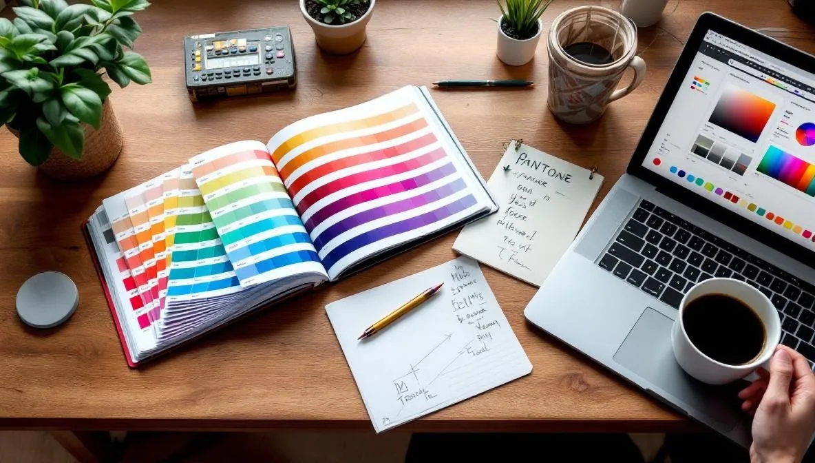
Colour Psychology Is Real, But Don't Overcomplicate It
I'll be direct: colour psychology is often presented as more precise than it is. You can't look at a hex code and guarantee an emotional outcome. Culture, context, and personal history all interfere. A colour that reads as "trustworthy" in one country can read as "mournful" in another.
That said -- it's not nothing. Patterns exist, and they're worth understanding.
Franco's colour theory breakdown maps it cleanly:
- Blue: Trust, calmness, professionalism -- dominant in corporate and tech
- Green: Growth, health, nature -- go-to for eco and wellness brands
- Yellow: Warmth, optimism -- works brilliantly as an accent, overwhelming as a primary
- Purple: Luxury, creativity -- beauty and high-end product territory
- Black: Sophistication, power -- luxury brands, premium tech
- Red: Energy, urgency -- fast food, clearance sales, activism
Seahawk had a fintech client a couple of years ago who was dead set on using orange as a primary colour. His reasoning: "it stands out." And yes, it does stand out. But orange reads as playful and impulsive -- exactly the wrong signal for a product asking people to trust it with their savings. We moved orange to an accent and brought in a deep slate blue as the primary. The brand felt completely different. More considered. More safe to hand money to.
Building a Palette That Actually Works Together
Most brands need four colours, maybe five. That's it. A primary, a secondary, an accent, a neutral, and occasionally a fifth for data visualisation or alerts.
VistaPrint's branding guide points out that neutrals -- greys, whites, off-whites, beiges -- often get ignored but they're doing heavy lifting in the background. Black can work as a neutral but be careful; it tends to dominate whatever it's placed against. I learned this the hard way on a real estate project where we used pure black (#000000) as a background and it made the whole site feel gothic rather than premium.
The Tools I Actually Use
I open Coolors.co for almost every new palette. Lock in your primary colour, hit the spacebar, and it generates harmonious combinations. Brilliant for unsticking your brain when you've been staring at the same swatches for forty minutes. Adobe Colour is good for checking contrast ratios -- important for accessibility, and increasingly important for SEO since Core Web Vitals started touching on user experience signals.
One rule I stick to: test your palette in greyscale before committing. If the hierarchy collapses and everything looks the same shade of mid-grey, your colours are doing too little structural work. The palette needs to function even without hue.
Colour Consistency Across Everything
This is where most early-stage brands fall apart. They get the logo right, maybe the website, and then the social graphics are slightly different, the business cards are printed slightly different, and six months in the brand feels incoherent without anyone being able to say exactly why.
Your brand's colours need to live in a document -- actual hex codes, RGB values, and CMYK values for print. Not "it's sort of a teal-ish blue." A specific hex. Every designer, every print shop, every freelancer you hire gets that document on day one.
Research on colour and brand recognition consistently shows that repetition of the same colours strengthens brand awareness over time. Think about it -- when did you last see a Coke can that wasn't red? That consistency is a deliberate, compounding investment.
Making the Name and Colours Work Together
Here's something that doesn't get discussed enough: your name and your colour palette should feel like they come from the same place. They should be telling the same story.
A playful, punchy name paired with a sombre dark-grey palette creates cognitive dissonance. People can't articulate why the brand feels off, but they feel it. Conversely, a serious professional name -- something like "Harrington Consulting" -- dressed up in neon yellow and coral looks like a mistake rather than a design choice.
When I work with a new brand, I develop the name shortlist and the colour direction in parallel, not sequentially. They inform each other. Sometimes a name emerges that's quite bold and edgy, and that immediately rules out certain colour directions. Sometimes a client is drawn to a particular colour instinctively, and that gut response tells me something about what kind of name will feel right alongside it.
The Canva brand colour guide makes a point I agree with strongly: when your colours align with your tone of voice, typography, and overall design language, the whole thing compounds. Brand management becomes easier. Recognition builds faster. The brand stops feeling like a collection of assets and starts feeling like a coherent identity.
Quick Checks Before You Commit to Either
Before you finalise a name or a palette, run through this:
- Does the name pass the "radio test"? Can someone hear it spoken aloud and find you online without seeing it written?
- Are your brand colours accessible? WCAG AA contrast ratio is the minimum bar -- use a contrast checker.
- Does the name work in your secondary market if you plan to expand? Some words carry very different connotations across cultures.
- Can your colour palette be reproduced accurately in single-colour print? (Think embroidered shirts, embossed business cards, signage.)
- When you put the name and the primary colour on a white background -- does it feel like the same brand?
If the answer to any of those is uncertain, dig in further before you print anything or launch anything.
---
FAQ
How many colours should a brand have?
Most brands work well with three to five colours: a primary, a secondary, an accent, and one or two neutrals. Go beyond five and you start to lose coherence -- everything starts to feel like it belongs to a different brand. Pick fewer colours and use them with more intention rather than adding new ones every time you feel the palette is missing something.
Does it matter if my brand name isn't descriptive?
Not really, no. Some of the most powerful brand names are entirely abstract -- Apple, Amazon, Uber. What matters is that the name is ownable, memorable, and doesn't carry negative associations. Descriptive names can actually work against you if your business pivots or expands, because you've baked a limitation into the name itself.
Should I follow colour trends in my industry?
Understand them, yes. Follow them blindly, no. Knowing that most fintech companies use blue gives you a choice: align with the convention to signal credibility, or deliberately diverge to stand out. Both are valid. What's not valid is ignoring the convention entirely without knowing it exists -- that's not boldness, that's just ignorance.
How do I know if my brand name is too similar to a competitor?
Do a trademark search first -- UK IPO for British businesses, USPTO for American markets, EUIPO for Europe. Then do a plain Google search for the name. Then check social handles. If a direct competitor ranks on the first page for your proposed name, that's a problem regardless of trademark status. You'll be fighting for visibility before you've even started.
Can I change my brand name later?
You can, but it's expensive and painful in proportion to how established you are. The cost isn't just the rebrand itself -- it's SEO equity, customer recognition, and the confusion you create in the market during the transition. Get it right earlier rather than later. That said, if the name is genuinely working against you, a well-executed rebrand is better than staying stuck with something that's hurting you. Mailchimp went through this. So did Instagram (previously "Burbn"). It's not the end of the world -- just don't do it casually.
---
Your name and your colours will outlast your first website, your first logo iteration, and probably your first product. Treat them like the long-term decisions they are. Take a week, not an afternoon. Test them with real people, not just your co-founder. And once you've committed -- be consistent, everywhere, always. That consistency is where the brand equity actually accumulates.