Here are 20 of the best portfolio websites online right now: designers, developers, a photographer and an architect presenting their own work, studios and agencies selling theirs, plus a few project sites such as a brand book and an industry report. Taste did not decide the list. I drew all 20 at random from 23 live, hand-reviewed portfolio sites, checked that each one loads, measured it on a phone and recorded what you could adapt for your own site. The surprise: none of the 8 sites with enough real-visitor data passes all three of Google's Core Web Vitals, and the median mobile Lighthouse score is 61.5. This is the portfolio spoke of 64 beautiful websites, checked live and speed-tested.
How these 20 were picked and tested
Most lists of the best portfolio websites are curated favourites. That says nothing about what those choices cost in loading time, so I used a random draw instead.
- The pool: 23 live portfolio websites from a curated design database I maintain. Every one was reviewed by hand, has desktop and mobile captures, and passed an availability check in the last 30 days.
- The draw: 20 sites in a fixed random order, with no more than two from any one studio. None needed swapping. Nothing here is my client work, and no one paid to be included.
- The live check: every site was opened in a browser (Chromium) on 31 Oct 2026 and loaded the same site it was listed for.
- The lab test: a mobile Lighthouse run per site between 12 and 20 Oct 2026, recording the performance score, Largest Contentful Paint and page weight.
- The real-visitor data: Chrome UX Report figures for phones, which Google collects from real Chrome users. A page only appears once it has enough visitors (Chrome UX Report), which many personal portfolios never reach, so 11 of the 20 show "no data".
- Not a ranking: the order below is the draw order.
What 20 portfolio websites cost in speed
Google marks a page as good when its Largest Contentful Paint (LCP) is 2.5 seconds or less, its Interaction to Next Paint (INP) is 200 milliseconds or less and its Cumulative Layout Shift (CLS) is 0.1 or less, measured at the 75th percentile of page loads. A page passes Core Web Vitals only when it meets all three (web.dev).
| Finding | Result |
|---|---|
| Median mobile Lighthouse performance score | 61.5 |
| Score 90 or above | 1 of 20 |
| Score under 50 | 5 of 20 |
| Median page weight | 3.4 MB |
| Pages over 10 MB | 5 of 20 |
| Pages under 2 MB | 7 of 20 |
| Sites with real-visitor (CrUX) data | 9 of 20 |
| Pass all three Core Web Vitals, of the 8 with enough data to judge | 0 |
| Real-visitor LCP within 2.5 seconds | 2 of 9 |
For comparison, Google's September 2026 Chrome UX Report release puts the share of origins with good Core Web Vitals at 55.9% across 18,376,044 origins (Chrome UX Report release notes). Not one of the 8 portfolios judged here passes. Of those 8, 7 miss the 2.5 second LCP target, 5 respond too slowly to taps and 2 move their layout too much.
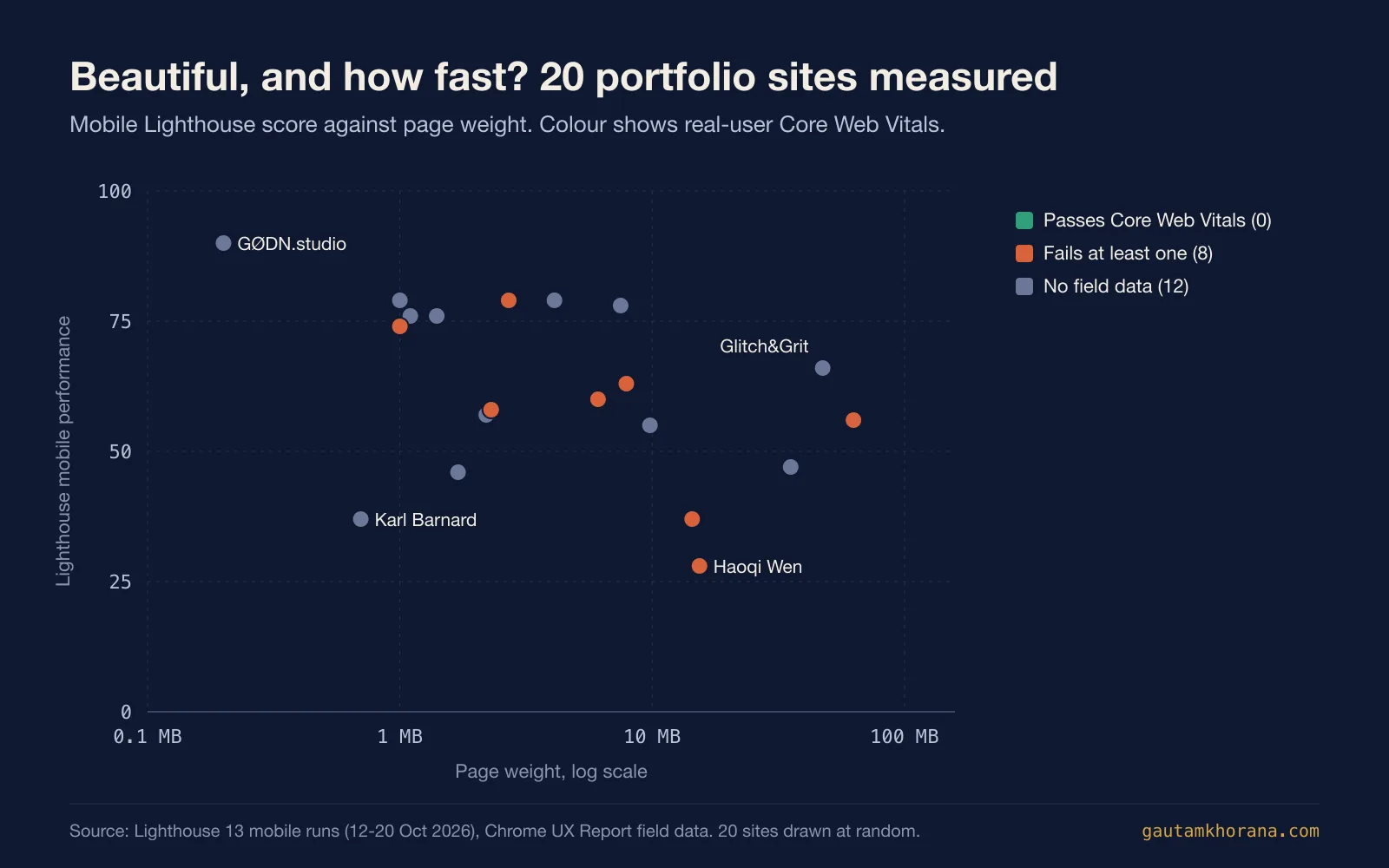
A light page does not guarantee a good score, and a heavy page does not guarantee a bad one. Karl Barnard's portfolio weighs 0.7 MB but scores 37 in the lab, where the test recorded 908 ms of blocking time while scripts ran. Glitch&Grit weighs 47.4 MB and scores 66. The smallest page in the draw, GØDN.studio at 0.2 MB, is also the only one to score 90 or above.
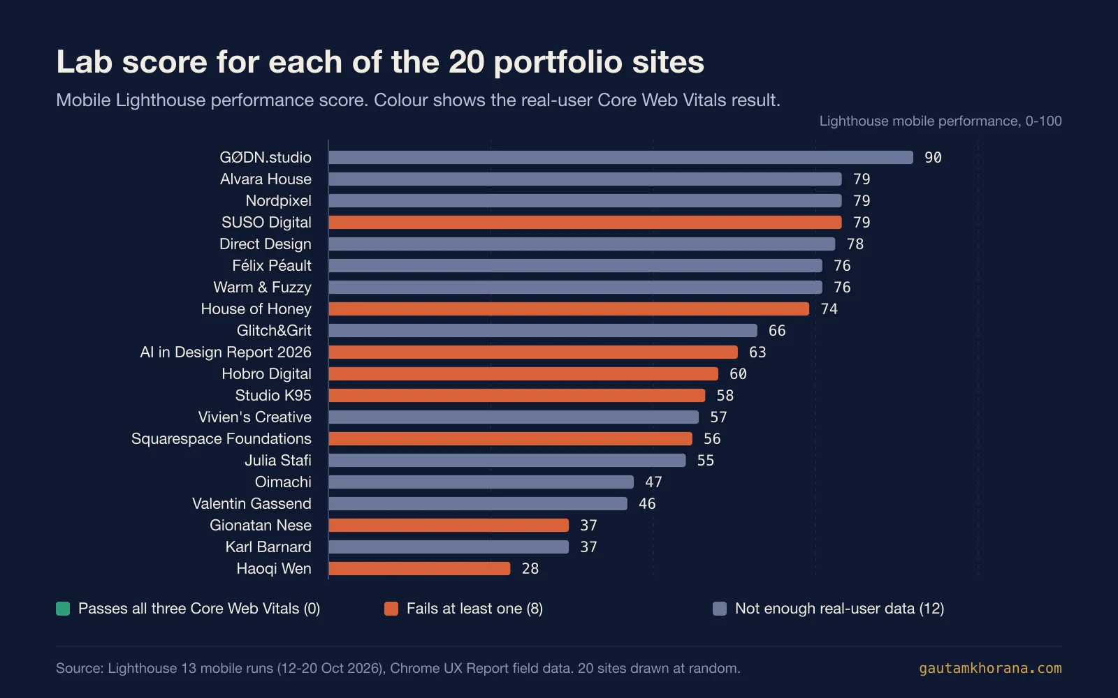
The lab and real visitors disagree here too. Gionatan Nese scores 37 in the lab, yet real visitors see the main content in 1.2 seconds; the site fails only on responsiveness, at 232 ms against Google's 200 ms line. Lighthouse is one run on an emulated phone, and when it conflicts with the Chrome UX Report, web.dev says the real-visitor data is likely the more accurate view (web.dev).
What these 20 are built with
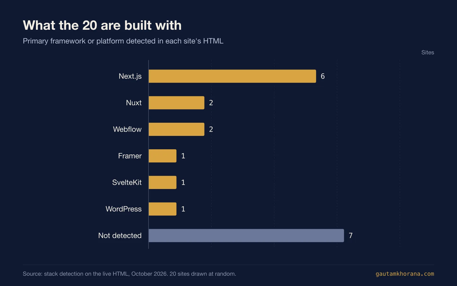
Next.js runs 6 of the 20. Nuxt and Webflow run 2 each, and Framer, SvelteKit and WordPress run one each. For the other 7, the stack could not be read from the HTML. Félix Péault's photography portfolio on SvelteKit scores 76 on a 1.4 MB page. If you are choosing a framework for your own site, Astro vs Next.js covers the trade-off.
What the 20 have in common
Every site in the database gets style tags during review, and the stack is detected from the live HTML, so these are counts, not impressions.
- Big type is the signature. 11 of the 20 set a name or a headline in very large type, the most common tag in the group. On a portfolio the name is often the whole first screen.
- Interaction over decoration. 7 are tagged interactive, more than any other style: 3D scenes, backgrounds that react to the cursor and project rings you can rearrange. Minimal and typographic come next with 6 each.
- The work does the selling. 9 lead with photography and 8 with illustration, and the best of them show one piece large rather than ten small.
- Motion is not what slows them down. 6 load a smooth-scroll or animation library such as GSAP or Lenis. Their median lab score is 77, against 57.5 for the other 14, so in this draw animation alone does not explain the slow scores.
The 20 portfolio websites
All 20 appear below in draw order, with measurements first, then a closer look at each one with a homepage capture, the pattern worth borrowing and the trade-off to understand. Real-visitor figures are from phones; "no data" means Google had too few visitors to report. For your own site, see portfolio web design.
| # | Site | Lighthouse (mobile) | LCP, real visitors | INP | CLS | Page weight | Built with |
|---|---|---|---|---|---|---|---|
| 1 | Hobro Digital | 60 | 2.7 s | 282 ms | 0.06 | 6.1 MB | Not detected |
| 2 | Valentin Gassend | 46 | no data | no data | no data | 1.7 MB | Next.js |
| 3 | Vivien's Creative | 57 | no data | no data | no data | 2.2 MB | Next.js |
| 4 | Oimachi | 47 | no data | no data | no data | 35.4 MB | Webflow |
| 5 | Squarespace Foundations | 56 | 4.5 s | 217 ms | 0.00 | 62.8 MB | Nuxt |
| 6 | AI in Design Report 2026 | 63 | 6.4 s | 98 ms | 0.36 | 7.9 MB | Framer |
| 7 | Julia Stafi | 55 | no data | no data | no data | 9.8 MB | Not detected |
| 8 | Studio K95 | 58 | 5.5 s | 245 ms | 0.00 | 2.3 MB | Nuxt |
| 9 | Direct Design | 78 | no data | no data | no data | 7.5 MB | Webflow |
| 10 | House of Honey | 74 | 3.0 s | no data | 0.00 | 1 MB | Next.js |
| 11 | Félix Péault | 76 | no data | no data | no data | 1.4 MB | SvelteKit |
| 12 | Karl Barnard | 37 | no data | no data | no data | 0.7 MB | Not detected |
| 13 | Gionatan Nese | 37 | 1.2 s | 232 ms | 0.00 | 14.4 MB | Next.js |
| 14 | SUSO Digital | 79 | 2.8 s | no data | 0.00 | 2.7 MB | WordPress |
| 15 | Nordpixel | 79 | no data | no data | no data | 4.1 MB | Not detected |
| 16 | Alvara House | 79 | no data | no data | no data | 1 MB | Next.js |
| 17 | Haoqi Wen | 28 | 9.7 s | 238 ms | 0.15 | 15.4 MB | Not detected |
| 18 | Warm & Fuzzy | 76 | 2.4 s | no data | 0.00 | 1.1 MB | Next.js |
| 19 | Glitch&Grit | 66 | no data | no data | no data | 47.4 MB | Not detected |
| 20 | GØDN.studio | 90 | no data | no data | no data | 0.2 MB | Not detected |
1. Hobro Digital
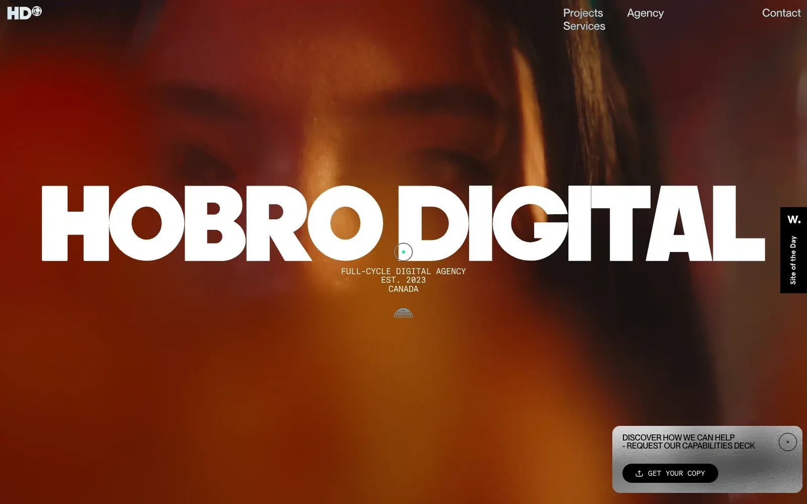
The name sits in a very heavy, wide sans serif in white, stretched almost edge to edge across a blurred, close-cropped face in deep red and amber. The warm colour stays within one family, so the white lettering reads at once. A small monospaced line underneath gives the agency descriptor and place, and the contrast between chunky display type and light typewriter-style text keeps the hierarchy clear.
Borrow this: Set your studio name in a single heavy display face at full width over a blurred, warm-toned photograph or video still, and pair it with a small monospaced descriptor line.
Watch out for: The page is heavier than average and scores in the middle of the lab results. Real visitors also see slow loading of the main content and sluggish response to taps and clicks, which fits a full-screen moving backdrop with scripted animation.
Designed in-house. Visit hobro.digital.
2. Valentin Gassend
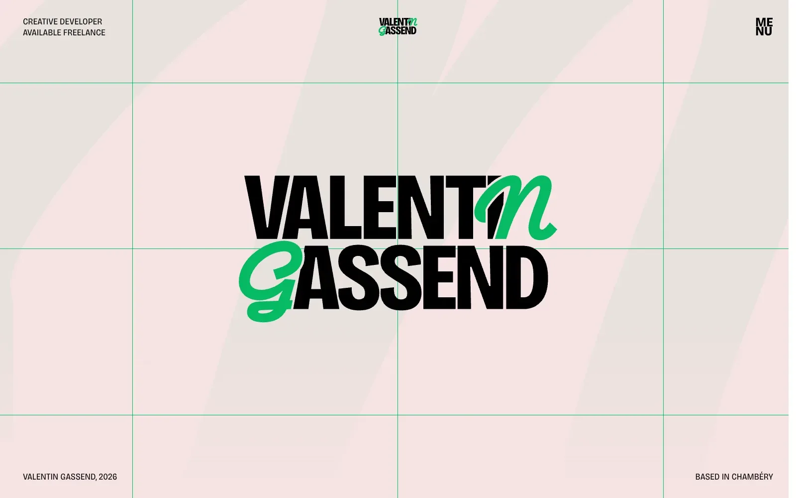
The name does the work. A heavy, tall condensed sans in black stacks into a tight block, and the G and the final N switch to a green brush script, which gives a plain wordmark some personality. Thin green grid lines divide the pale pink ground into cells, while small uppercase captions sit in the corners and leave the centre clear.
Borrow this: Set your name at a huge size in a single heavy typeface, swap a couple of letters for a script face in one accent colour, and repeat that colour in thin grid lines behind it.
Watch out for: The lab test rated the page as slow despite its light weight, and Google holds too little real-visitor data to confirm how it performs for actual users.
Designed in-house. Visit valentingassend.com.
3. Vivien's Creative
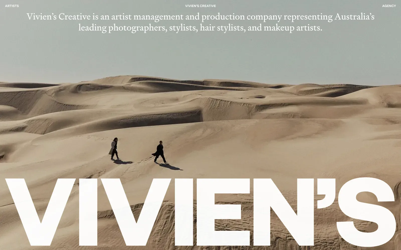
A full-bleed photograph of pale dunes fills the screen, with two walkers in dark coats set small against the sand, giving the page scale and calm. The intro sits in a light, bookish serif over the grey-green sky, while the name below uses a huge, heavy white sans that runs edge to edge. The small capitalised menu links stay out of the way, so the image and the name carry the opening.
Borrow this: Pair a full-bleed photograph with an oversized wordmark cropped to the bottom edge and a short serif intro above, so a small studio gets a confident first screen from a good image and a pair of typefaces.
Watch out for: The page is light, but the lab result is only middling, and Google does not hold enough real-visitor data to judge how it performs for actual people.
Built by Christopher Doyle & Co.. Visit vivienscreative.com.au.
4. Oimachi
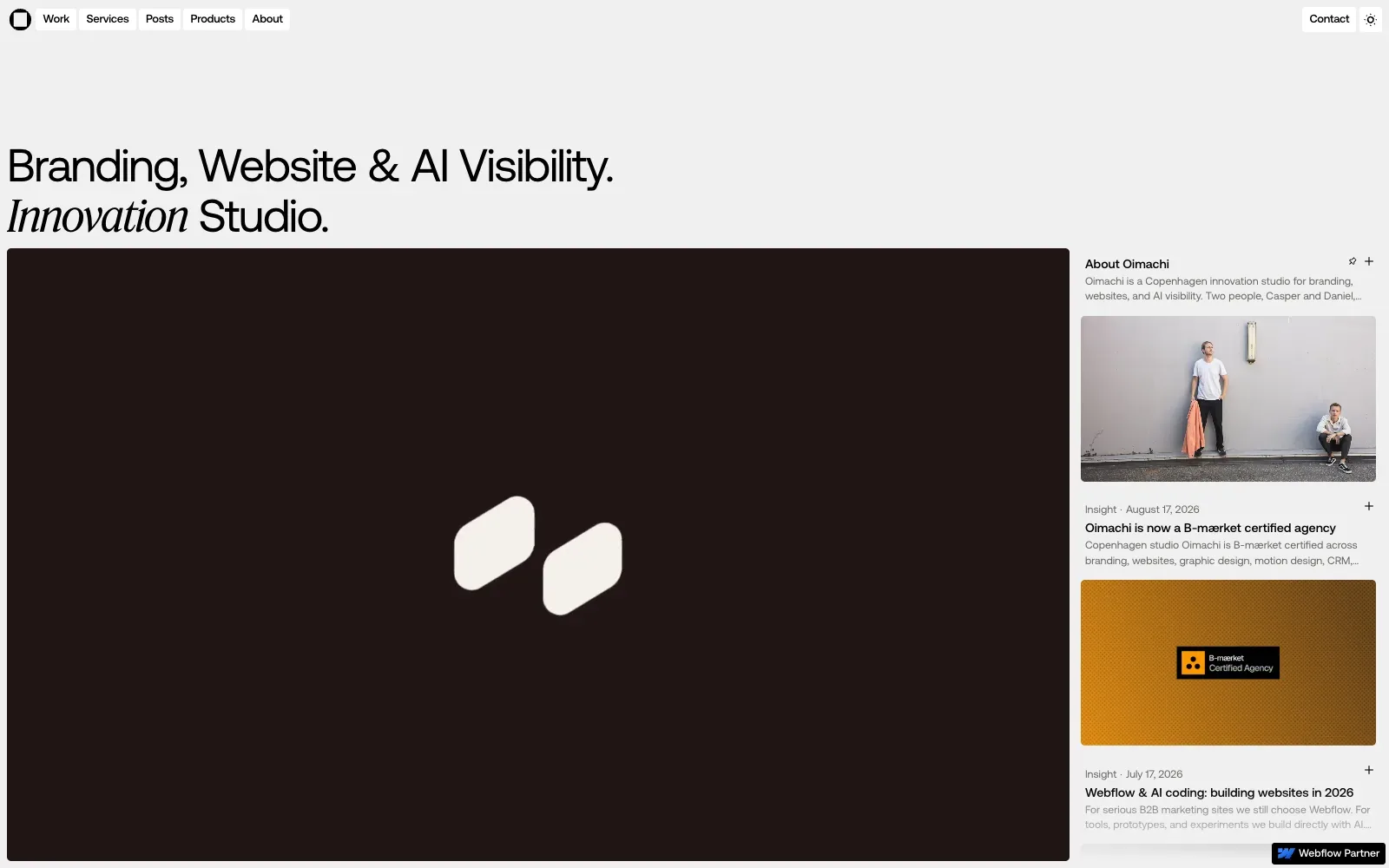
The headline sets a large, plain grotesque against a single italic serif word, giving the page a clear voice before anyone reads the body copy. A pale grey ground, tight margins and a big dark panel with two cream rounded shapes keep the palette quiet, while a narrow column of post cards on the right adds photography and an orange accent. On mobile, the same headline stacks neatly above a grid of bold black icons drawn over faint construction grids.
Borrow this: Pair a plain sans headline with a single italic serif word to give a text-led hero a recognisable voice, then show process work such as icons on faint construction grids.
Watch out for: The lab test found the page slow and very heavy, with GSAP motion detected alongside Webflow, and there was not enough real-visitor data from Google to say how it performs for actual users.
Designed in-house. Visit oimachi.co.
5. Squarespace Foundations
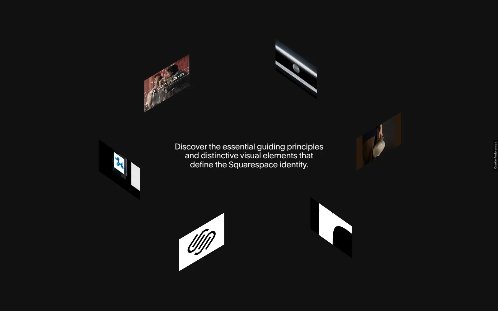
A near-black field holds a short centred statement in a clean, even-weight sans serif, and nothing else fights it. Small image tiles, skewed into an isometric tilt, sit around the edges like a loose orbit, mixing a white logo mark, a ceramic jug in warm shadow and a pale metallic strip. The restraint and wide spacing make the page feel calm and assured, and the tilted tiles imply movement.
Borrow this: Pair a single short sentence in a clean sans serif with a handful of skewed image tiles on a flat dark background, which needs only a few cropped images and a CSS transform.
Watch out for: This is an immersive brand book rather than a sales page, and its imagery creates a large download: real visitors wait longer than Google targets for the main content and for taps to respond.
Built by Resn. Visit brand.squarespace.com.
6. AI in Design Report 2026
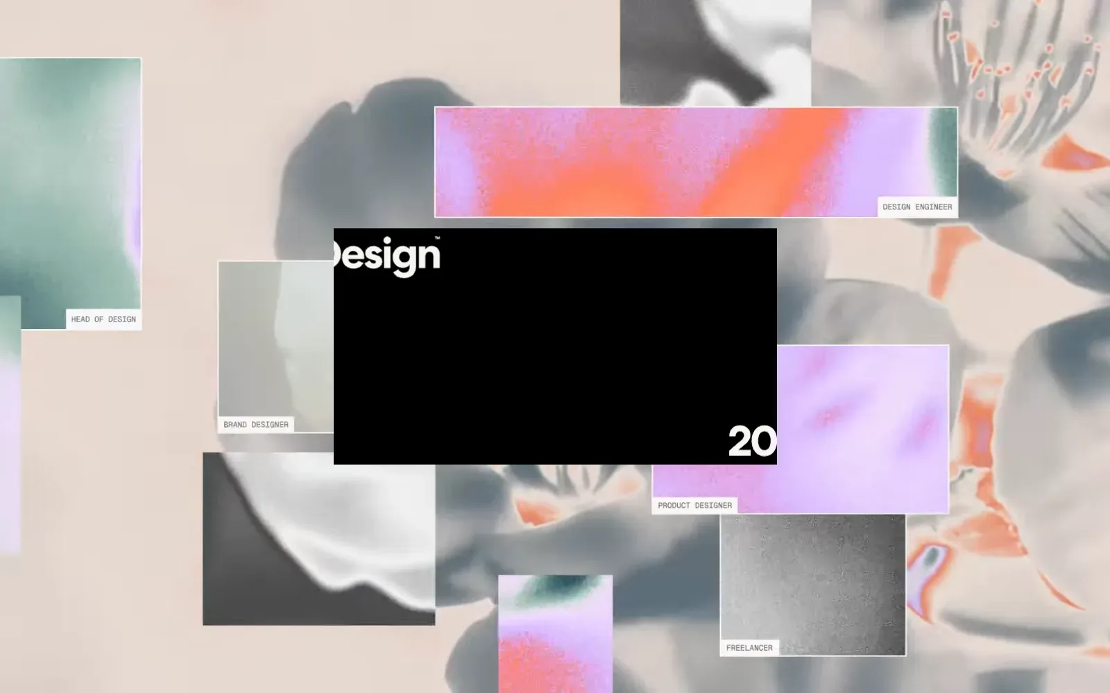
A washed-out, inverted flower photograph in grey and peach sits behind a scatter of grainy gradient cards in orange, lilac and green. Each card carries a tiny monospaced label naming a job role, giving the collage a quiet editorial order. The black central panel with a heavy white geometric sans wordmark anchors the composition, and the mobile view keeps the palette with a black logo block beside a bright orange menu bar.
Borrow this: Pair one large, tightly spaced sans headline with small monospaced labels, and build the hero collage from a handful of grainy gradient images layered over a single tinted photograph.
Watch out for: The page is heavier than average, and real visitors see slow loading of the main content and some layout shift, so the large collage is the first thing to inspect.
Built by ++hellohello. Visit stateofaidesign.com.
7. Julia Stafi
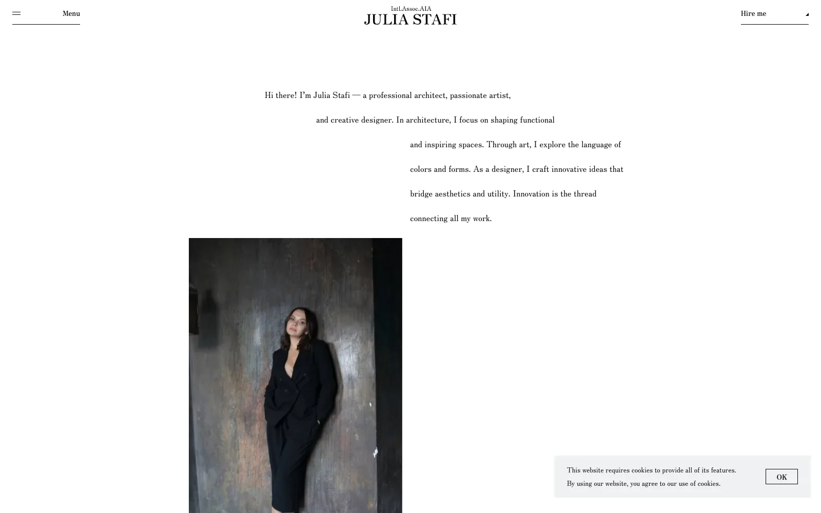
The page is almost all white space, with a centred wordmark in a high-contrast serif and a short introduction set in a lighter text serif. The intro lines step across the page in a staggered, diagonal pattern, giving a plain paragraph movement without decoration. Below it, a tall portrait of the architect in black against a weathered, mottled wall adds the only strong tone, so the dark image and pale page balance each other.
Borrow this: Stagger the lines of your introduction across the page with simple left indents, and pair them with a tall portrait on a plain white ground.
Watch out for: The page is heavier than average and only middling in the lab test, which fits a layout built around a large photograph, and there is not enough real-visitor data from Google to say how it performs for actual users.
Built by Sasha Khudova. Visit juliastafi.com.
8. Studio K95
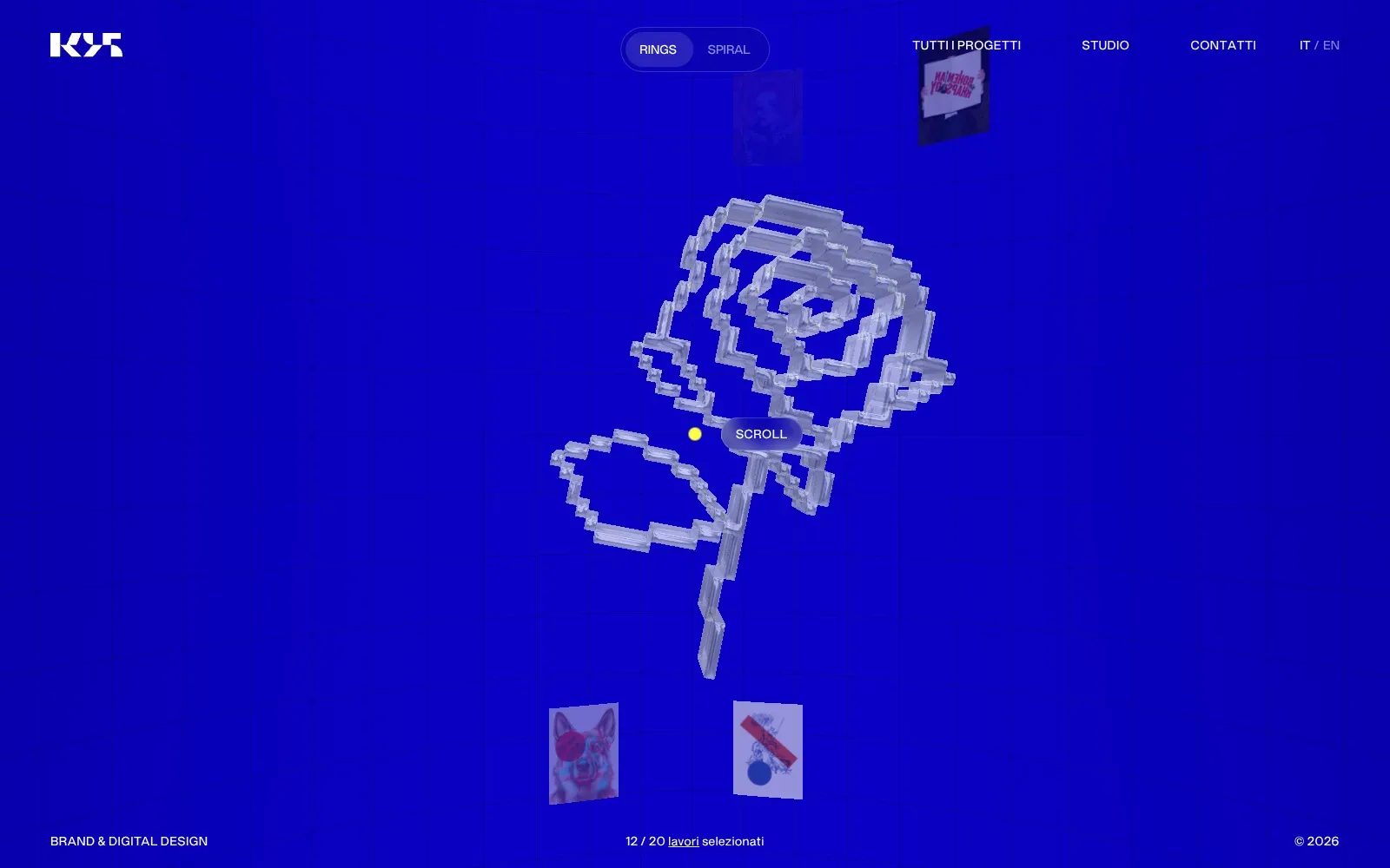
A flat, saturated blue fills the screen, and a pixelated rose built from pale, glass-like blocks sits in the middle with nothing competing with it. Small project cards drift around it in rings, and the red and cream posters pop against the blue on the phone view. The navigation uses tiny uppercase sans serif in white, so the artwork leads and the interface stays quiet.
Borrow this: Use a flat block of strong colour as the stage and add a small Rings and Spiral style toggle that rearranges your project thumbnails, so the same work can be browsed in a different layout.
Watch out for: The page itself is light, yet the lab test is only middling and real visitors see slow loading of the main content and slow response to taps and clicks, so the 3D scene is the first thing to check.
Designed in-house. Visit k95.it.
9. Direct Design
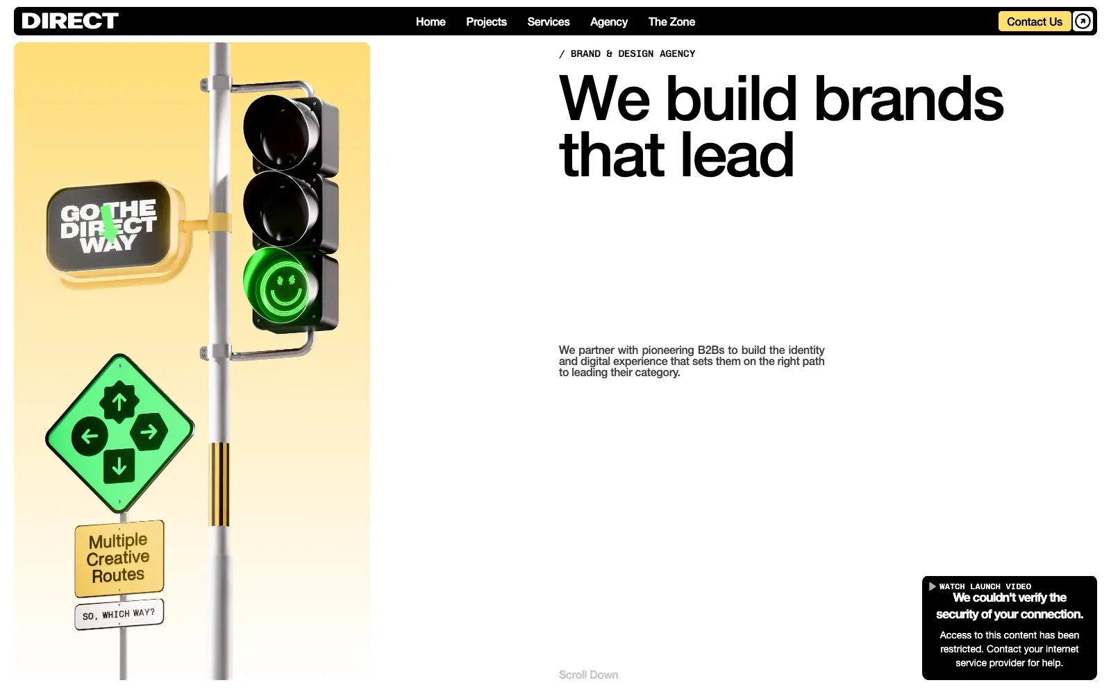
A glossy rendered traffic light sits against a soft yellow gradient, with a green smiley lamp and a diamond sign that turn the agency's direction idea into one picture. The headline uses a large, tight grotesque sans in black on white, so it reads at once beside the image. A black rounded navigation bar and a small yellow contact button keep the palette to black, white, yellow and green.
Borrow this: Pair a single bespoke rendered object with a very large headline, then carry its colours into the menu bar and button so the page feels branded without needing many assets.
Watch out for: The page is heavier than average and only middling in the lab test, which fits the rendered imagery and the animation libraries detected, and there is not enough real-visitor data from Google to say how it performs for actual users.
Built by COSMOFLOW Agency. Visit wearedirect.co.
10. House of Honey
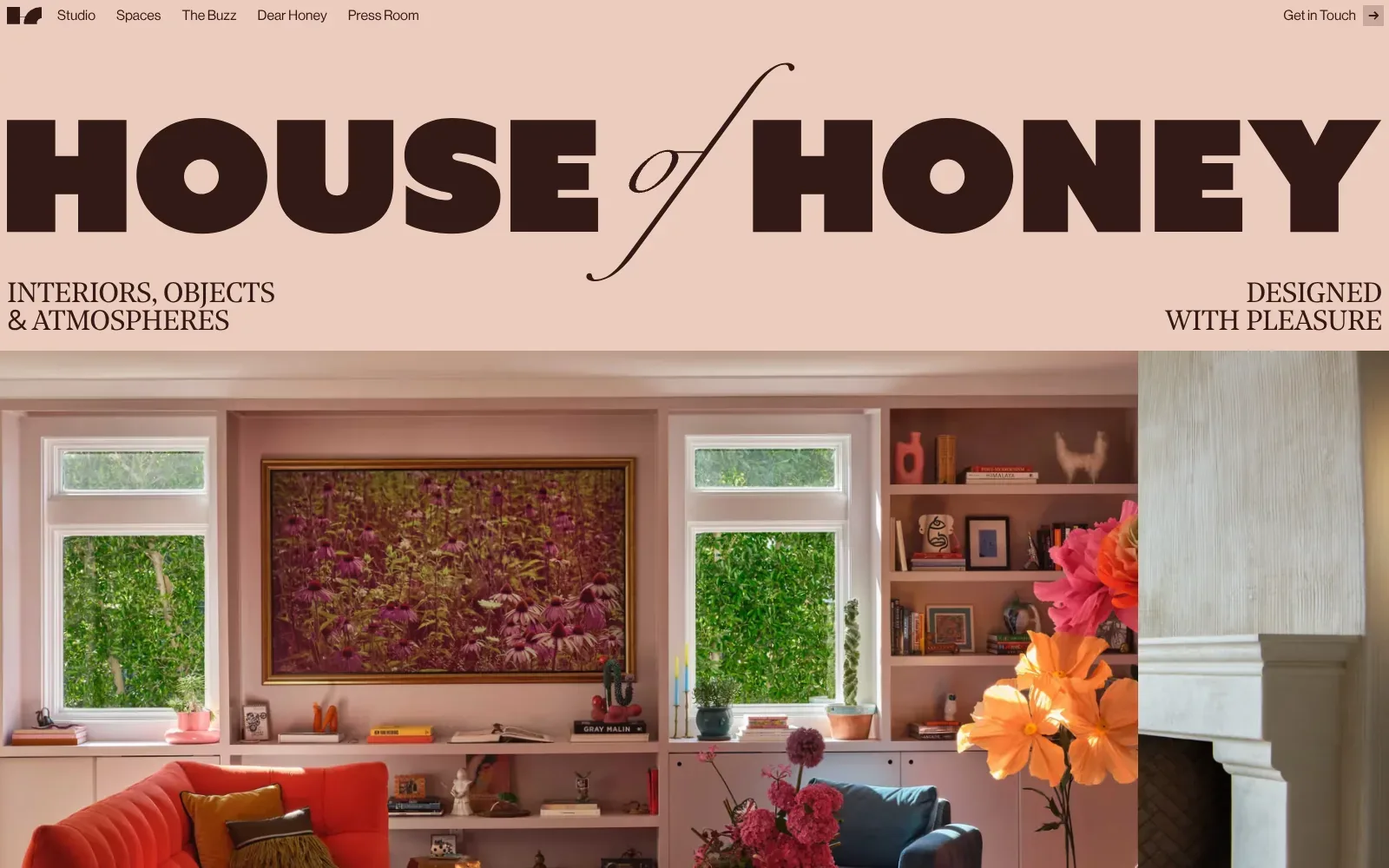
The wordmark runs edge to edge in a heavy, wide black-weight sans, with a thin italic serif "of" cutting through it in contrast. Set on a flat blush pink in dark chocolate brown, it reads at once and feels warm. The tagline sits in small uppercase serif at either corner, and the full-bleed interior photograph below repeats the pinks and oranges of the palette.
Borrow this: Pair one very heavy sans wordmark with a single delicate italic serif word, then keep the palette to one flat background colour and one dark ink so the photography carries everything else.
Watch out for: The page itself is light, but real visitors see slow loading of the main content (LCP), a common cost when a large full-bleed photograph is the first thing on screen, and the lab result is only middling.
Built by Edoardo Lunardi. Visit houseofhoney.com.
11. Félix Péault
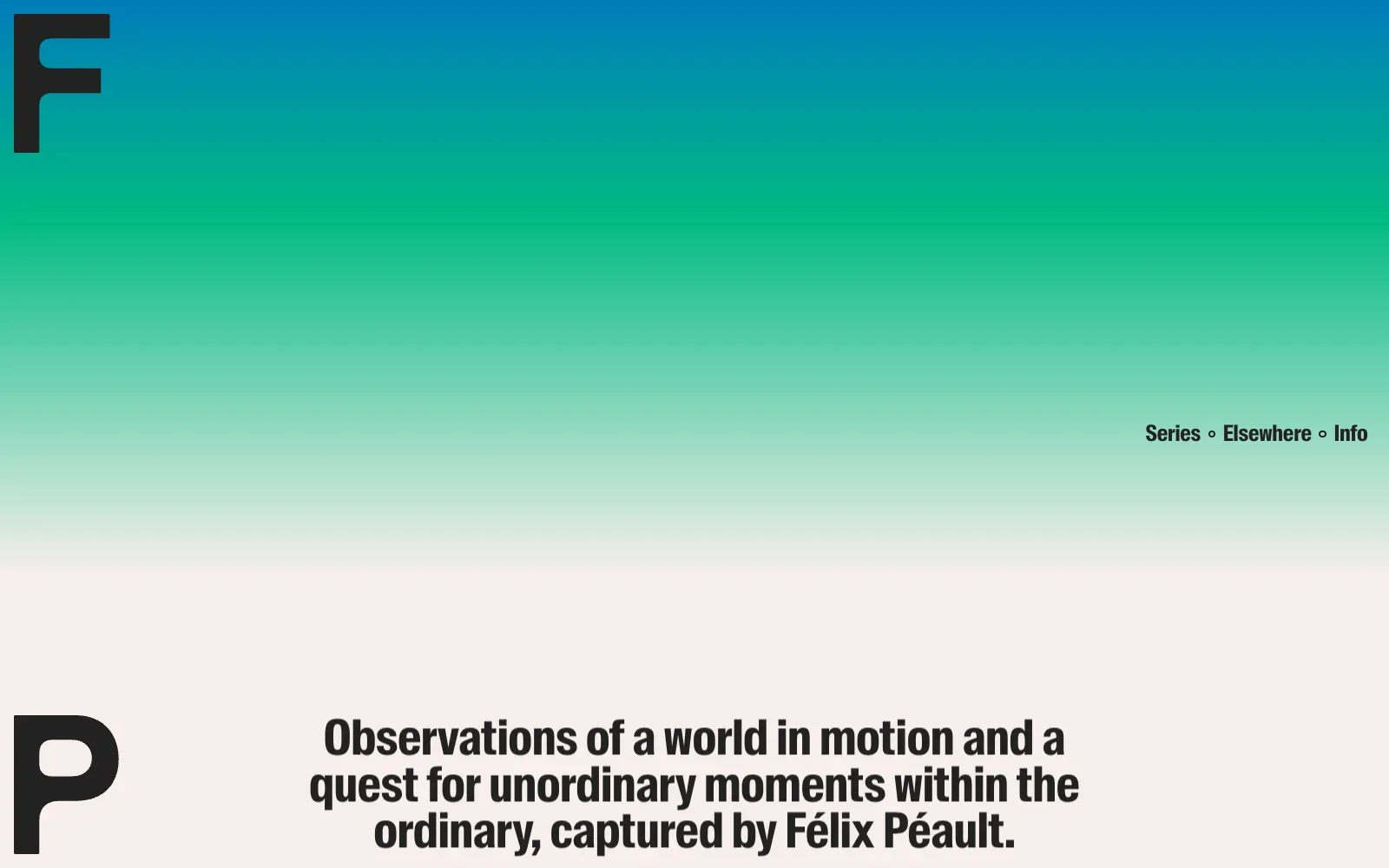
The page is little more than a gradient running from deep blue through a clear green into a warm off-white, and that wash handles all the colour. A pair of oversized dark letters, an F and a P, sit in the corners like a monogram, while a tall condensed sans serif carries the tagline and the small menu. On mobile, a photograph of people seen from above, with long shadows, adds the only image.
Borrow this: Set your initials as oversized letters in opposite corners and fill the background with a soft gradient, so the page has an identity without any heavy imagery.
Watch out for: The lab test came out middling, though the page itself is light, and there is not enough real-visitor data from Google to say how it performs for actual users.
Designed in-house. Visit felixpeault.com.
12. Karl Barnard
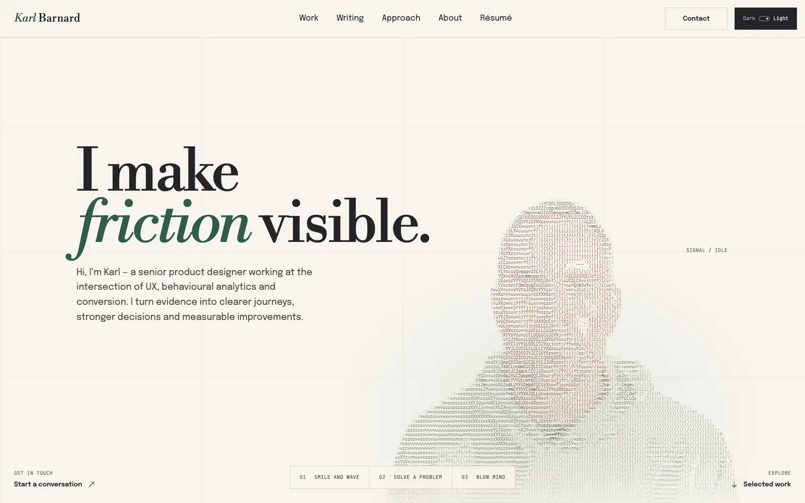
The headline uses a high-contrast serif, with one word switched to a green italic that carries all the emphasis. Everything else stays quiet: warm off-white ground, faint grid lines, and a small monospaced face for labels. The portrait is built from typed characters, so the image echoes the type and the page feels like one idea rather than a pile of parts.
Borrow this: Pick one word in your headline, set it in an italic and a single accent colour, and leave the rest of the palette to neutral tones.
Watch out for: The lab test rated the page as slow even though the page itself is light, and there was not enough real-visitor data from Google to say how it feels for actual users.
Designed in-house. Visit karlbarnard.co.za.
13. Gionatan Nese
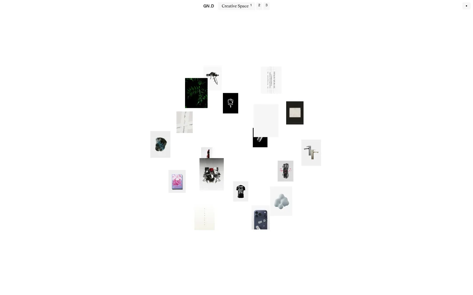
A white page, a small cluster of product shots, posters and objects arranged in a loose ring, and almost nothing else. The tiny menu at the top pairs a plain sans for the initials with a refined serif for Creative Space, set in light grey tabs, giving a quiet contrast. Images overlap at different sizes, so the eye moves round the circle, and the empty white margins make each thumbnail feel like an exhibit.
Borrow this: Arrange a small set of your best project thumbnails in a loose ring on a plain white page, with overlaps and varied sizes, so the work does the talking without a hero image or headline.
Watch out for: The lab test found the page slow and very heavy, and real visitors see slow responses to taps (INP), though the main content itself arrives quickly.
Designed in-house. Visit gionatannese.com.
14. SUSO Digital
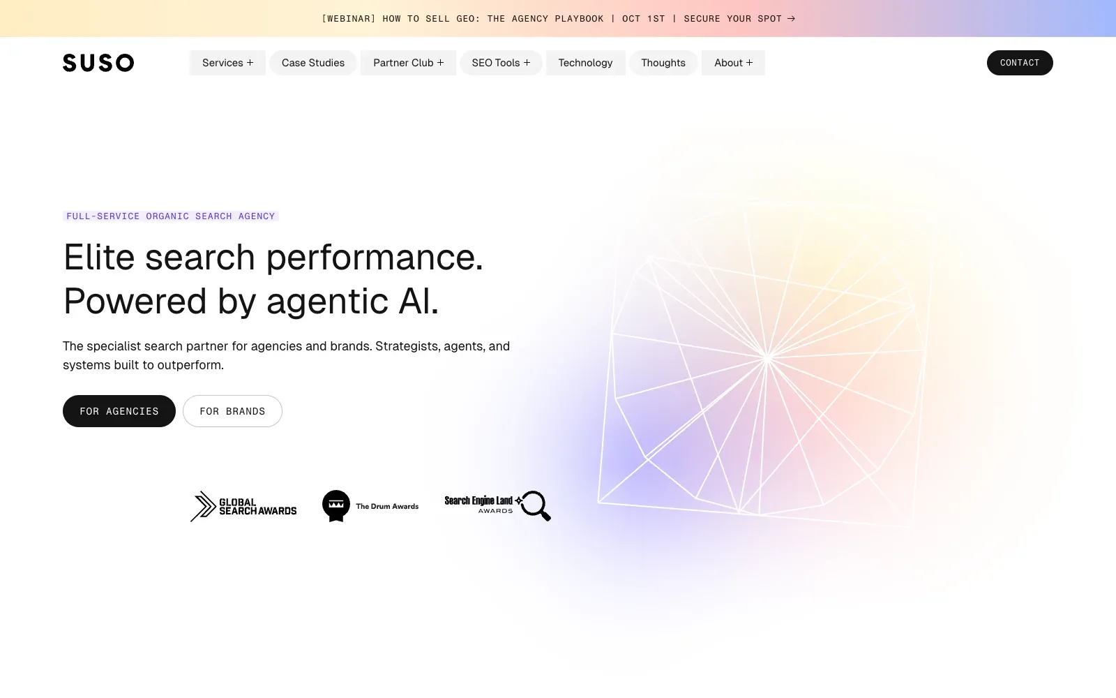
The hero stays on a calm white field with a single soft gradient glow of peach, lilac and pale blue behind a thin white wireframe shape. The headline uses a clean, even sans serif at a large size, with a small monospaced label above it and two clear pill buttons below. The spacing is generous, so the page reads quickly and the one graphic does the decoration.
Borrow this: Pair a clean sans serif headline with small monospaced labels and buttons, then put one soft gradient graphic behind the text so the page feels designed without needing photography.
Watch out for: The page is light, but real visitors see problems with how quickly the main content loads (LCP), and the large gradient graphic in the hero is a likely thing to check first.
Built by Fhoke. Visit susodigital.com.
15. Nordpixel
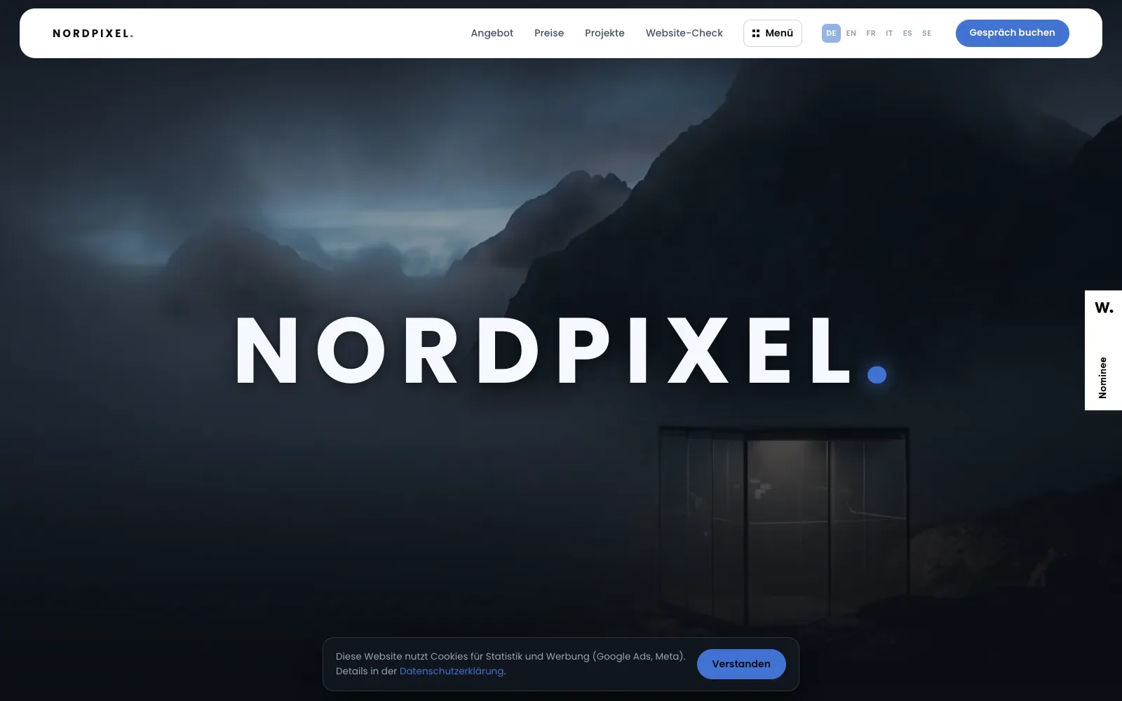
A dark, misty mountain photograph fills the whole screen, with a glass-fronted cabin lit faintly at the lower right. The wordmark sits in the middle in widely spaced bold geometric capitals, ending in a blue dot that repeats in the logo and the buttons. A white rounded menu bar floats above the image, so the blue accent and pale lettering provide all the contrast.
Borrow this: Pair a full-bleed photograph, darkened with an overlay, with a wide-spaced bold wordmark and a single accent colour used only for the dot and the buttons.
Watch out for: The page is heavier than average and only middling in the lab test, which is what a full-screen photograph tends to cost, and there is not enough real-visitor data from Google to say how it performs for actual visitors.
Built by Michael Schnyder. Visit nordpixel.ch.
16. Alvara House
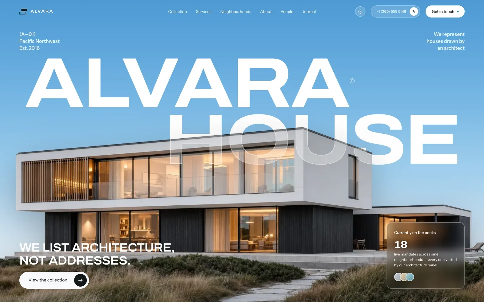
A full-bleed photograph of a flat-roofed house at dusk sits under a huge wide white sans-serif wordmark, and the word HOUSE passes semi-transparent over the roofline so type and building read as one image. The blue sky gives clean, quiet space for small corner labels, and the warm glow in the windows contrasts with the cool background. One pill button and one frosted card are the only competing elements.
Borrow this: Pair one strong photograph with an oversized wordmark that overlaps the subject, and keep every other element small and tucked into the corners.
Watch out for: The lab test came back middling even though the page is light, so the large hero photograph is the likeliest place to look for gains, and there was not enough real-visitor data from Google to say how it feels in practice.
Built by Visuvate Studio. Visit alvara.visuvate.com.
17. Haoqi Wen
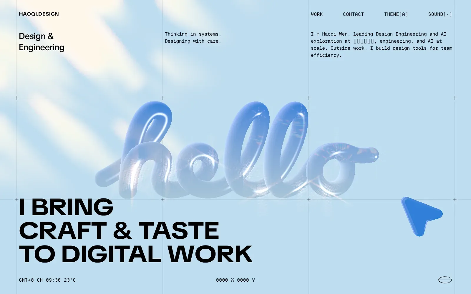
A glossy, inflated blue script reading hello sits over a pale sky-blue field, and it is the one soft object on a page otherwise ruled by thin grid lines and small crosshair marks. The heavy black wide sans headline anchors the lower left, while a monospaced typeface handles the navigation and bio. That contrast between playful and technical suits a design engineer.
Borrow this: Pair one tactile, rendered object with a strict hairline grid and a single monospaced face for small text, so a personal site feels both warm and precise.
Watch out for: The lab test found the page slow and very heavy, and real visitors see problems with loading, responsiveness and layout stability, which is the usual price of a large rendered hero and live details.
Designed in-house. Visit haoqi.design.
18. Warm & Fuzzy
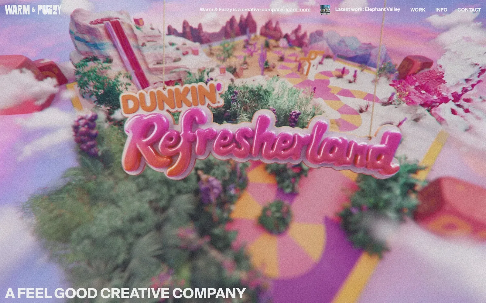
A full-bleed, softly blurred film still fills the whole screen, and its candy pinks, mustard yellows and leafy greens carry the opening. The glossy bubble lettering sits in the middle, while the small navigation stays out of the way in a plain sans serif. A bold grotesque tagline across the bottom edge anchors the page and sets a friendly, confident tone.
Borrow this: Use one full-screen moving image as the whole opening, then keep the logo, a few short links and a single bold line of text as the only furniture on top.
Watch out for: The lab test came back middling even though the page itself is light, so the full-screen moving background is the likely cost, and there is not enough real-visitor data from Google to say how it feels for actual users.
Built by Neutral Studio. Visit warmnfuzzy.tv.
19. Glitch&Grit
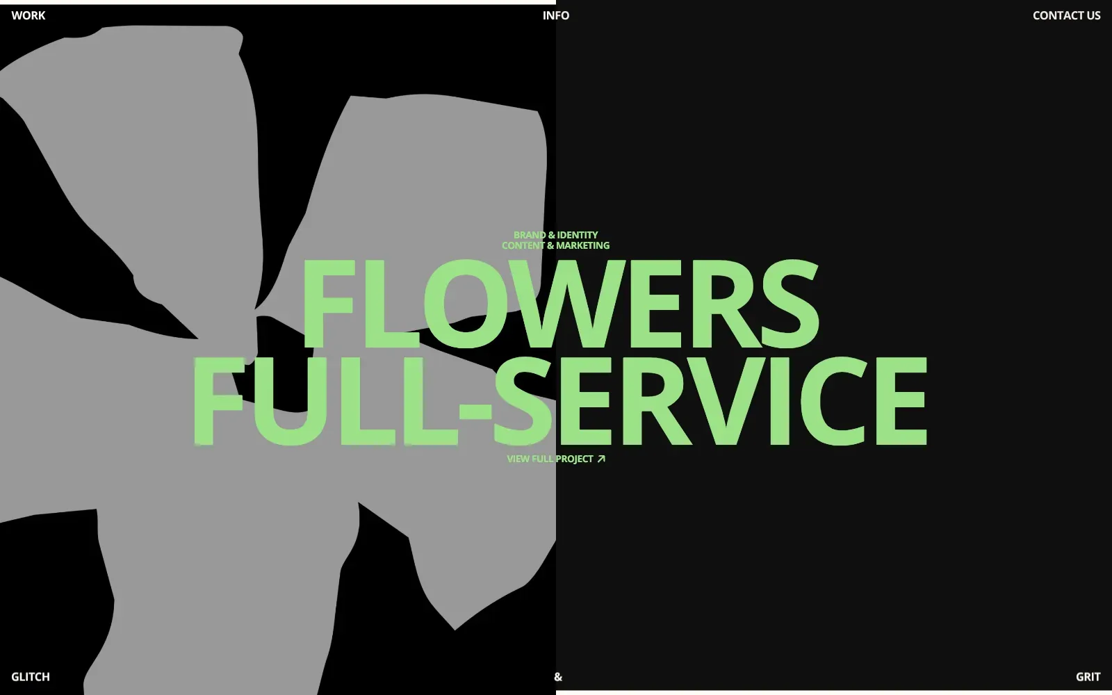
The page splits the screen down the middle, with a flat black half on the left carrying a large grey flower silhouette and a slightly lighter charcoal half on the right. Over both sits a huge heading in a bold, open sans serif in soft lime green, which stays readable against the grey and the black alike. Navigation and the studio name sit in small white capitals tucked into the corners, so the centre stays clear.
Borrow this: Pair a huge heading in a single accent colour with a split flat background and a cut-out shape, so the page feels distinctive without a photography budget.
Watch out for: The page is very heavy and only middling in the lab test, and Google has too little real-visitor data to say how it feels in practice, so the large visuals are the first place to look for savings.
Visit glitchandgrit.com.
20. GØDN.studio
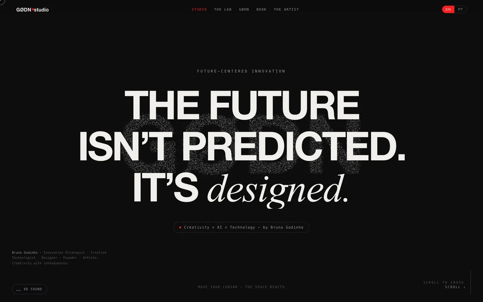
A near-black field carries one huge statement in heavy, tightly set grotesque capitals, and the last word drops into a light italic serif that changes the voice at once. A grainy, speckled mark sits behind the type like static, adding depth without photography. Small, widely spaced monospaced labels stay quiet around it, so the headline is read first.
Borrow this: Pair a heavy sans headline with one word in a light italic serif, and keep everything else in small spaced monospaced capitals on a dark ground.
Watch out for: The page tested fast in the lab and is light, which is good given it runs GSAP and Three.js, but there was not enough real-visitor data from Google to say how it performs for actual users.
Built by Bruno Godinho. Visit studio.godn.pt.
How to make a portfolio that is beautiful and fast
The 20 above show that a portfolio can look distinctive on almost any stack. The faster ones differ from the slower ones in how they load the work itself.
- Show three to five projects properly. Nielsen Norman Group's survey of 204 UX professionals who hire recommends choosing 3 to 5 projects as detailed case studies, quality over quantity (NN/g).
- Make it scannable. The same research found that hiring managers will very rarely read a whole portfolio word for word (NN/g), so put the problem, your role and the result where a skimming eye lands.
- Load the first image early. Never set loading="lazy" on the image that fills the first screen, keep it in the page's HTML rather than adding it with JavaScript, and give it fetchpriority="high" (web.dev).
- Lazy-load everything below it, with sizes set. Use loading="lazy" only for images outside the first screen, and add width and height to every image so the layout does not jump (web.dev).
- Watch the total. At the 90th percentile, sites already send over 5 MB of images (web.dev), and 5 of these 20 portfolios weigh more than 10 MB in total.
- Measure real visitors yourself. A small portfolio may never get enough traffic to appear in the Chrome UX Report, and web.dev strongly recommends setting up your own real-user monitoring (web.dev).
If you want a portfolio that wins work rather than only looking good, portfolio web design is how I build them: fast, found in search and written around the work. If your current site just needs a fresh look and a faster first screen, a website redesign is the place to start.
Questions people ask
What makes a good portfolio website?
Show the work large and early, with enough context to explain it. Across these 20, the strongest first screens do one thing: a name in very large type, a single project or a single photograph. Nielsen Norman Group's research adds the part that wins jobs: a few projects written up as case studies, not a wall of finished images (NN/g).
How many projects should a portfolio show?
Nielsen Norman Group recommends choosing 3 to 5 projects as detailed case studies, with quality over quantity (NN/g). Fewer, deeper projects also mean fewer large images on the page.
What is the best platform for a portfolio website?
This data does not give one stack a win. Next.js runs 6 of the 20, Nuxt and Webflow 2 each, and Framer, SvelteKit and WordPress one each, while 7 are built in ways that could not be detected. Next.js alone has both a 79 and a 37 here, so pick the one you can keep up to date and spend the effort on how your images load.
Why is my portfolio website slow?
The cause is usually the work itself: full-size images and video on the first screen, or a first image that loads late because it is lazy-loaded or added by JavaScript (web.dev). In this draw, 7 of the 8 portfolios judged by Google miss the 2.5 second LCP target.
Why does my portfolio have no Core Web Vitals data?
The Chrome UX Report only includes pages and sites with enough visitors to form a statistically significant sample (Chrome UX Report). 11 of these 20 portfolios have no real-visitor data at all. Use a lab test such as Lighthouse in the meantime, and add your own real-user monitoring if you want field numbers.
Where can I see more beautiful websites?
The 64 beautiful websites pillar covers eight categories with the same tests. For restaurants and food brands, see the 20 best restaurant and food websites, and for galleries to browse, the web design inspiration sites roundup.