Here are 64 beautiful websites, eight in each of eight categories, from studios and portfolios to restaurants, museums and health brands. I did not choose them by taste. I drew all 64 at random from 227 live, hand-reviewed sites, checked that each one loads, measured each on a phone, and noted what is worth copying. The awkward finding is speed: only 11 of the 35 sites with enough real-visitor data pass all three of Google's Core Web Vitals, and the median mobile Lighthouse score is 61.
How these 64 were picked and tested
Most "best website" lists are one person's favourites. That works for inspiration, but it hides the speed cost of good-looking pages, because the slow examples tend to disappear from the shortlist. I used the opposite method.
- The pool: 227 live websites from a curated design database I maintain. Every one was reviewed by hand, has a desktop and mobile capture, and passed an availability check in the last 30 days.
- The draw: eight sites at random from each of eight categories, with no more than two from any one studio. Nothing here is my client work, and no one paid to be included.
- The live check: every site was opened in a browser (Chromium) on 31 Oct 2026 and loaded the same site it was listed for. Two sites in the original draw sat behind age-verification screens that hide the whole design, so they were swapped for the next sites in their category.
- The lab test: a mobile Lighthouse test per site between 12 and 31 Oct 2026, recording the performance score, Largest Contentful Paint and total page weight.
- The real-visitor data: Chrome UX Report figures for phones, which Google collects from real Chrome users over a rolling 28-day window. Small sites often do not have enough visitors to appear, so 26 of the 64 show "no data".
- Not a ranking: the order inside each category is the draw order.
What 64 beautiful websites cost in speed
Google calls an LCP of 2.5 seconds or less, an INP of 200 milliseconds or less and a CLS of 0.1 or less "good", measured at the 75th percentile of page loads (web.dev). A page passes Core Web Vitals when it meets all three. The 64 sites landed like this.
| Finding | Result |
|---|---|
| Median mobile Lighthouse performance score | 61 |
| Score 90 or above | 7 of 64 |
| Score under 50 | 16 of 64 |
| Median page weight | 4.25 MB |
| Pages over 10 MB | 15 of 64 |
| Heaviest page | 104.4 MB (ERA Residence) |
| Sites with real-visitor (CrUX) data | 38 of 64 |
| Pass all three Core Web Vitals, of the 35 with enough data to judge | 11 |
| Real-visitor LCP within 2.5 seconds | 20 of 38 |
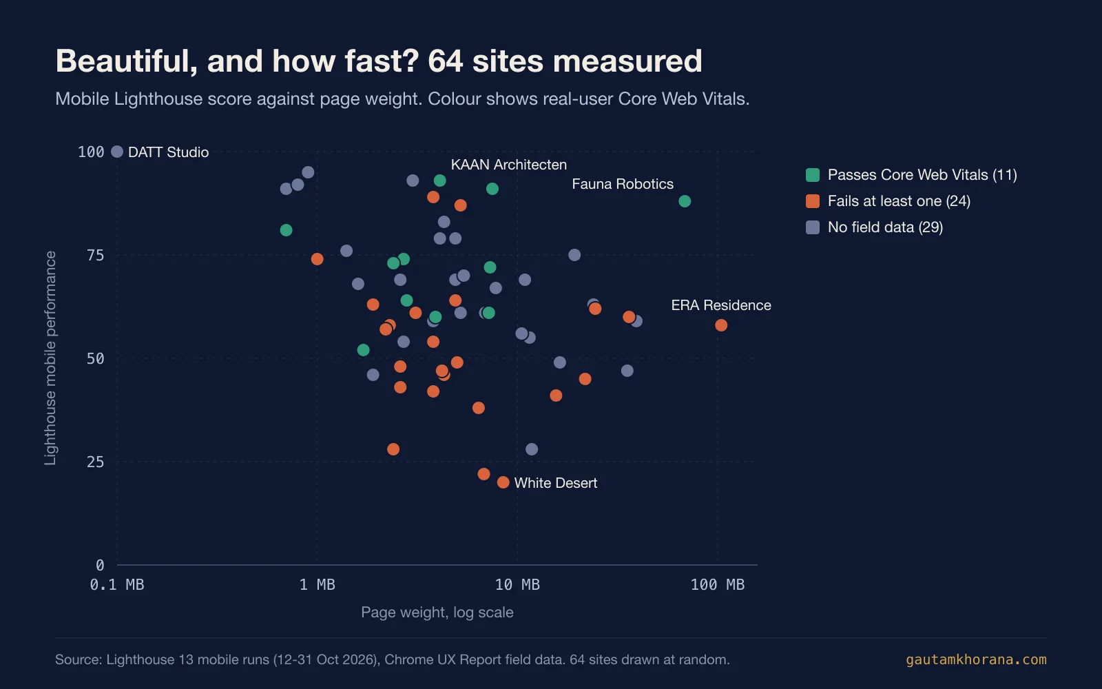
For comparison, Google's September 2026 Chrome UX Report release puts the share of origins with good Core Web Vitals at 55.9% across 18,376,044 origins (Chrome UX Report release notes). These 64 sites pass at a little over half that rate, 11 of 35 or about 31%. Beautiful sites need not be slow, but most of these are.
The lab score and the real-visitor result often disagree, which matters if you judge a site by its Lighthouse number. Lighthouse cannot measure INP at all (web.dev), and it runs once, in a controlled setting, rather than across real devices and networks. Heron AI scores 52 in the lab yet passes all three Core Web Vitals for real visitors. Fauna Robotics weighs 68.6 MB and still passes, because the visible part of the page arrives quickly.
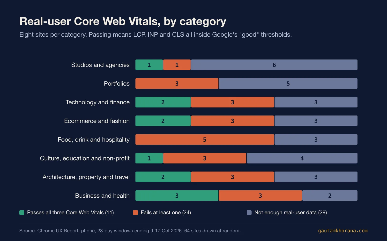
Categories differ less than you might expect. The studios had the best median lab score at 69.5, and the culture, education and non-profit sites had the lowest at 50.5. Food, drink and hospitality sites, which rely heavily on full-screen photography and video, had no site that passed all three Core Web Vitals.
What the 64 are built with
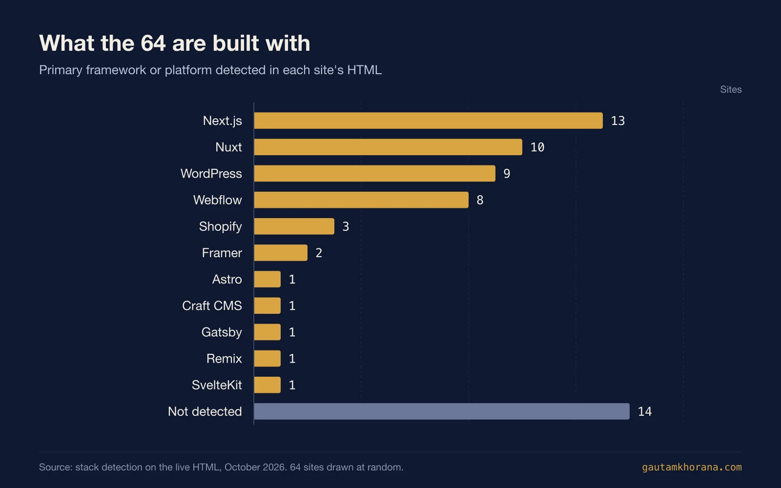
Next.js runs 13 of the 64 and Nuxt 10. WordPress has 9 and Webflow 8, Shopify 3 and Framer 2, with one site each on Astro, Craft CMS, Gatsby, Remix and SvelteKit. For 14 sites, the stack was not visible in the HTML. If you are choosing a framework for your own build, Astro vs Next.js and the web frameworks hub cover the trade-offs.
What the 64 have in common
Each site in the database gets a style tag during review, and the stack is detected from the live HTML, so these patterns are counts rather than impressions.
- Restraint wins. 23 of the 64 are tagged minimal, more than any other style. Lots of space, one typeface family and a short palette do most of the work.
- Photography carries the page. 22 lead with photography. A single strong image at full width beats a collage almost every time.
- Motion is common, and it costs. 20 sites load a smooth-scroll or animation library, Lenis on 14 and GSAP on 11. Their median Lighthouse score is 56.5, against 64 for the sites without one.
- Dark and colourful are equally popular. 14 sites are tagged dark and 14 colourful. Pick one deliberately and commit to it.
- Type is the brand. 12 are tagged typographic, where an oversized headline or a distinctive face does the job a hero image would.
Studios and agencies
Studio and agency sites are the designer's own shop window, so they usually take the biggest risks with type and motion. This group had the best median lab score of the eight at 69.5, helped by DATT Studio, which scores 100 on a 0.1 MB page. If you are hiring a studio, its own site is a fair preview of its working habits, and the London web design agency page explains how I approach the same brief.
| # | Site | Lighthouse (mobile) | LCP, real visitors | INP | CLS | Page weight | Built with |
|---|---|---|---|---|---|---|---|
| 1 | Little Plains | 55 | no data | no data | no data | 11.5 MB | Next.js |
| 2 | DATT Studio | 100 | no data | no data | no data | 0.1 MB | Astro |
| 3 | Ad Astra Marketing | 91 | no data | no data | no data | 0.7 MB | Next.js |
| 4 | Hattenberger Partner | 59 | no data | no data | no data | 3.8 MB | Gatsby |
| 5 | GM Studios | 67 | no data | no data | no data | 7.8 MB | Next.js |
| 6 | Boc.Studio | 72 | 2.5 s | 122 ms | 0.00 | 7.3 MB | Next.js |
| 7 | LxL Creative | 63 | 3.3 s | 442 ms | 0.02 | 1.9 MB | Webflow |
| 8 | Outfit | 95 | 2.2 s | no data | 0.00 | 0.9 MB | Next.js |
1. Little Plains
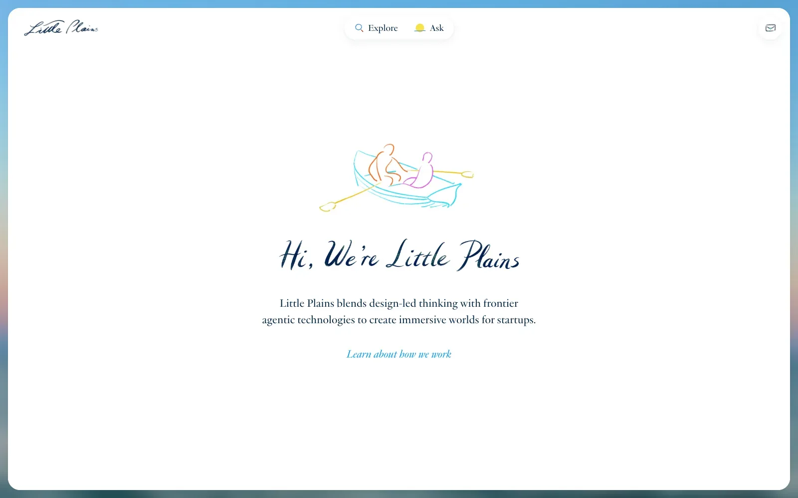
A white panel with rounded corners sits over a blurred sky-and-sea photograph, giving the page a calm, uncluttered feel. The loose line drawing of two people in a rowing boat and the brush-script heading add handmade warmth, while the plain serif body copy keeps the message readable. The colour palette stays mainly navy, with a few soft accents.
Borrow this: Pair one hand-drawn illustration with a script headline and a plain serif paragraph, so a small studio gets a recognisable personality without needing a photo shoot.
Watch out for: The lab test came out middling and the page is very heavy, which is a lot to ask of a screen that holds one drawing, one heading and one paragraph. Google did not have enough real-visitor data to show how it feels for actual users.
Designed in-house. Visit littleplains.com.
2. DATT Studio
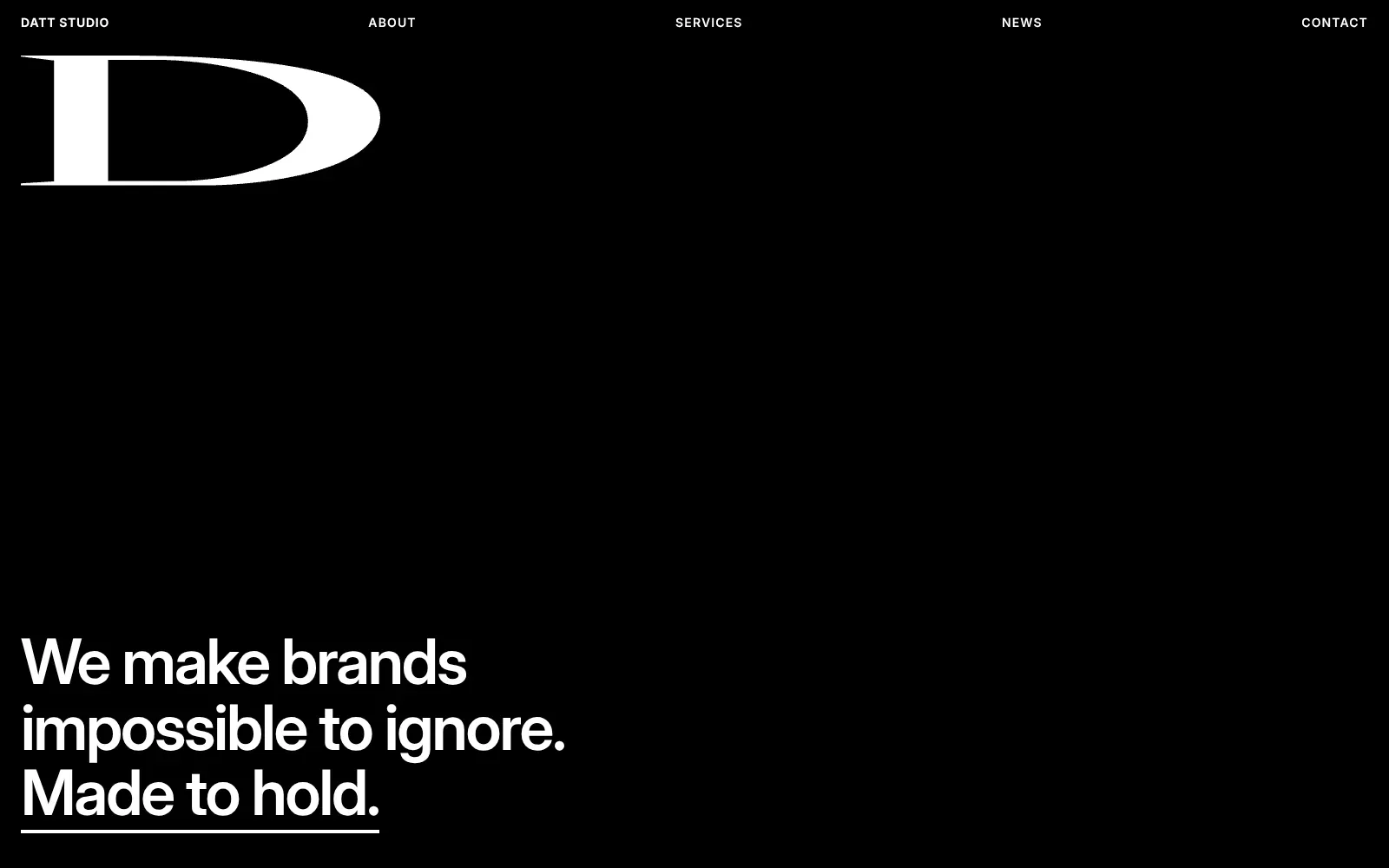
One oversized white serif capital D, wide and sharply contrasted in its thick and thin strokes, sits on pure black and carries the role of a logo. The headline below uses a tight, bold grotesque, with the last line underlined as a link cue. Generous empty space gives both elements room.
Borrow this: Pair one distinctive display letterform with a plain bold sans-serif headline, and let a flat single-colour background carry the rest.
Watch out for: The page tested fast in the lab and is light, which suits a layout with no imagery, although Google did not have enough real-visitor data to show how it performs for actual users.
Designed in-house. Visit dattstudio.com.
3. Ad Astra Marketing
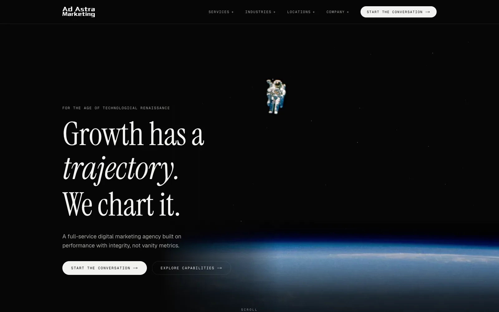
One photograph of a spacewalker above the curve of the Earth carries the whole idea, and the headline answers it directly. The tall condensed serif, with one italic word, gives the black page warmth, while small spaced monospace labels keep the rest orderly. Generous empty space around the text lets the image breathe.
Borrow this: Pair one strong, relevant photograph with a large serif headline that sets a single word in italic, and keep the supporting text small and quiet.
Watch out for: The lab test came back fast and the page is light, so the large dark hero costs little, but Google did not have enough real-visitor data to show how it performs for actual users.
Designed in-house. Visit adastramarketing.com.au.
4. Hattenberger Partner
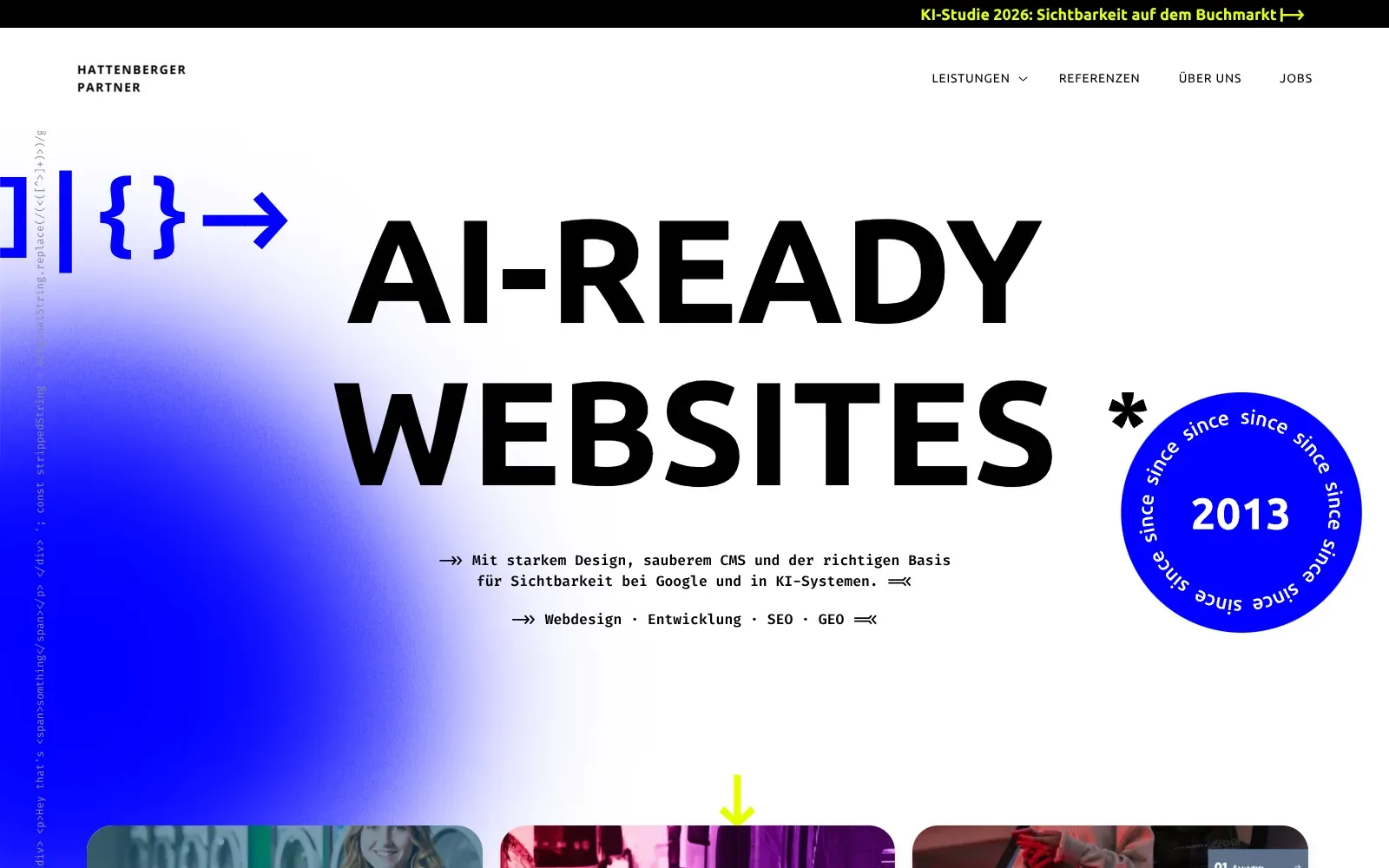
A huge black headline in a heavy, wide sans-serif sits on plain white, so the message lands before anything else. A soft blurred blob of electric blue bleeds in from the left edge, and a round blue badge with text around its rim gives the page a stamp-like focal point. Small typewriter-style body text and bracket icons in blue add a coder's flavour without clutter.
Borrow this: Set the headline in a heavy sans-serif at a very large size on plain white, then add a single blurred colour shape behind it for depth.
Watch out for: The page is light, which helps, but the lab speed test came out middling and Google holds too little real-visitor data to show how it feels in everyday use.
Designed in-house. Visit hattenbergerpartner.de.
5. GM Studios
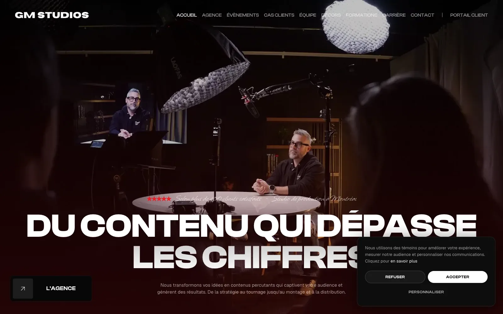
A dark full-bleed photograph of the studio, with two presenters at a round table under softbox lights, sets the tone immediately. The huge heavy extended sans headline in white fades into a deep red-black base, so it stays legible. A thin script line above adds contrast without crowding the layout.
Borrow this: Use one real photograph of your own workspace behind a short, very large headline, and fade the bottom of the image to a solid colour so the text stays readable.
Watch out for: The lab test came out middling and the page is heavier than average, which fits a full-screen studio image or video. Google did not have enough real-visitor data to show how it feels for actual users.
Built by tonsiteweb.io. Visit lesgmstudios.com.
6. Boc.Studio
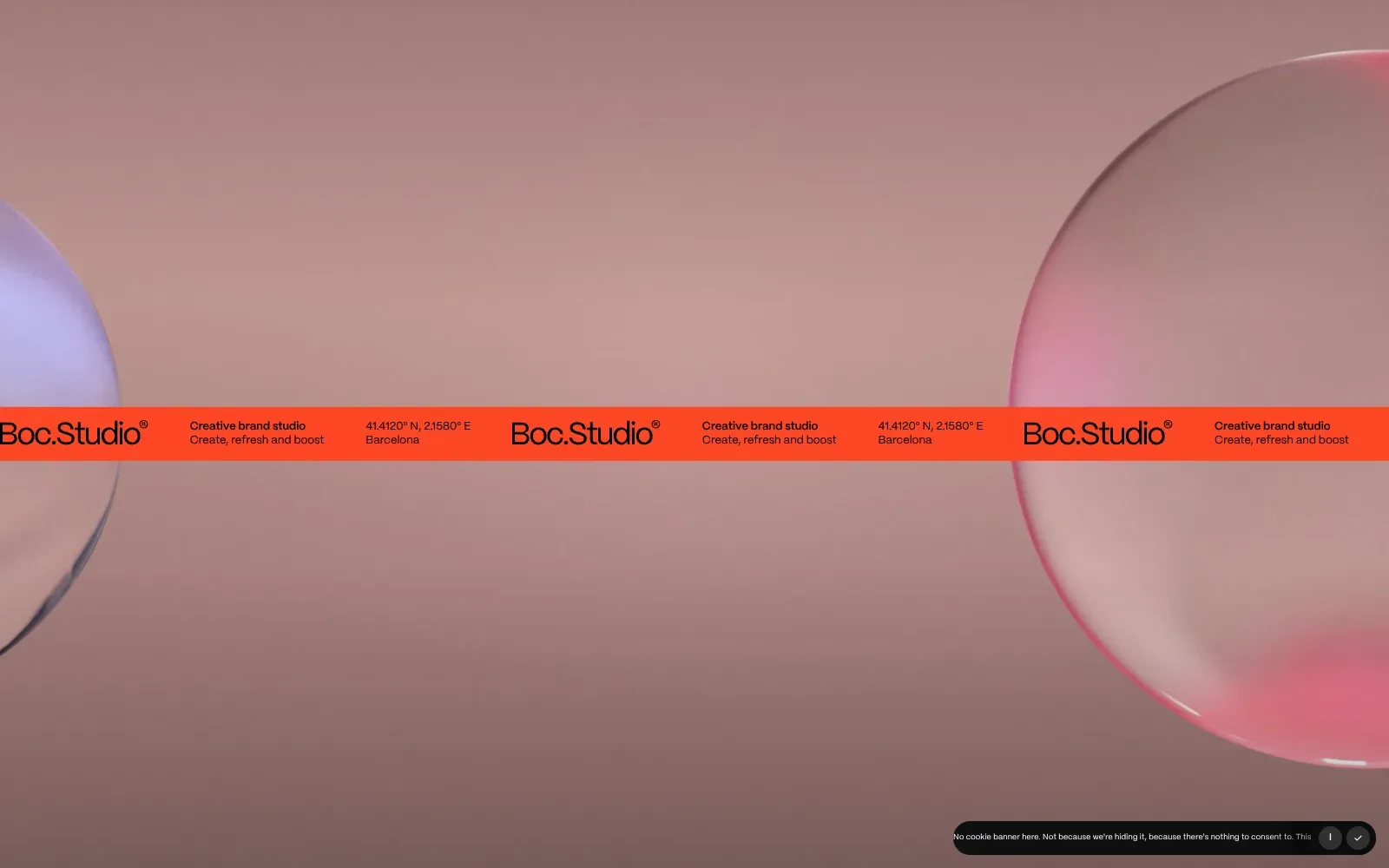
A saturated orange band cuts across a soft dusty-rose backdrop, with two glassy translucent spheres at the edges like props. The wordmark uses a clean geometric sans with tight spacing, and small bold and regular lines beside it set a clear hierarchy. Large empty areas leave the colour contrast to carry the screen.
Borrow this: Use one strongly coloured horizontal band to carry your name and a short description over a calm, single-tone background, so the first screen has a clear focal point.
Watch out for: The page is heavier than average and scores middling in the lab test, yet real visitors get a good experience on all three Core Web Vitals, so the weight is not hurting people in practice.
Designed in-house. Visit boc.studio.
7. LxL Creative
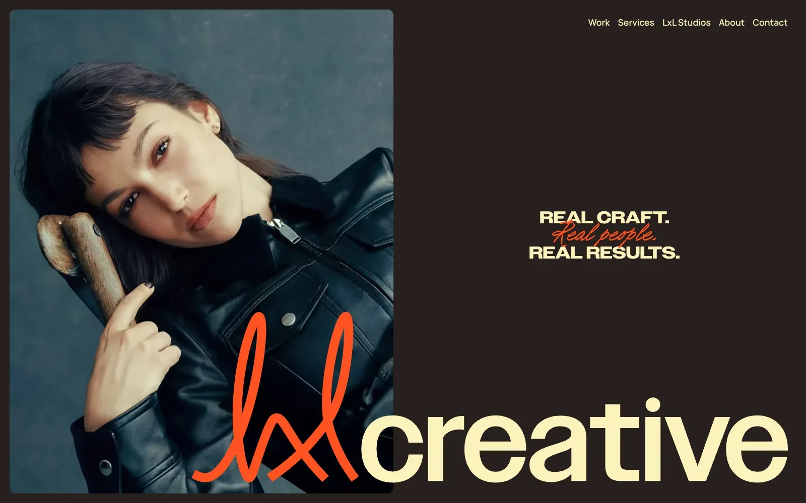
A single portrait in a rounded frame sits against a deep brown ground, and the cream wide lettering and orange handwritten script pull their colour from the photograph and the jacket. The oversized wordmark overlaps the image edge, tying picture and type together. Plenty of empty space keeps the tagline calm.
Borrow this: Pair one strong portrait with a heavy, wide sans in cream and a single handwritten accent in one bright colour, all on a dark flat background.
Watch out for: The page itself is light, but real visitors see slow loading of the main content and sluggish response to taps and clicks, which fits a site layered with scripted animation and page transitions.
Built by Jordan Gilroy. Visit lxlcreative.co.uk.
8. Outfit
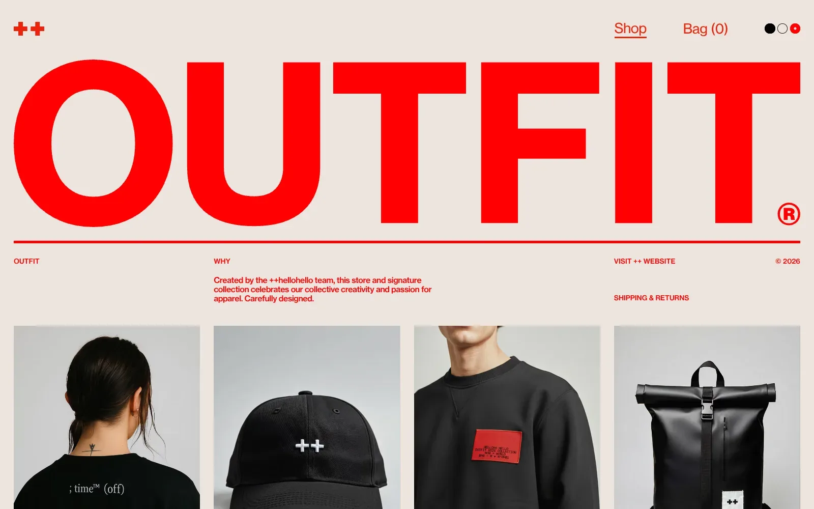
One huge word in a heavy, wide sans serif fills the full width in saturated red on a warm off-white ground. Everything else is small, red and tightly aligned to a column grid, so the hierarchy is immediate. The black clothing photos, shot against pale grey, provide the only contrast.
Borrow this: Pick one strong colour, set the business name at full width in a heavy sans serif, and keep every other element small, in that same colour, on a plain warm background.
Watch out for: The page tested fast in the lab and stays light, which suits a layout built from type, flat colour and a few photos, although Google did not have enough real-visitor data to judge how it performs for actual users.
Built by ++hellohello. Visit outfit.hellohello.is.
Portfolios
Portfolios usually belong to one person or a very small team, and the best ones let the work fill the screen. None of the eight passed all three Core Web Vitals, and two weigh more than 35 MB, which is what happens when full-resolution work goes straight onto the page. For your own, see portfolio web design.
For a bigger sample, 20 portfolios drawn from the same pool and measured the same way, see the 20 best portfolio websites.
| # | Site | Lighthouse (mobile) | LCP, real visitors | INP | CLS | Page weight | Built with |
|---|---|---|---|---|---|---|---|
| 9 | Vivien's Creative | 57 | no data | no data | no data | 2.2 MB | Next.js |
| 10 | Studio K95 | 58 | 5.5 s | 245 ms | 0.00 | 2.3 MB | Nuxt |
| 11 | Jesper Landberg | 60 | 1.1 s | 219 ms | 0.00 | 36.1 MB | Nuxt |
| 12 | House of Honey | 74 | 3.0 s | no data | 0.00 | 1 MB | Next.js |
| 13 | Félix Péault | 76 | no data | no data | no data | 1.4 MB | SvelteKit |
| 14 | Nordpixel | 79 | no data | no data | no data | 4.1 MB | Not detected |
| 15 | Oimachi | 47 | no data | no data | no data | 35.4 MB | Webflow |
| 16 | Matthäus Jandl | 61 | no data | no data | no data | 6.9 MB | Framer |
9. Vivien's Creative
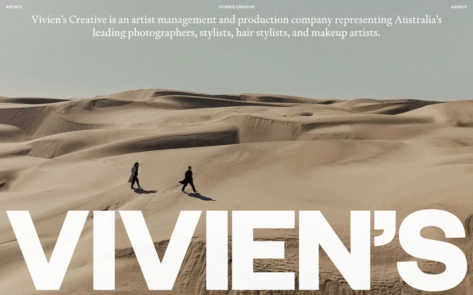
A wide photograph of two figures crossing pale dunes fills the screen, with the heavy white wordmark sitting across the bottom edge. The intro line uses a light book-style serif, centred against the grey-green sky. Navigation drops to three small capitals, so the photograph does nearly all the work.
Borrow this: Pair one strong full-bleed photograph with a single oversized wordmark and a short serif intro line, so a small business can say who it is and what it does without any extra panels.
Watch out for: The page is light, but the lab test came back middling, and Google did not have enough real-visitor data to show how it performs for actual users.
Built by Christopher Doyle & Co.. Visit vivienscreative.com.au.
10. Studio K95
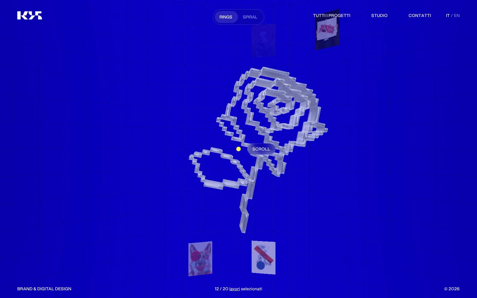
A saturated blue fills the screen, so the pale glass-like rose built from chunky blocks reads instantly as the focal point. Project posters orbit it in rings, and on the phone the active card swells to fill half the screen with a soft red label pill. Navigation stays in small, plain capitals with generous spacing, leaving the artwork to carry the screen.
Borrow this: Pick a single flat brand colour for the whole backdrop, place a bold central image on it, and keep the navigation small and white.
Watch out for: The page itself is light, but the lab result is only middling and real visitors report slow loading of the main content (LCP) and sluggish response to taps and clicks (INP), which fits a page built around a moving interactive scene.
Designed in-house. Visit k95.it.
11. Jesper Landberg
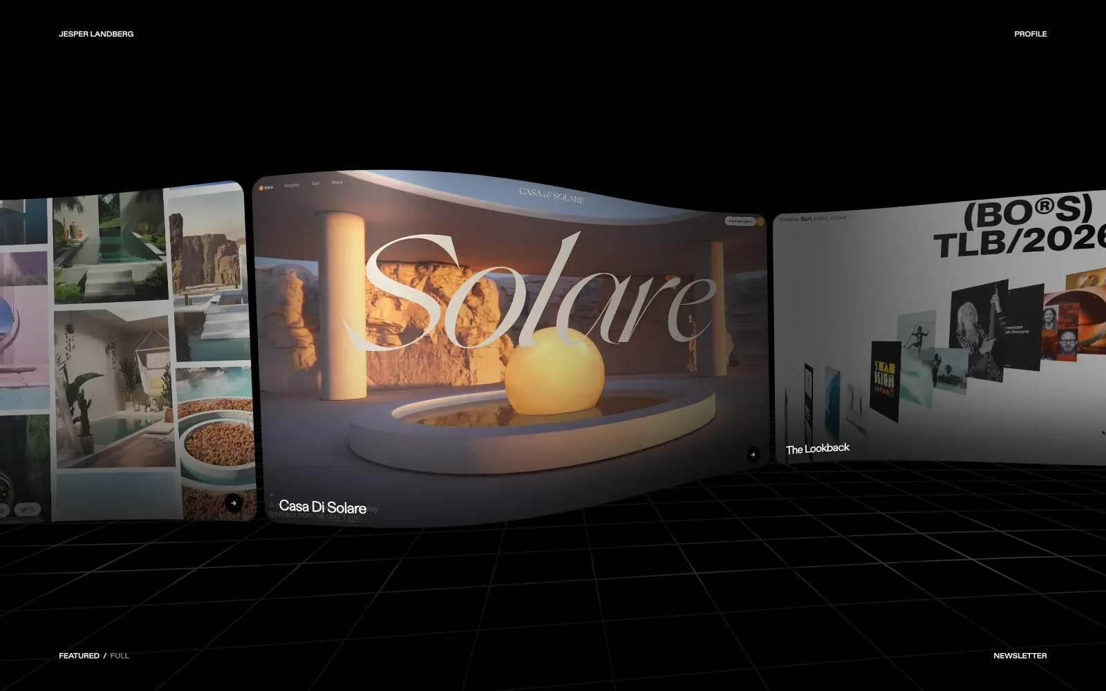
The black room with a faint perspective grid gives the project panels all the attention, and the warm amber light in the centre panel pulls the eye straight to it. A tall, thin italic serif sits over a glowing sphere and pool, giving the page a calm, tactile feel. Links shrink to small capitals in the corners, so nothing competes with the imagery.
Borrow this: Use a plain dark background with tiny corner links so a few strong images carry the whole page.
Watch out for: The page is very heavy and scored middling in the lab test, and real visitors report sluggish responses to taps and clicks (INP), which is the usual cost of rich motion and large imagery.
Designed in-house. Visit jesperlandberg.com.
12. House of Honey
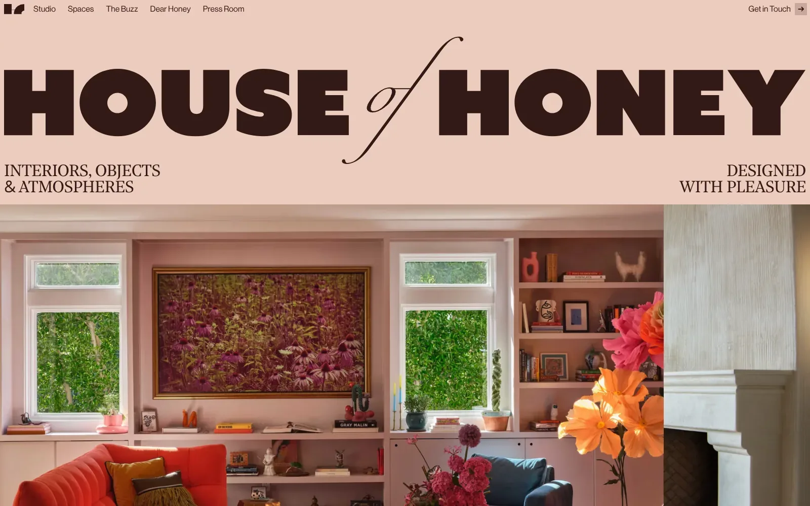
The wordmark runs edge to edge in a heavy, wide black-letter-free sans, with a thin italic script "of" cutting through it. Dusty pink and deep brown are the only colours in the header, so the photograph carries all the warmth beneath. Small serif capitals in the corners keep the tagline quiet and balanced.
Borrow this: Pair one very heavy headline face with a single delicate italic accent word, and keep the header to two flat colours so your photography does the talking.
Watch out for: The page is light, but real visitors see slow loading of the main content (LCP), which fits a large full-width photograph sitting right under the header, so that image is the first thing to compress and size carefully.
Built by Edoardo Lunardi. Visit houseofhoney.com.
13. Félix Péault
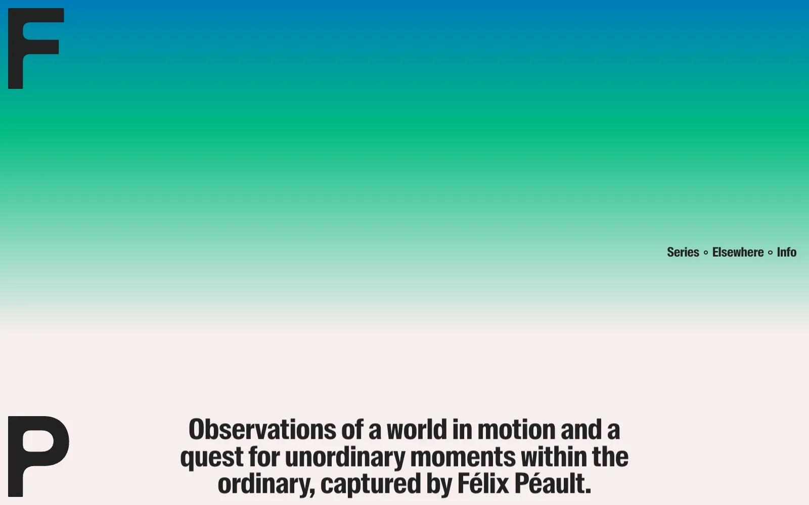
A blue to green gradient fades into warm off-white, giving the page atmosphere without a decorative flourish. The huge black initials sit in opposite corners, and the tall condensed sans headline is centred and tightly set. Everything else stays empty, leaving the one photograph to carry the weight on mobile.
Borrow this: Use one oversized pair of initials or a short wordmark in the corners, with a single soft gradient behind it, instead of a stock hero image.
Watch out for: The lab test came back middling even though the page is light, and Google did not have enough real-visitor data to show how it feels for actual users.
Designed in-house. Visit felixpeault.com.
14. Nordpixel
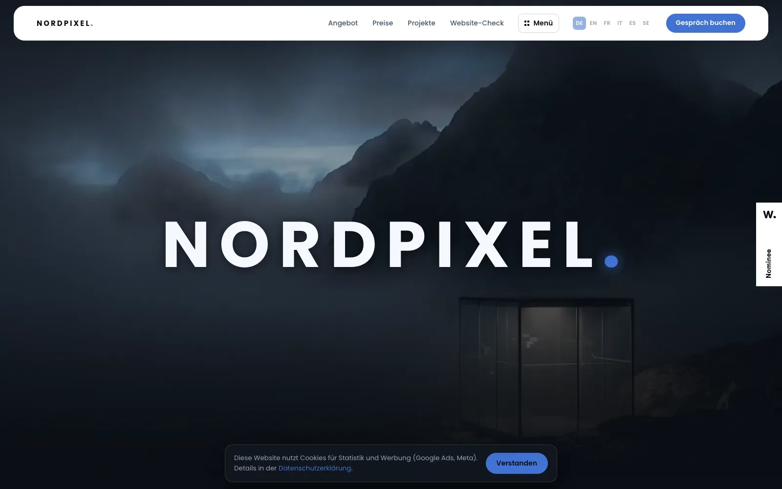
A misty mountain photograph in deep blue and slate fills the whole screen, with a glass-fronted cabin glowing faintly in the lower right. The wordmark sits across the middle in wide-spaced, heavy geometric capitals, ending in a blue dot that echoes the buttons. The white rounded navigation bar stands out cleanly against the dark image, and the mobile view keeps the same calm composition.
Borrow this: Use one large, calm photograph with a single heavy wordmark over it, and keep one coloured button in the navigation bar for the main action.
Watch out for: The lab test came out middling and the page is heavier than average, which fits a full-screen photographic opening, and Google did not have enough real-visitor data to show how it performs in practice.
Built by Michael Schnyder. Visit nordpixel.ch.
15. Oimachi
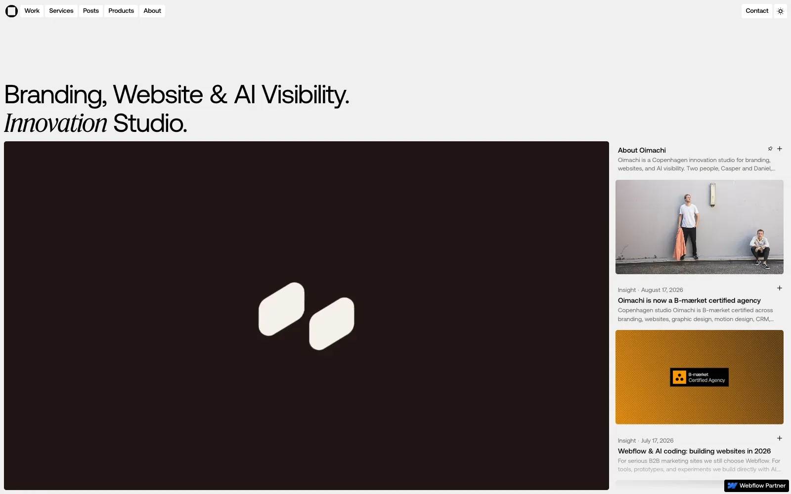
The headline uses a large light grotesque sans, with one word switched to an italic serif for contrast without another colour. A pale grey page, a dark hero panel and a narrow column of post cards create clear zones. On mobile, the grid of black pictograms on drawn construction lines looks deliberate and precise.
Borrow this: Mix a single italic serif word into a plain sans headline to give the page a point of difference without adding colour or extra assets.
Watch out for: The lab test found the page slow and very heavy, and Google did not have enough real-visitor data to show how it feels for actual users.
Designed in-house. Visit oimachi.co.
16. Matthäus Jandl
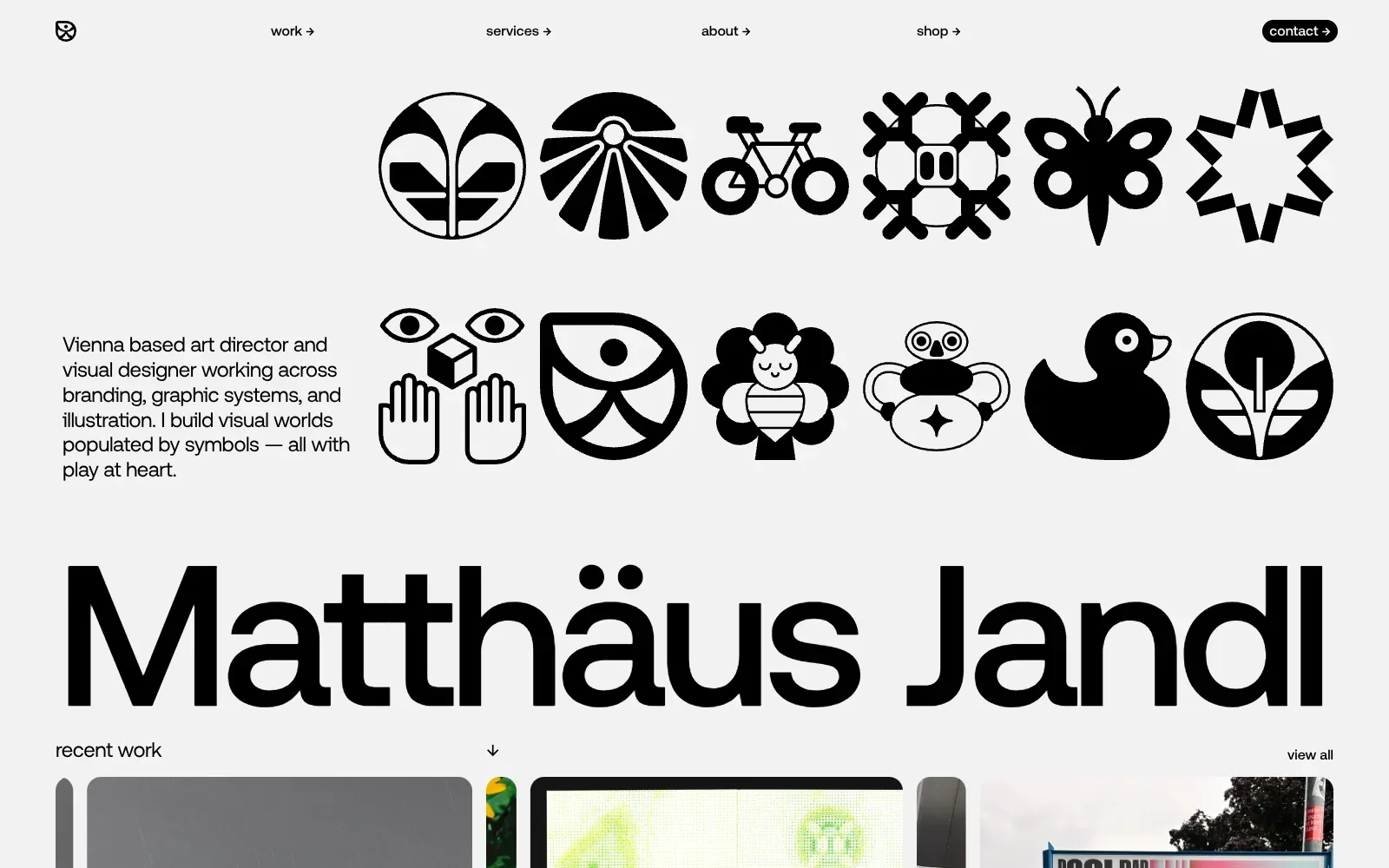
A grid of bold black symbols on a pale grey ground does all the talking, and the name below it uses a huge, wide grotesque that runs the full width of the page. Everything is one colour, so the icons carry the personality. Generous gaps keep a busy set of shapes calm and readable.
Borrow this: Set your name or brand in one oversized line of heavy sans serif text across the full width, and let a single consistent set of simple graphics sit above it.
Watch out for: The page is heavier than average and only middling in the lab test, which is a fair price for a hero built from many large graphics and a scrolling row of project images, and there was not enough real-visitor data to show how it feels in practice.
Designed in-house. Visit matthaeusjandl.com.
Technology and finance
Technology and finance sites have to explain something abstract and earn trust at the same time. Possible Finance and Fauna Robotics both pass all three Core Web Vitals, and Fauna does it on a 68.6 MB page. For product sites, see SaaS web design and financial services website design.
| # | Site | Lighthouse (mobile) | LCP, real visitors | INP | CLS | Page weight | Built with |
|---|---|---|---|---|---|---|---|
| 17 | Possible Finance | 74 | 1.6 s | 87 ms | 0.00 | 2.7 MB | Framer |
| 18 | Linearity | 46 | 2.9 s | 403 ms | 0.01 | 4.3 MB | Nuxt |
| 19 | MagicShot.ai | 89 | 1.9 s | 213 ms | 0.00 | 3.8 MB | Not detected |
| 20 | Maxima Finance | 54 | no data | no data | no data | 2.7 MB | Not detected |
| 21 | Clarvos | 46 | no data | no data | no data | 1.9 MB | Webflow |
| 22 | Finance/able | 83 | no data | no data | no data | 4.3 MB | Webflow |
| 23 | Fauna Robotics | 88 | 1.3 s | 180 ms | 0.01 | 68.6 MB | Not detected |
| 24 | Serve Robotics | 41 | 4.6 s | 152 ms | 0.00 | 15.6 MB | Not detected |
17. Possible Finance
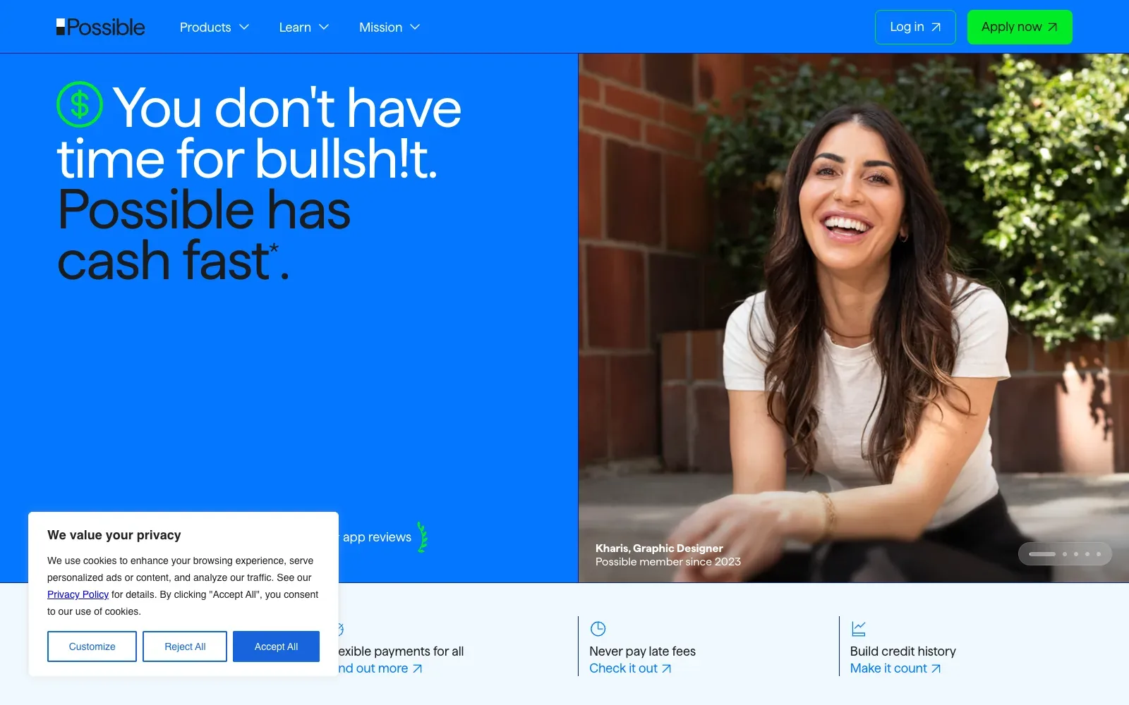
A saturated electric blue fills the left half and the navigation bar, with a very large, tightly set sans serif headline in white and near-black that reads at a glance. The right half uses a warm photograph of a laughing woman against brick and leaves, which contrasts well with the cold blue. A bright green button and green dollar icon give the eye clear landing points.
Borrow this: Pair a flat brand colour with a large headline and a warm photograph of a real customer, then keep a contrasting accent colour for the main button only.
Watch out for: The lab test scored the page as middling, but the page itself is light and real visitors get a good experience on all the Core Web Vitals, so the Framer build holds up where it counts.
Visit possiblefinance.com.
18. Linearity
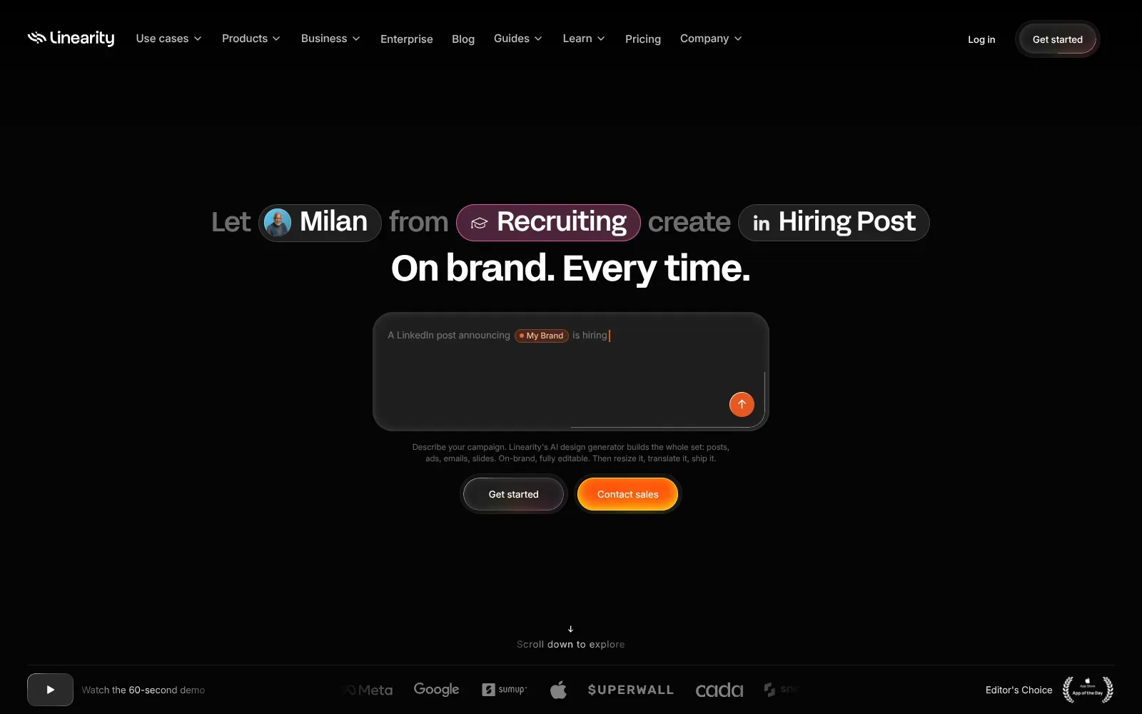
A near-black page lets the headline carry the screen. Grey connecting words sit beside bright pill-shaped chips holding an avatar and icons, so the sentence reads like a form being filled in. The warm orange button and the orange send arrow are the only strong colour, telling the eye exactly where to click.
Borrow this: Turn the headline into a sentence with highlighted chips for the key words, and pair a dark secondary button with a single bright primary one.
Watch out for: The page is heavier than average and slow in the lab test, and real visitors see problems with loading (LCP) and responsiveness (INP), so the animated effects come at a cost on slower connections.
Built by Konpo. Visit linearity.io.
19. MagicShot.ai
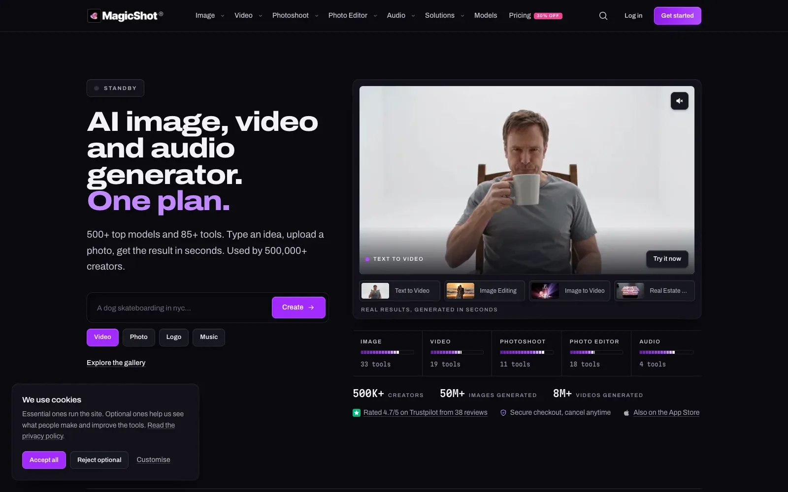
A near-black page with a heavy, wide sans-serif headline in white, with its last line picked out in purple, gives the top of the page clear order. The purple is reserved for actions: the Get started button, the Create button and the active Video tab. A large video panel with small thumbnail tabs beneath it shows the product working, while a monospaced stats row adds a technical note.
Borrow this: Use a single accent colour only for buttons and the active choice, so the next step stands out against a dark or neutral background.
Watch out for: The page is light, but the lab test came out middling and real visitors report problems with responsiveness (INP), so taps and clicks may feel slow to answer.
Designed in-house. Visit magicshot.ai.
20. Maxima Finance
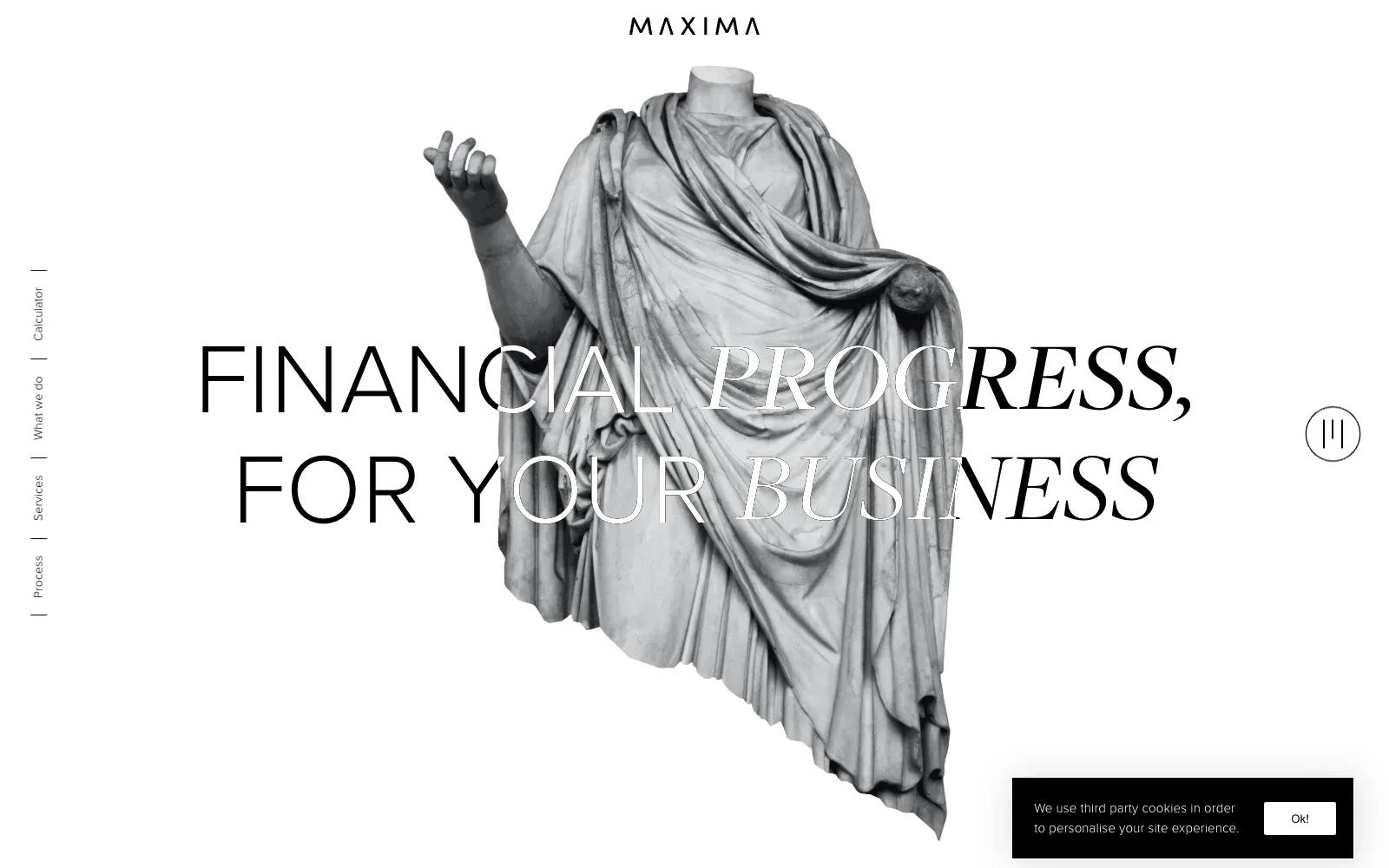
A cut-out grey statue of a headless robed figure sits in the middle of a plain white page, with the headline running straight across it. The type mixes a thin, wide sans with an italic high-contrast serif, so the two important words stand apart. Everything else is held back, giving the image room.
Borrow this: Pair one strong, well-cropped image with a headline that overlaps it, and set the key words in a contrasting italic so the message reads at a glance.
Watch out for: The lab test came out middling even though the page is light, and Google did not have enough real-visitor data to show how it performs for actual users.
Built by Dirty Martini. Visit maximafinance.co.uk.
21. Clarvos
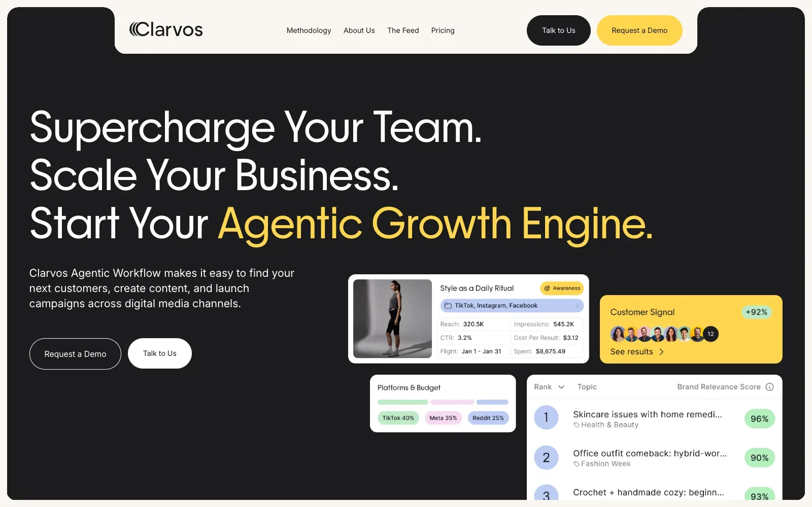
A near-black panel with a cream notched navigation bar gives the page a confident, contained frame. The headline uses a large clean geometric sans, with the last phrase picked out in warm yellow. White dashboard cards in the lower right, with a yellow card among them, show the product at once and keep the colours tightly controlled.
Borrow this: Pick out the key phrase of your headline in a single accent colour against a dark background, then repeat that colour on one card and the main button.
Watch out for: The lab test rated the page slow even though the page itself is light, and the mobile view opens on a large empty dark area before the cards appear, which fits scripted animation (GSAP and Lenis were both detected) holding content back; Google had too little real-visitor data to judge.
Built by BRIGHTSCOUT. Visit clarvos.com.
22. Finance|able
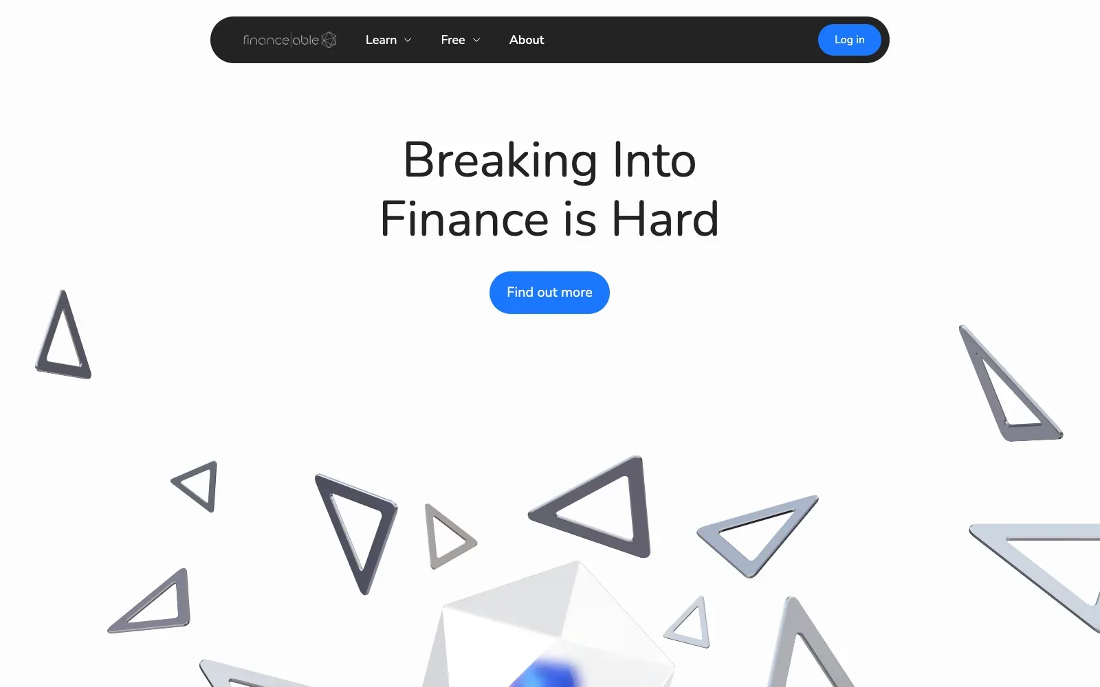
A pale, almost white page lets the headline do the work, set in a large rounded sans serif and centred above a blue pill button. Below it, grey metallic triangles float around a glassy faceted shape, suggesting a rendered scene with depth and movement. The dark rounded menu bar gives the top edge a firm anchor and echoes the button shape.
Borrow this: Pair a short, plain headline with a bright pill button on a near-white background, and let a decorative image fill the space below.
Watch out for: The page is heavier than average and scored middling in the lab test, which is the usual cost of a rendered scene built with Spline and GSAP, and there was not enough real-visitor data to judge further.
Built by Outcrowd. Visit finance-able.com.
23. Fauna Robotics
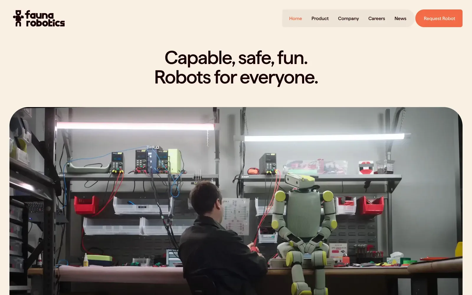
A warm cream background and tight, dark headline type give the page a friendly feel before any robot appears. The large photo with generously rounded corners shows a person at a workbench beside a seated robot, making the product feel approachable rather than clinical. The pill-shaped navigation and orange button echo the soft shapes.
Borrow this: Pair a single plain sentence of headline with one large, honest photo of your own people at work, and keep the colour palette to cream, near-black and one warm accent.
Watch out for: The page is very heavy and the lab test result is only middling, though real visitors get a good experience on all three Core Web Vitals, so the weight is not hurting people in practice.
Visit faunarobotics.com.
24. Serve Robotics
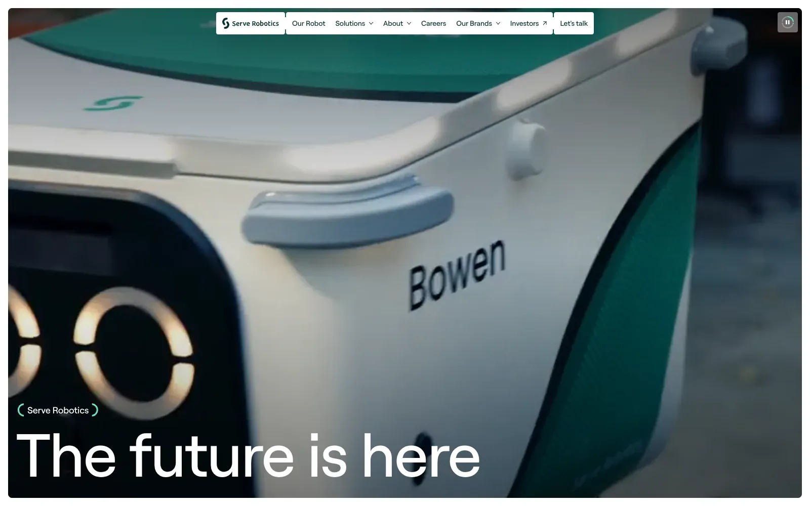
A full-bleed video fills the screen, with a close crop of the delivery robot in white and deep green that matches the logo. The headline sits bottom left in a large, clean sans serif with tight spacing, so it reads at once over the dark footage. The small white navigation tabs float at the top and stay out of the way.
Borrow this: Pair one oversized white headline with a short bracketed label above it, set over a darkened photo or video, so the message reads in a second.
Watch out for: The page is very heavy, it tested slow in the lab, and real visitors see a slow main image or video load, which is the usual cost of full-screen footage.
Built by WILD. Visit serverobotics.com.
Ecommerce and fashion
Fashion and ecommerce sites sell mood first and product second. Ferm Living and EMO Altar II pass all three Core Web Vitals, and RemyShoots scores 93 in the lab. For shops, see headless ecommerce development and fashion website design.
| # | Site | Lighthouse (mobile) | LCP, real visitors | INP | CLS | Page weight | Built with |
|---|---|---|---|---|---|---|---|
| 25 | Miu Miu, A House That We Shaped | 42 | 3.4 s | 194 ms | 0.01 | 3.8 MB | Not detected |
| 26 | An Ocean of Ideas | 57 | 4.3 s | no data | 0.00 | 2.2 MB | Remix |
| 27 | RemyShoots | 93 | 1.6 s | no data | 0.00 | 3 MB | Next.js |
| 28 | Coutumes | 69 | no data | no data | no data | 2.6 MB | Shopify |
| 29 | Ferm Living | 61 | 1.2 s | 112 ms | 0.00 | 7.2 MB | Shopify |
| 30 | Indigo Laboratory | 49 | no data | no data | no data | 16.3 MB | Not detected |
| 31 | EMO Altar II | 60 | 1.4 s | 114 ms | 0.00 | 3.9 MB | Not detected |
| 32 | Music Sound | 61 | 4.0 s | 99 ms | 0.00 | 3.1 MB | WordPress |
25. Miu Miu, A House That We Shaped
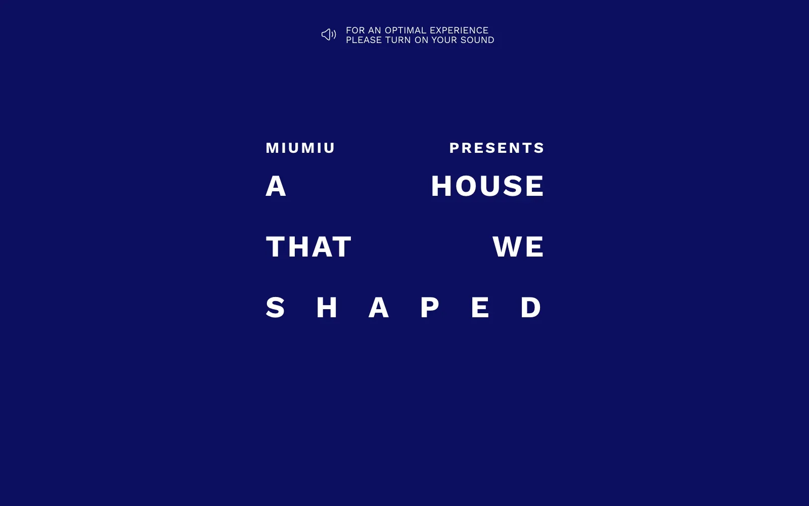
A flat field of deep navy carries nothing but white capitals in a wide, heavy sans serif. Each line is pushed to the edges of a narrow column, and the last word is letterspaced so it fills the same width, turning the sentence into a tidy block. A thin sound prompt with a speaker icon sits alone at the top.
Borrow this: Set a single short statement in heavy capitals inside a narrow column, justify each line to the edges and letterspace the shortest line to match.
Watch out for: The page was slow in the lab test and real visitors see problems with loading the main content (LCP), even though the page itself is light, so page weight is not the cause of the delay.
Built by Merci Michel. Visit immersivebags.miumiu.com.
26. An Ocean of Ideas
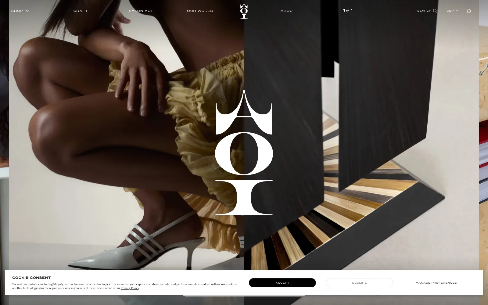
The page splits the screen down the middle, with a crouching figure in a pale yellow gathered skirt on the left and a dark grained sculpture with a fan of striped inlay on the right. A large white logo in a high-contrast serif with sharp, flared tops sits dead centre over both. The navigation uses small, spaced capitals in white, so the photography does the talking.
Borrow this: Pair two contrasting photographs side by side under a single centred logo so the first screen says what the brand makes without needing any copy.
Watch out for: The page is light, but the lab score is middling and real visitors see slow loading of the largest element, which suggests the full-screen imagery takes a moment to appear.
Built by Airnauts. Visit aoiofficial.com.
27. RemyShoots
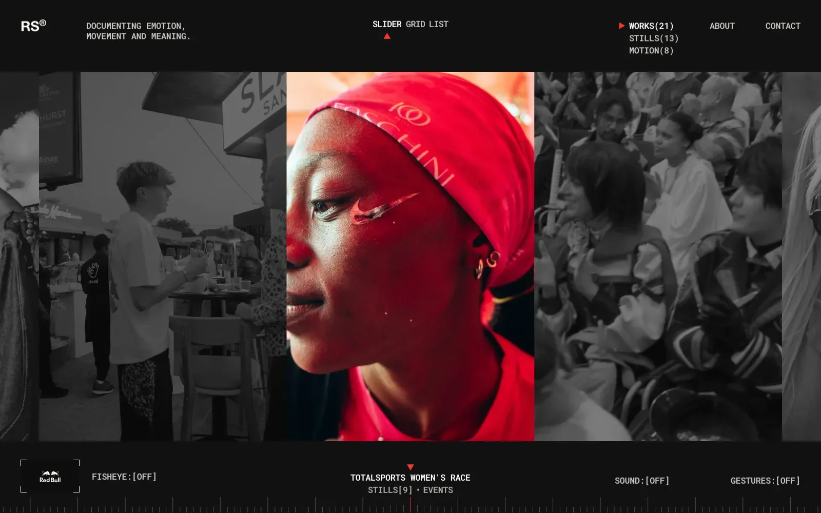
A near-black frame lets the photography carry everything. The centre image is in full red while its neighbours are drained to greyscale, so the eye lands in one place. Monospaced type with bracketed counts and a tick-mark timeline adds a quiet, technical order that suits a photographer's archive.
Borrow this: Use one full-colour image against muted greyscale neighbours to steer attention, with a plain monospaced caption and a count in brackets beneath it.
Watch out for: The lab test shows the page is fast and light despite the large photography, although Google did not have enough real-visitor data to show how it performs for actual users.
Built by Arc Marumo. Visit remyshoots.co.za.
28. Coutumes
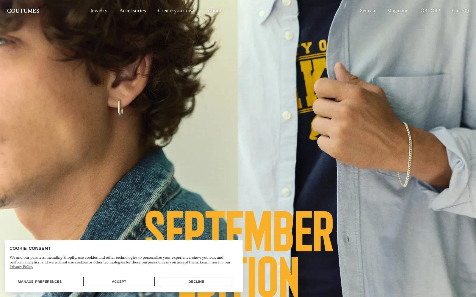
A full-bleed photograph does all the work, with a close crop of a silver hoop earring on the left and a bracelet on the right. The tall condensed headline in mustard yellow picks up the print on the T-shirt in the picture, so type and image feel related. Navigation in a light serif sits quietly in white across the top.
Borrow this: Pull the headline colour straight from the product photograph, so a bold condensed heading and the image read as a matched set.
Watch out for: The lab test came back middling, though the page itself is light, and Google did not have enough real-visitor data to show how it performs for actual customers.
Visit coutumes.com.
29. Ferm Living
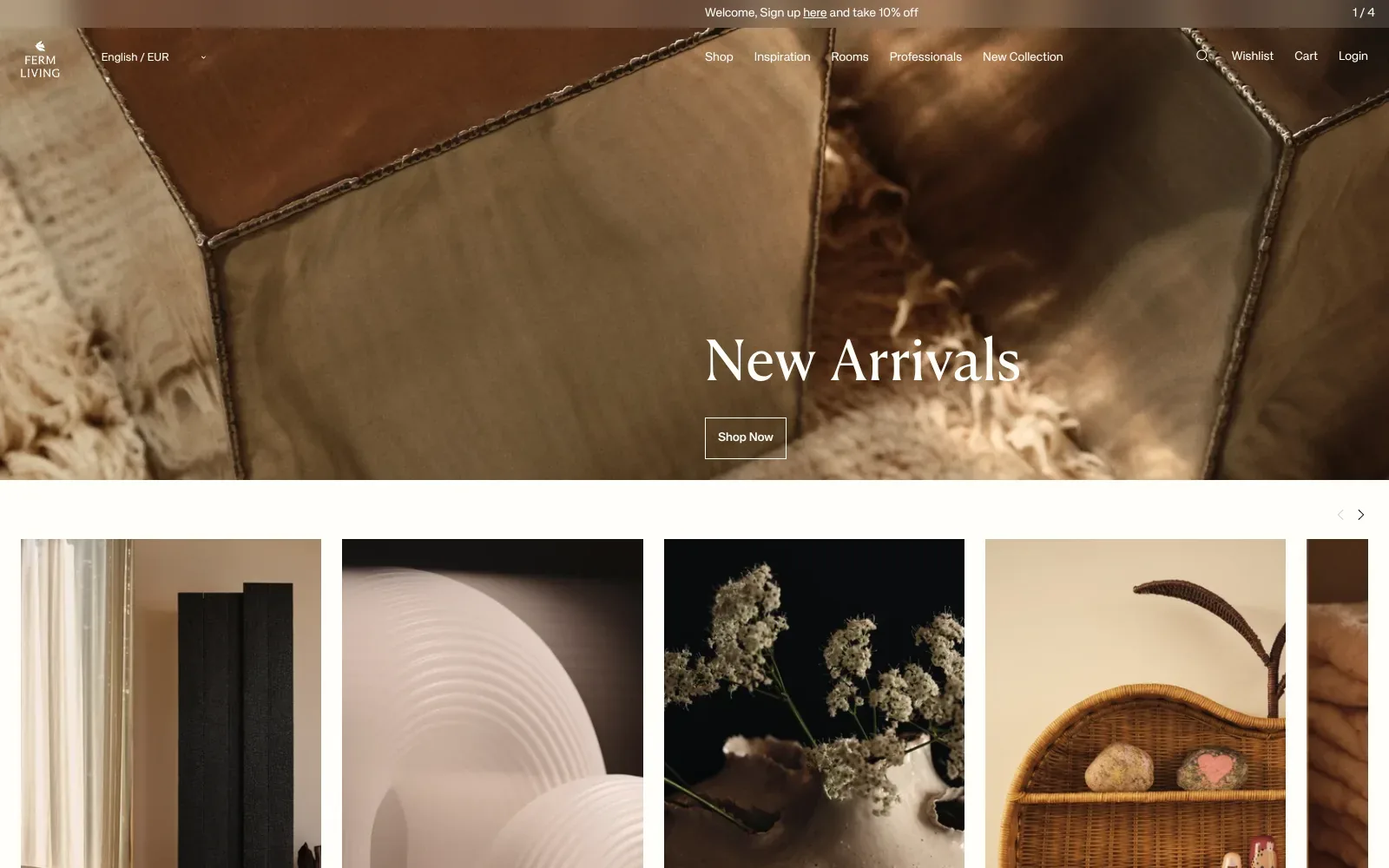
The hero is a close, warm photograph of metallic stools on a shaggy rug, with a light serif headline and a single outlined button set over it. The earthy browns carry through the product tiles below, so the whole page reads as one palette. Plenty of white space and small, quiet navigation keep attention on the photography.
Borrow this: Use one tightly cropped, warm photograph per section with a single outlined button, and keep every other colour on the page drawn from that same photograph.
Watch out for: The page is heavier than average and only middling in the lab test, though real visitors get a good experience on all three Core Web Vitals, so the large photography is holding up in practice.
Built by Signifly. Visit fermliving.com.
30. Indigo Laboratory
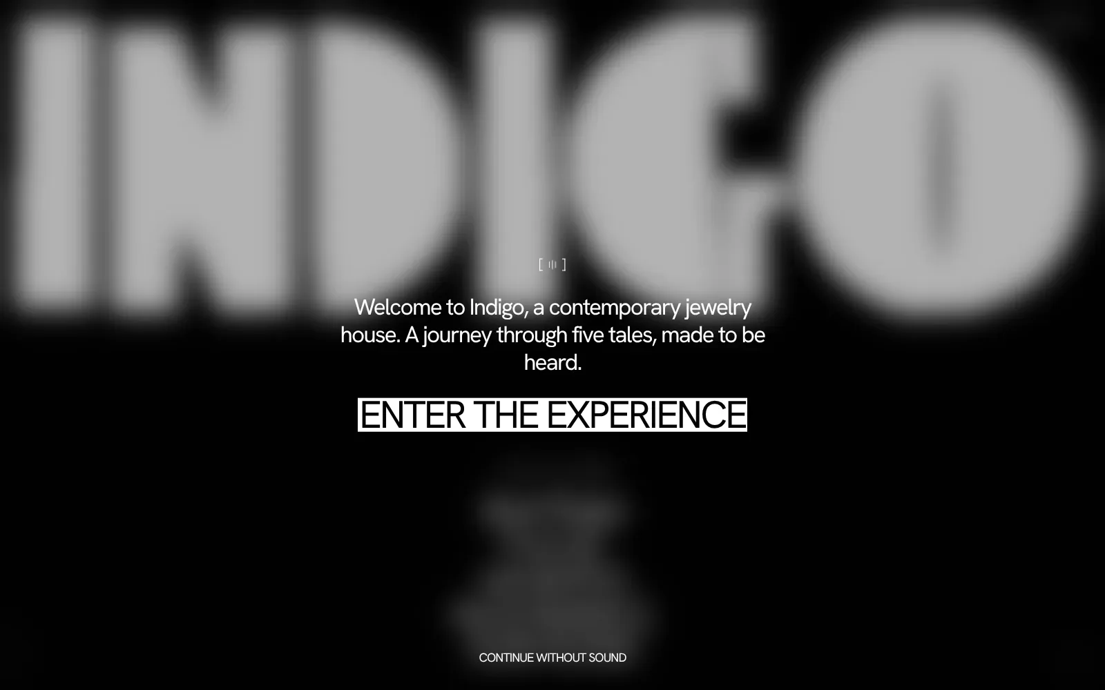
The entry screen is built almost entirely from black, white and soft grey. A huge blurred wordmark in a heavy geometric sans fills the top, and the welcome line sits centred beneath it in a lighter, friendly sans. The white block behind the enter button is the only hard-edged shape, so the eye lands there immediately.
Borrow this: Use a single high-contrast block for the main button, white on black here, so the next step is obvious without any extra decoration.
Watch out for: The lab test found the page slow and very heavy, and Google did not have enough real-visitor data to show how it behaves for actual visitors.
Built by FPTP Studio. Visit indigo-laboratory.it.
31. EMO Altar II
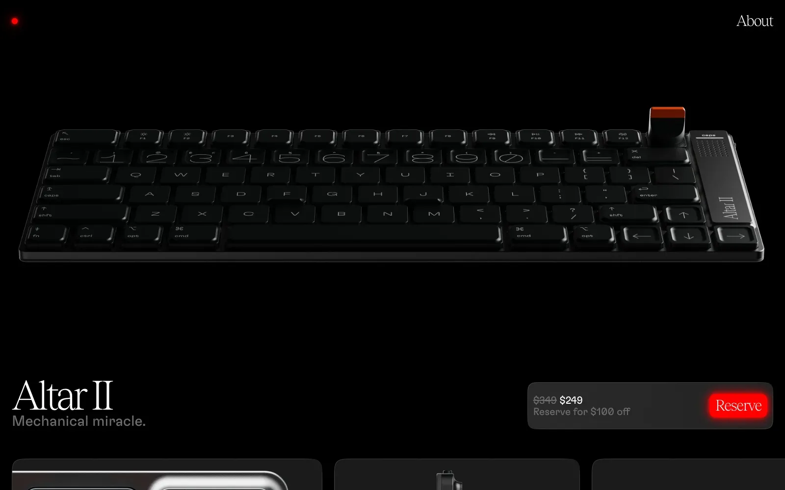
A single black keyboard render floats on a pure black ground, so the product is the only thing that draws the eye. The wordmark uses a tall, high-contrast serif beside a plain grey sans tagline, and one saturated red button is the lone strong colour. The price card is rounded and quiet, keeping the call to action obvious.
Borrow this: Give the page one hero image on a flat dark background and reserve a single accent colour for the main button, so the eye has nowhere else to go.
Watch out for: The lab test came out middling, though the page is light and real visitors get a good experience on all three Core Web Vitals, which is the result that counts for a shop.
Built by Electronic Materials Office. Visit electronicmaterialsoffice.com.
32. Music Sound
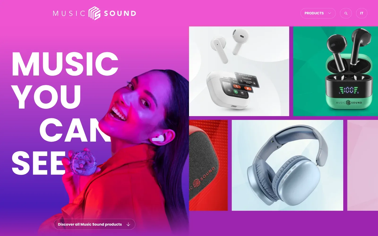
A hot pink to deep violet gradient fills the page and carries a heavy white geometric sans headline, stacked on four lines with the third indented. The smiling woman in magenta light overlaps the lettering, and the product tiles on the right sit on clean pale, green and red backgrounds, so the headphones and earbuds stay easy to read.
Borrow this: Stack a short headline in a heavy sans over a single colour gradient and let one photo overlap the lettering to give the page depth.
Watch out for: The page is light, but real visitors report slow loading of the main content (LCP), and the large lifestyle photo and product tiles are the likely candidates, so compressing and prioritising those first images would help.
Built by Gummy Industries. Visit musicsound.com.
Food, drink and hospitality
Food, drink and hospitality sites sell appetite, so they lean on large photography and video. This was the only category where no site passed all three Core Web Vitals, and the median lab score was 56.5. For restaurants and hotels, see restaurant website design and hotel website design.
For a bigger sample, 20 food and drink sites drawn from the same pool and measured the same way, see the 20 best restaurant and food websites.
| # | Site | Lighthouse (mobile) | LCP, real visitors | INP | CLS | Page weight | Built with |
|---|---|---|---|---|---|---|---|
| 33 | Vamvalis Foods | 54 | 3.0 s | 90 ms | 0.26 | 3.8 MB | WordPress |
| 34 | Best Bean Best Cup | 75 | 1.4 s | no data | 0.00 | 19.3 MB | Shopify |
| 35 | Benvenusa Italian Wines | 79 | no data | no data | no data | 4.9 MB | Not detected |
| 36 | White Desert | 20 | 2.3 s | 194 ms | 0.23 | 8.5 MB | Next.js |
| 37 | Don Molinico | 48 | 3.8 s | 136 ms | 0.16 | 2.6 MB | Nuxt |
| 38 | Meyers | 43 | 2.1 s | 161 ms | 0.12 | 2.6 MB | Nuxt |
| 39 | Qissa | 87 | 2.7 s | 137 ms | 0.00 | 5.2 MB | WordPress |
| 40 | Pier88 Coast By MONARQ | 59 | no data | no data | no data | 39.3 MB | WordPress |
33. Vamvalis Foods
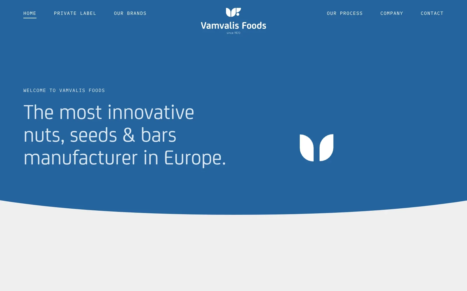
A single flat blue field carries the whole first screen, with a centred white logo and a headline in a light, rounded sans that reads easily at large size. Small spaced capitals in a monospaced face handle the navigation and the intro line. A soft curved edge separates the blue from the pale grey below, and on mobile the coloured leaf shapes frame a round photo of a seed bar.
Borrow this: Pair one large, light headline with small spaced capitals for labels, so the hierarchy is clear using only two type styles and one background colour.
Watch out for: The page itself is light, but real visitors see slow loading of the main content and elements shifting as it loads, so the empty hero and the late image are worth tightening.
Built by Point Blank. Visit vamvalisfoods.com.
34. Best Bean Best Cup
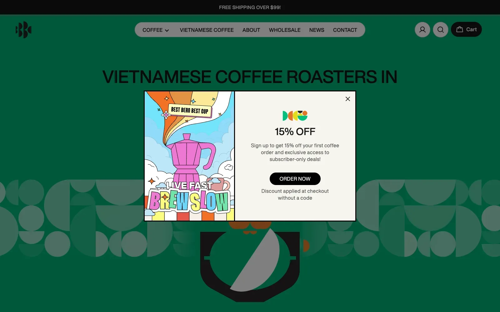
A saturated deep green fills the page, with a heavy black headline in tight, uppercase sans-serif type set directly on it. Behind it, a band of half circles and quarter shapes in muted grey-green gives the hero a graphic, printed feel. The pill-shaped nav and black cart button stay simple, leaving the artwork to carry the personality.
Borrow this: Use a single bold background colour with a repeating pattern built from simple geometric shapes, so the brand looks recognisable without needing photography.
Watch out for: The page is very heavy, and the animation tools detected (gsap and lottie) add to that, so the lab test result was middling and there was not enough real-visitor data to judge how it feels for customers.
Built by Nam Bui. Visit bestbeanbestcup.com.au.
35. Benvenusa Italian Wines
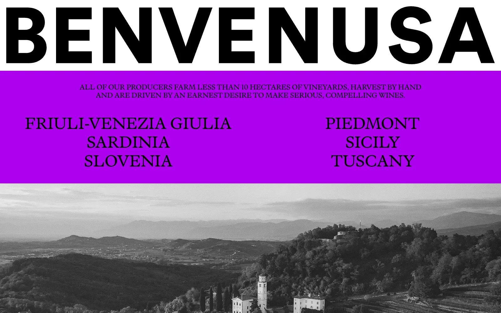
A wordmark in heavy, wide black capitals runs edge to edge, then a flat band of saturated purple carries a small serif statement and a list of regions. The black and white landscape below ties it together. Three flat colours and one serif keep it confident and readable.
Borrow this: Set the business name in one huge, heavy line across the top, then give your key message a single flat block of colour with plain serif capitals.
Watch out for: The page is heavier than average and only middling in the lab test, which fits the large photographs, and Google did not have enough real-visitor data to show how it feels to actual users.
Built by Sons & Co. Visit benvenusa.com.
36. White Desert
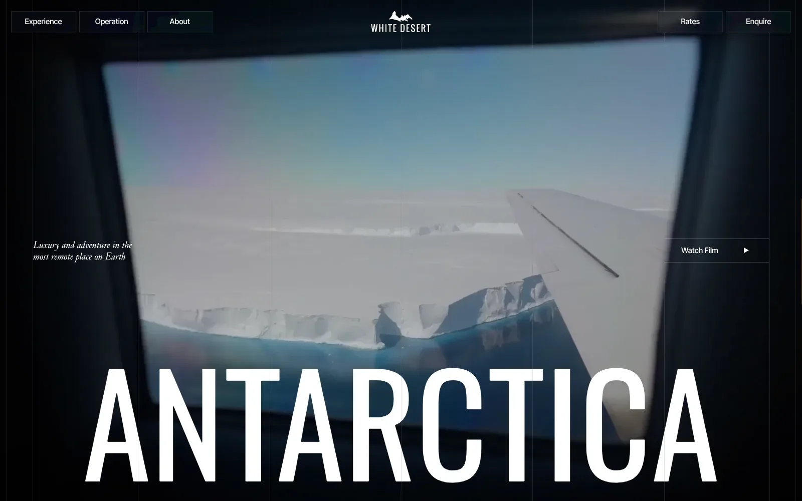
A single aeroplane-window view of an ice shelf fills the screen, framed by near-black edges that make the pale blues glow. The huge white condensed capitals of the headline sit across the bottom, and a small italic serif strapline gives a quiet counterpoint. Thin vertical guide lines add structure without clutter.
Borrow this: Pair one large condensed headline with a small italic serif line over a single strong photograph or looping clip, and keep the navigation to plain outlined buttons.
Watch out for: The page is heavier than average and slow in the lab test, and real visitors report layout shifting as it loads, so the full-bleed film and large type come at a cost to stability and speed.
Built by Malvah. Visit white-desert.com.
37. Don Molinico
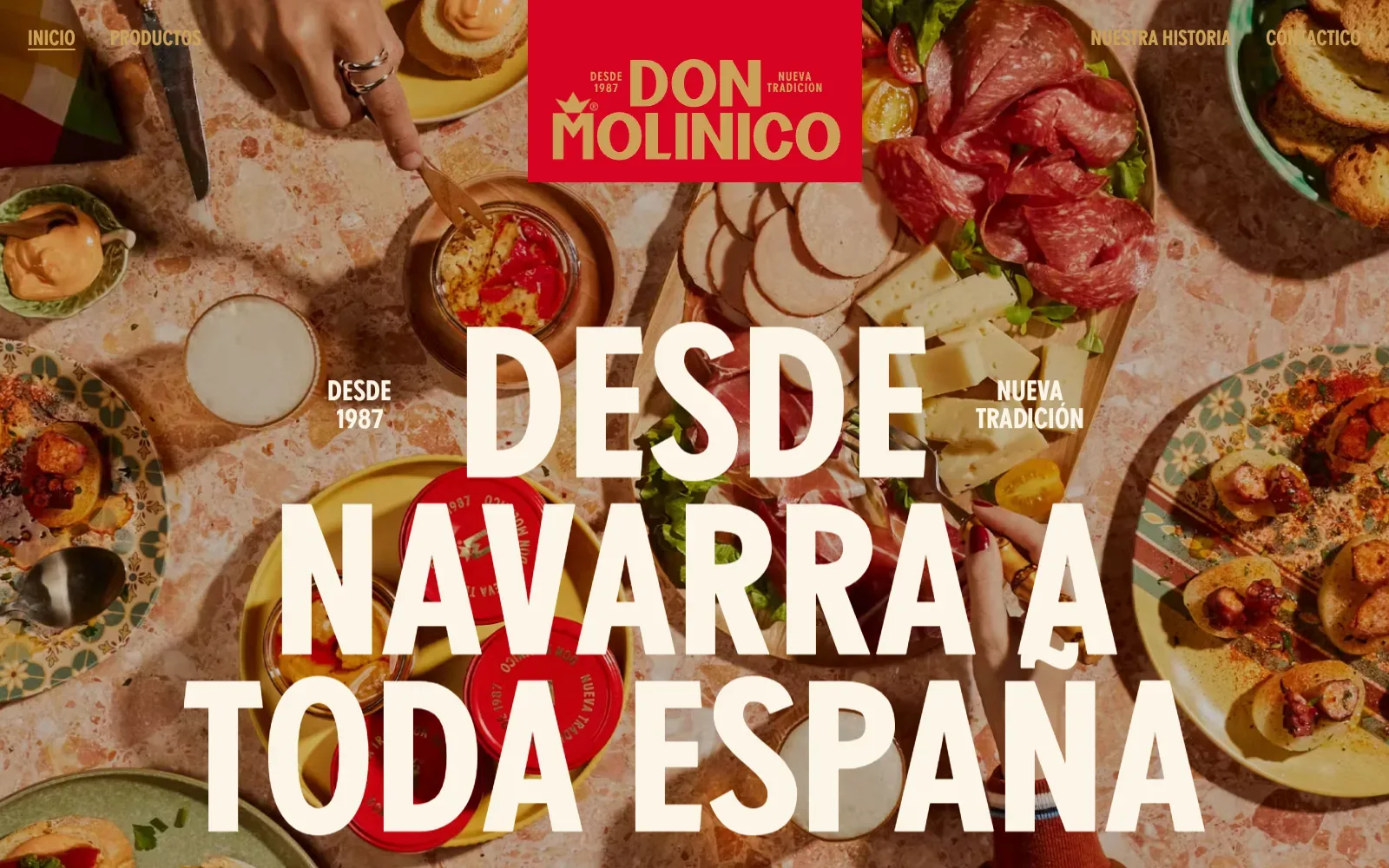
A full-bleed overhead photograph of a table laid with cured meats, cheese, jars and patterned plates fills the screen, so the product sits inside a real meal rather than on a white backdrop. The red logo block hangs from the top edge in the centre, and the huge cream condensed capitals read cleanly over the busy image. Warm terracotta, red and mustard tones all pull in the same direction.
Borrow this: Hang a solid colour logo block from the top edge over a full-width photograph of your product in use, then set a short headline in large cream capitals on top.
Watch out for: The lab test rates the page as slow, and real visitors see problems with how quickly the main content appears and with the layout shifting as it loads, even though the page itself is light.
Built by AUGE EXPERIENCE. Visit donmolinico.es.
38. Meyers
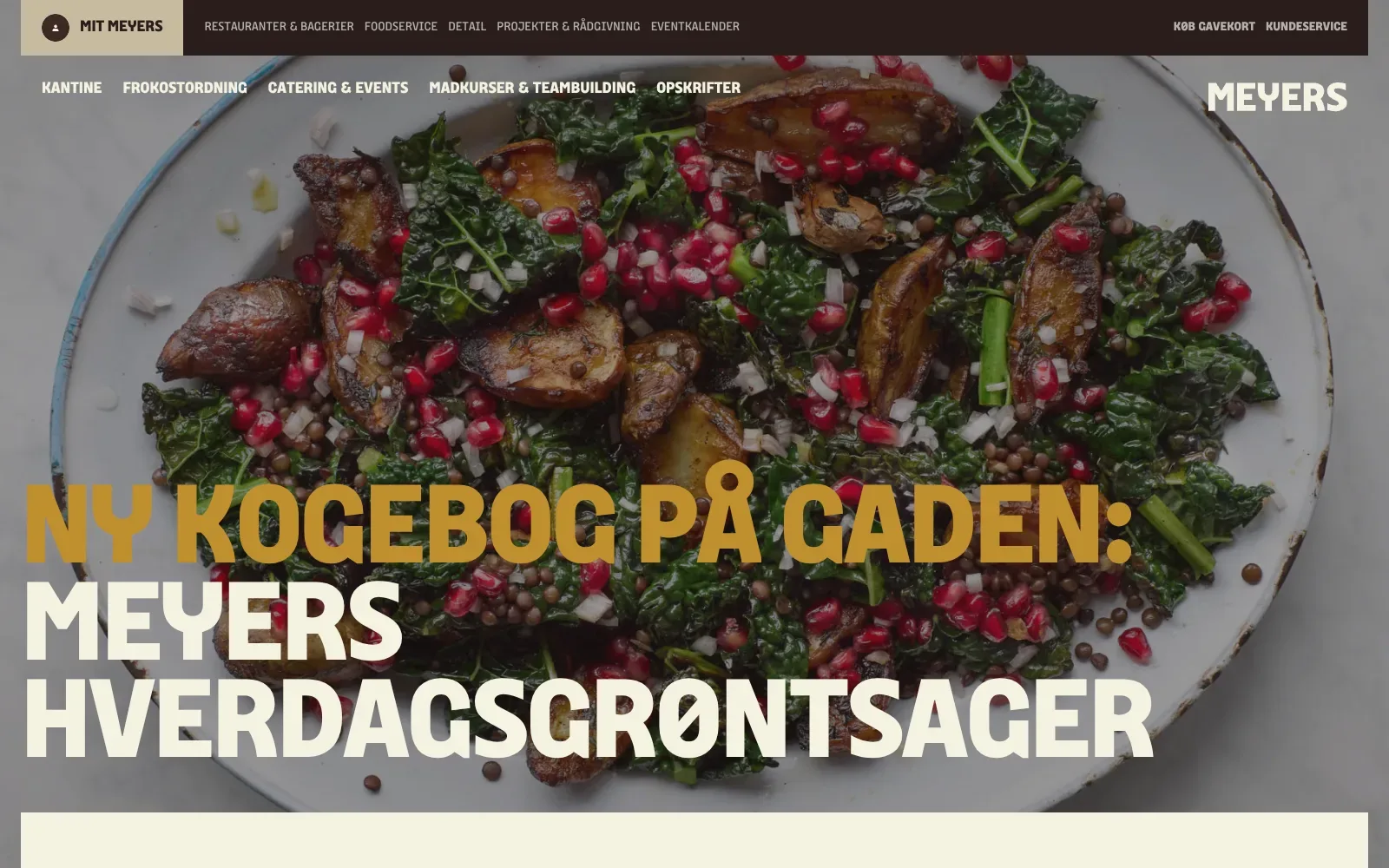
A full-bleed photograph of roasted potatoes, dark kale and pomegranate seeds fills the screen, and the headline sits straight over it in a heavy, wide, slab-like capital face. Mustard and cream type read clearly against the darkened image. The dark brown top bar and sand-coloured account tab keep the palette warm and consistent.
Borrow this: Use one large, well-lit food photograph with a soft dark overlay and set a two-colour headline across the lower third so it stays readable.
Watch out for: The page is light in weight, yet the lab test ran slowly and real visitors report layout stability problems, so content shifting as the page loads is the issue to fix first.
Built by Dwarf. Visit meyers.dk.
39. Qissa
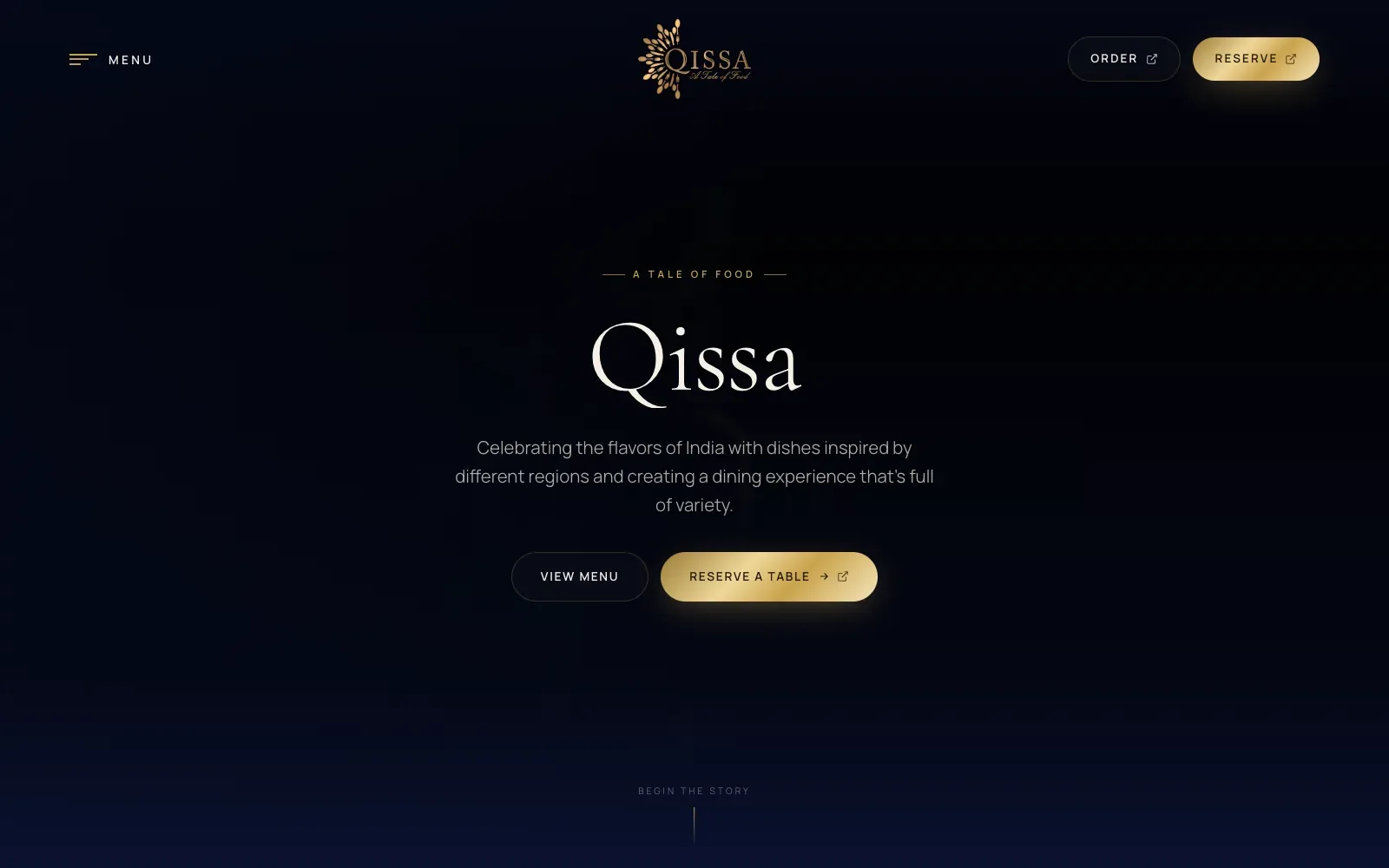
A deep navy ground with a single metallic gold accent gives the page a calm, evening-dinner mood. The wordmark uses a light, high-contrast serif with widely spaced small capitals above it, and the centred stack leaves generous space around the text. On mobile, a faint cutlery fan sits behind the copy like a watermark.
Borrow this: Pick one accent colour, use it only for the main action and small labels, and keep everything else quiet so the booking button is the first thing the eye lands on.
Watch out for: The page is heavier than average and real visitors see slow loading of the main content (LCP), so the dark hero is likely to appear later than it should, most likely on mobile connections.
Built by Red Dash Media. Visit qissa.co.uk.
40. Pier88 Coast By MONARQ
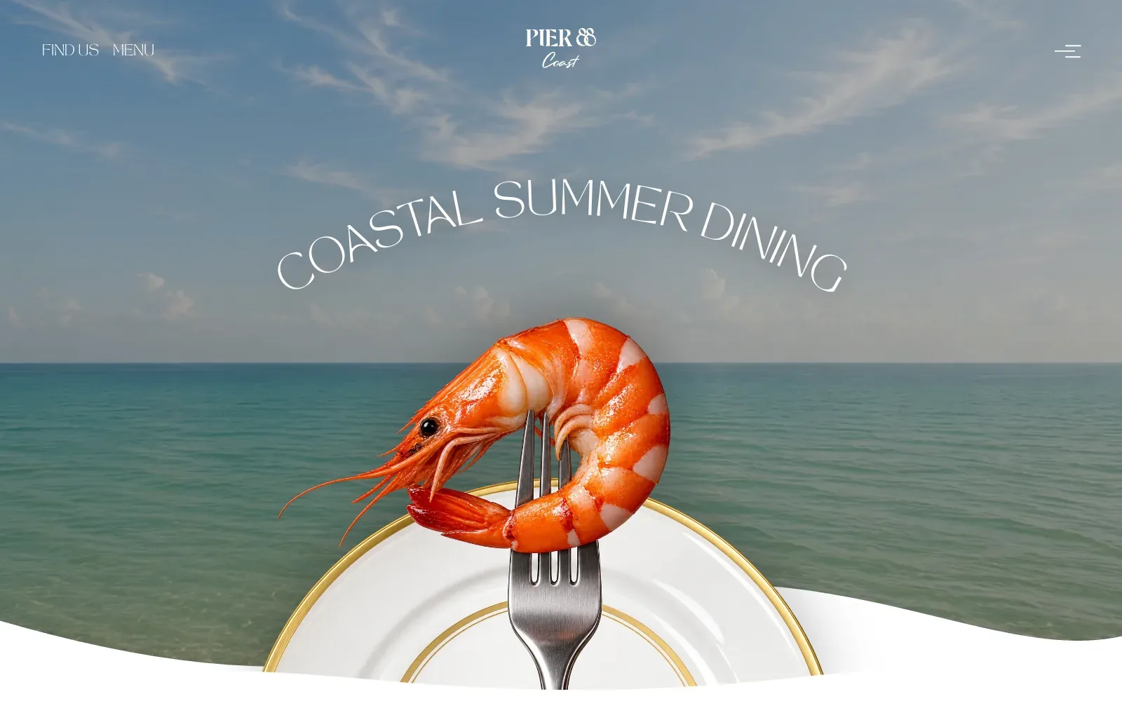
A single cut-out prawn on a fork sits over a calm sea and pale sky, so the eye lands on one warm orange shape against cool blue and teal. The headline curves in thin white capitals above it on desktop, then becomes loose handwritten script on mobile. A wavy white edge at the base softens the finish.
Borrow this: Pair one sharp, well-lit photograph of your best dish with a plain, calm background and a short headline in thin white lettering.
Watch out for: The page is very heavy and only middling in the lab test, which fits a full-bleed photographic hero with scroll animation libraries loaded, and there was not enough real-visitor data to judge how it feels for actual visitors.
Visit pier88coast.com.
Culture, education and non-profit
Museums, schools, charities and cultural projects tend to have the most to say and the tightest budgets. This group had the lowest median lab score at 50.5, though the Musée de Rochechouart passes all three Core Web Vitals. See education website design and nonprofit website design.
| # | Site | Lighthouse (mobile) | LCP, real visitors | INP | CLS | Page weight | Built with |
|---|---|---|---|---|---|---|---|
| 41 | Musée de Rochechouart | 64 | 1.8 s | 136 ms | 0.00 | 2.8 MB | WordPress |
| 42 | RPA Comunicación | 56 | no data | no data | no data | 10.5 MB | Not detected |
| 43 | Colonia Zacamil | 22 | 4.2 s | 438 ms | 0.00 | 6.8 MB | Nuxt |
| 44 | CauseHouse | 92 | no data | no data | no data | 0.8 MB | Next.js |
| 45 | NCCER | 45 | 3.5 s | 235 ms | 0.04 | 21.8 MB | WordPress |
| 46 | CalArts Graphic Design 2026 | 68 | no data | no data | no data | 1.6 MB | Nuxt |
| 47 | Primer | 28 | 4.7 s | 362 ms | 0.00 | 2.4 MB | Webflow |
| 48 | Beyond Spacesuit | 28 | no data | no data | no data | 11.8 MB | Next.js |
41. Musée de Rochechouart
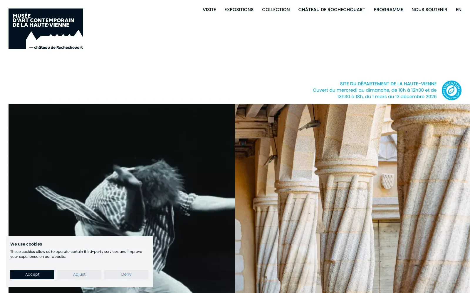
A bold navy logo block with a stylised castle roofline anchors the top left, and the navigation sits in small capitals in a clean geometric sans. Below, a split pair of images carries the page: a high-contrast black and white performance photograph beside a warm close-up of twisted stone columns. Pale cyan text and generous white space keep the page calm.
Borrow this: Use a tight pair of contrasting photographs side by side under a plain header, so the page conveys what the place is like before any copy is read.
Watch out for: The lab test rates the speed as middling, but the page is light and real visitors get a good experience on every Core Web Vitals measure.
Built by OCITOCINE. Visit musee-rochechouart.com.
42. RPA Comunicación
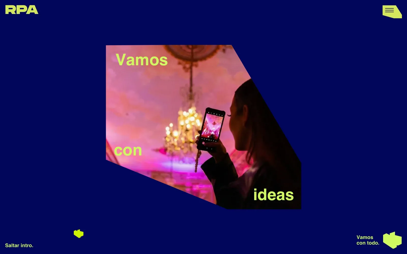
Deep navy and acid lime are the only flat colours, so the hot pink photograph reads as the focal point. The angular crop, with headline words dropped into its corners, feels loose and energetic rather than boxed in. The chunky wide sans logo and clipped-corner menu button repeat that cut-off geometry.
Borrow this: Crop a hero photograph to an angled shape and repeat that angle in the buttons and icons, so a tight palette and a little CSS give the page a clear identity.
Watch out for: The page is very heavy and only middling in the lab test, and Google holds too little real-visitor data to show how it performs for actual visitors, so the intro is worth weighing against the wait.
Built by LaNegrita. Visit rpacomunicacion.com.
43. Colonia Zacamil
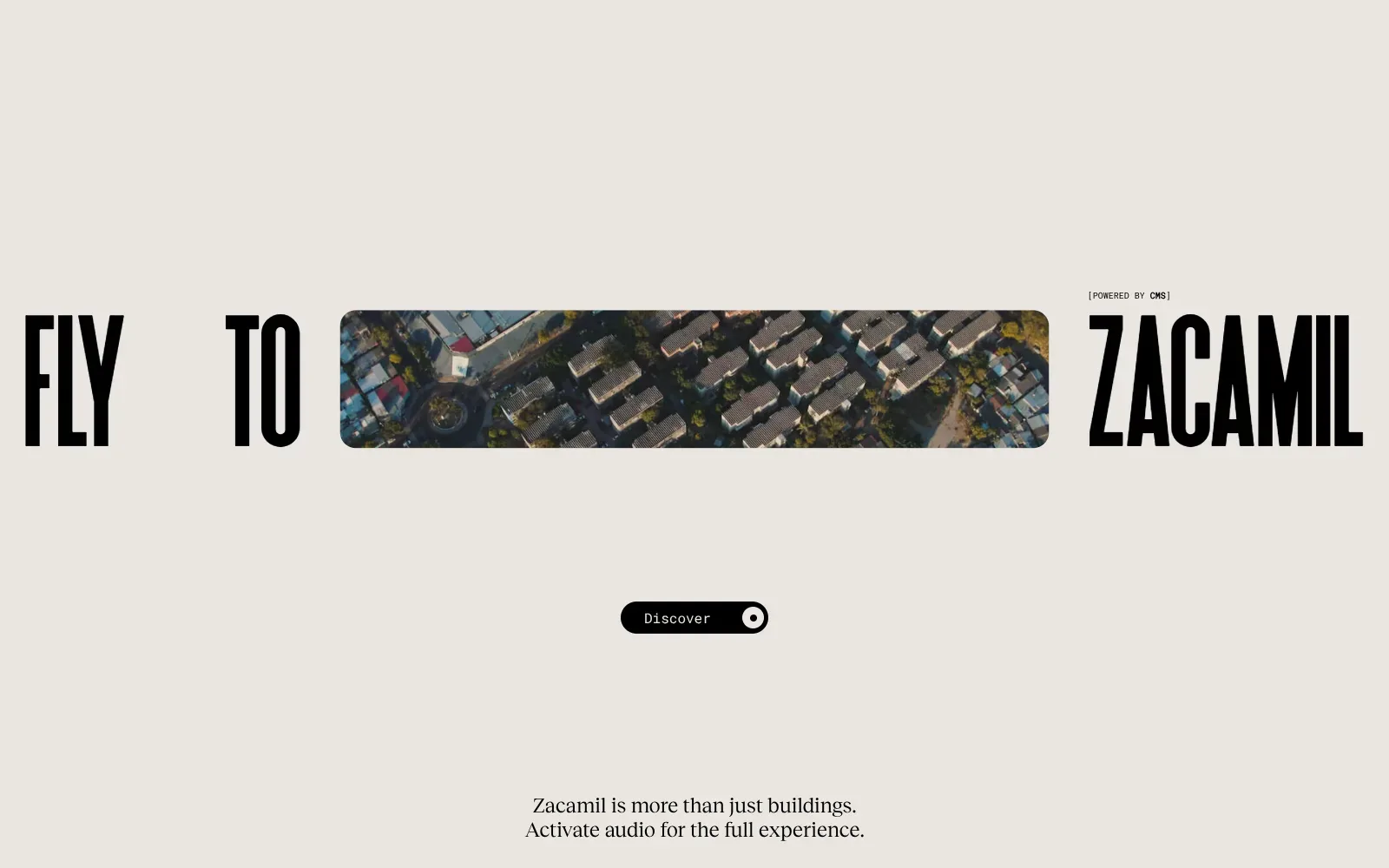
A tall condensed black headline runs edge to edge on a warm stone background, with a rounded strip of aerial footage cut into the sentence like a word. The small mono button and serif caption leave plenty of calm space. On mobile, the footage fills the screen under a blocky, modular logotype in off-white.
Borrow this: Replace one word in your main headline with a rounded crop of a real photograph, and keep everything else on a plain, single-colour background.
Watch out for: The page is heavier than average and slow in the lab test, and real visitors run into slow loading of the main content and sluggish response to taps, so the full-screen footage comes at a measurable cost.
Built by Adoratorio Studio. Visit coloniazacamil.com.
44. CauseHouse
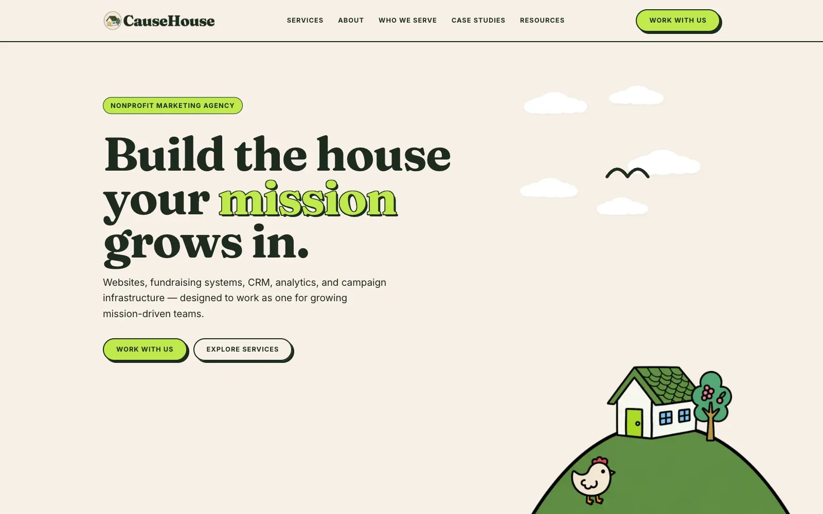
A heavy, high-contrast serif headline in dark green sits on a warm cream background, with one word picked out in lime and a hard offset shadow. The hand-drawn hill, house, tree and chicken give the page a friendly character that suits the name. Pill-shaped buttons and labels share the same lime and outline, so the page feels consistent.
Borrow this: Pick one accent colour, apply it to a single headline word and to the main buttons, and let a simple illustration carry the brand instead of stock photography.
Watch out for: The lab test shows a fast, light page, which is a fair return for using flat illustration over photographs, although Google did not have enough real-visitor data to show how it performs for actual users.
Designed in-house. Visit causehouse.co.
45. NCCER
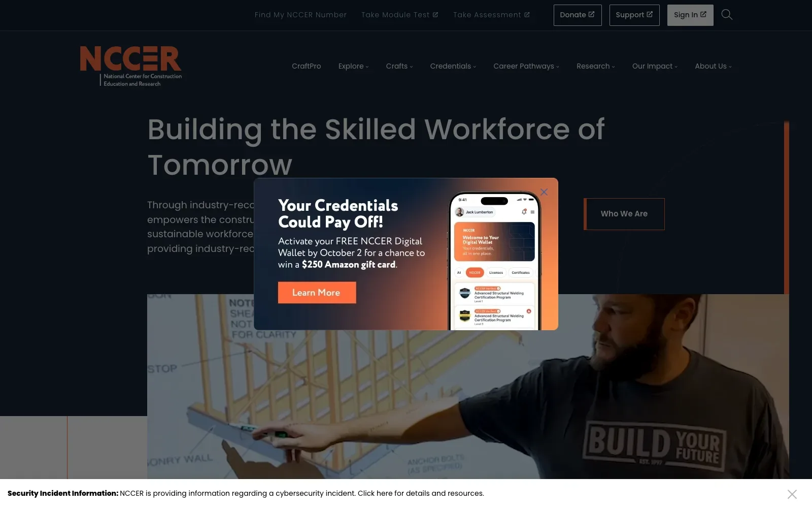
The dark navy ground and burnt orange accent give the page a steady, workmanlike palette that matches the logo. The headline uses a large round geometric sans with generous line spacing, and the photograph of a man pointing at a framing drawing shows the trade without a stock-photo feel. The pop-up borrows the same navy-to-orange gradient.
Borrow this: Use a single accent colour against a dark ground, repeated on the logo, buttons and edge rules, so every page feels related without extra graphics.
Watch out for: The lab test rates the page as slow and very heavy, and real visitors run into problems with loading (LCP) and responsiveness (INP), so the large hero image and stacked overlays carry a cost.
Built by Isadora Digital Agency. Visit nccer.org.
46. CalArts Graphic Design 2026
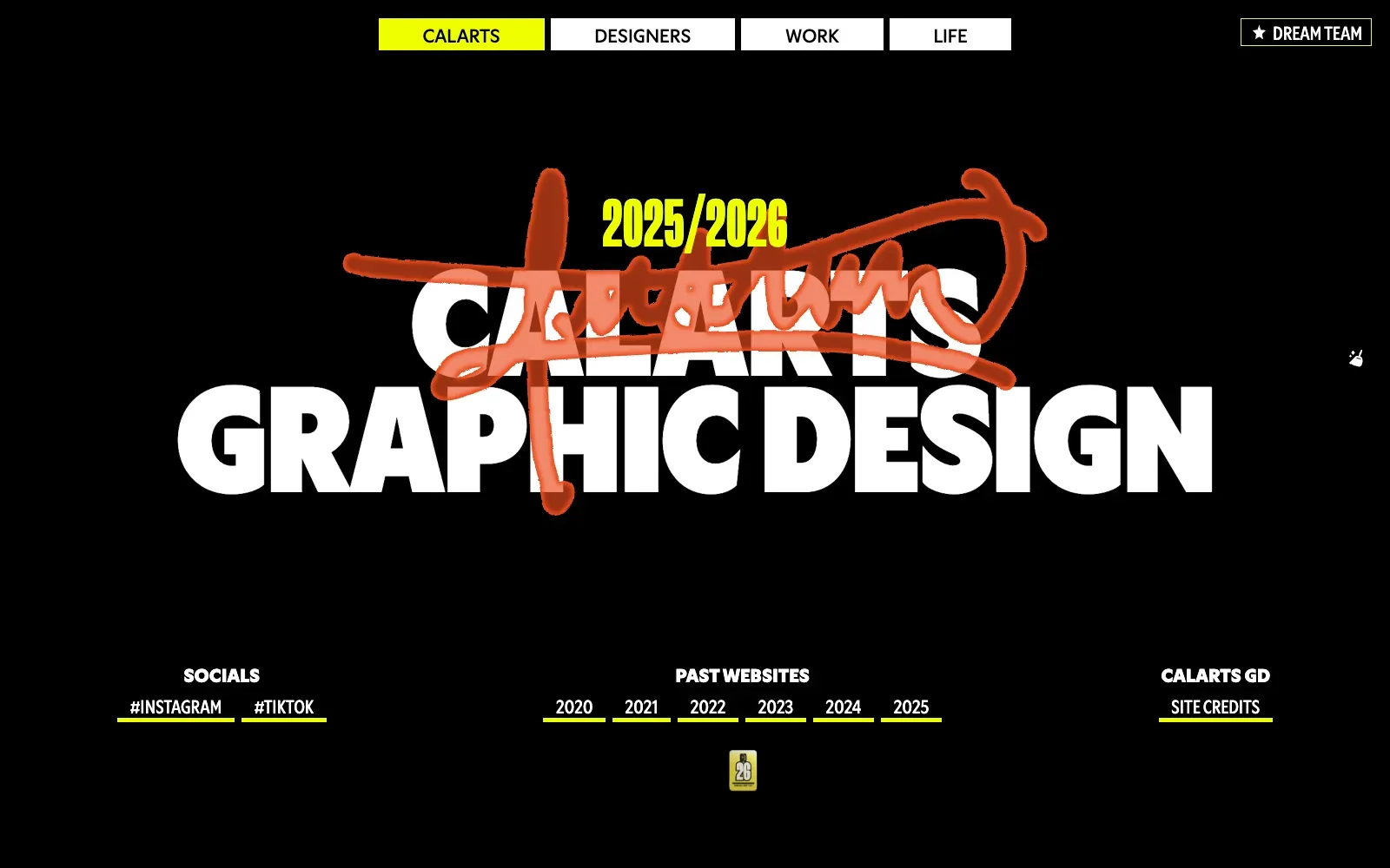
A heavy, tightly set white sans in capitals fills the black screen, with a single acid yellow used for the year, the active tab and the link underlines. The scrawled handwritten strike across the title adds a human mark, and it changes colour between desktop and mobile. Generous empty black space keeps it clear.
Borrow this: Pair one oversized headline with a single accent colour on a plain dark ground, and reserve that accent for the year, the current menu item and link underlines.
Watch out for: The lab test came out middling even though the page is light, and Google had too little real-visitor data to judge how it performs for actual people.
Visit design2026.calarts.edu.
47. Primer
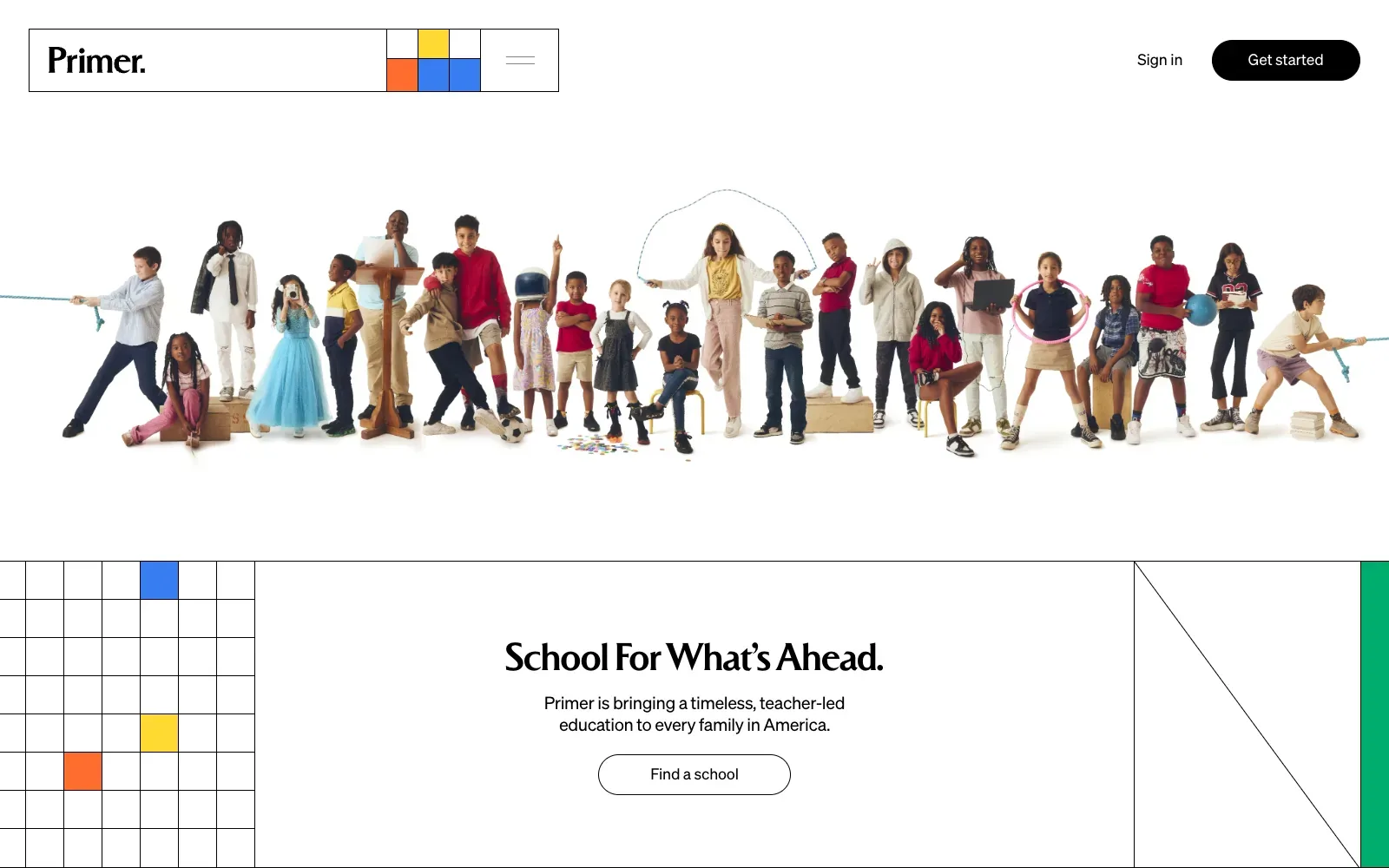
A single cut-out photograph of children, each holding a prop such as a skipping rope, a hoop or a lectern, runs edge to edge across a white page. Thin black grid lines and a few blocks of blue, yellow, orange and green frame it like a school exercise book. The tall, tight serif headline sits calmly in the centre.
Borrow this: Use one wide, cut-out group photograph on a plain white background, then add a few flat colour blocks and thin rules to give the page a recognisable structure.
Watch out for: The page is light, yet it was slow in the lab test, and real visitors report problems with loading of the main image and with responsiveness to taps and clicks, so a large hero photograph still needs careful handling.
Built by newkid. Visit primer.com.
48. Beyond Spacesuit
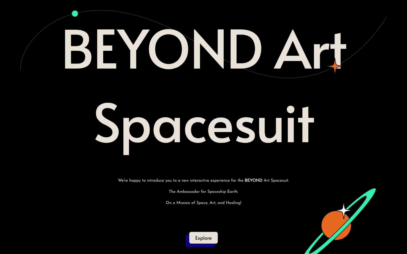
A huge geometric sans headline in warm off-white sits on pure black, so the name is readable at a glance. Small flat illustrations in orange and mint green, a ringed planet, four-point stars and a thin orbit line, add playfulness without clutter. The short centred copy and single button leave plenty of empty space.
Borrow this: Pair one oversized headline with a single contrasting button and a few flat accent shapes in two colours, so the page has a clear first action and a memorable look.
Watch out for: The lab test found the page slow and very heavy, and Google did not have enough real-visitor data to show how it feels for actual users, so the animated extras are worth weighing against load time.
Built by Airnauts. Visit beyondspacesuit.org.
Architecture, property and travel
Architecture, property and travel are visual businesses, and the best sites in this group get out of the photograph's way. KAAN Architecten and Colours of Istria pass all three Core Web Vitals and score 93 and 91 in the lab. For property, see real estate website design.
| # | Site | Lighthouse (mobile) | LCP, real visitors | INP | CLS | Page weight | Built with |
|---|---|---|---|---|---|---|---|
| 49 | Storey Architecture | 69 | no data | no data | no data | 4.9 MB | Nuxt |
| 50 | LPAS | 64 | 2.0 s | 138 ms | 0.50 | 4.9 MB | WordPress |
| 51 | arcoglobal | 61 | no data | no data | no data | 5.2 MB | Nuxt |
| 52 | Warren & Mahoney Architects | 69 | no data | no data | no data | 10.9 MB | Not detected |
| 53 | Lithuania Travel | 47 | 4.2 s | 172 ms | 0.00 | 4.2 MB | Not detected |
| 54 | GetYourGuide Trend Tracker | 38 | 2.6 s | 370 ms | 0.10 | 6.4 MB | Webflow |
| 55 | Colours of Istria | 91 | 2.0 s | 125 ms | 0.00 | 7.5 MB | Next.js |
| 56 | KAAN Architecten | 93 | 1.1 s | 62 ms | 0.00 | 4.1 MB | Craft CMS |
49. Storey Architecture
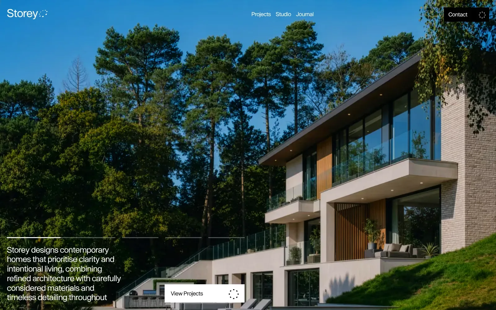
A full-bleed photograph of a glass-fronted house with timber slats and pale brick, framed by tall pines and a clear blue sky, does all the talking. The text uses a light, even sans serif in white, placed over the darker foliage so it stays legible. Slim progress lines above the intro suggest the image changes in a slideshow.
Borrow this: Use a single large, well-lit photograph of your best finished work behind short white text placed over its darkest area, with a plain button beneath.
Watch out for: The page is heavier than average and only middling in the lab test, which fits a full-screen photographic slideshow, and there is not enough real-visitor data to show how it performs for actual users.
Built by Dirty Martini. Visit storeyarchitecture.co.uk.
50. LPAS
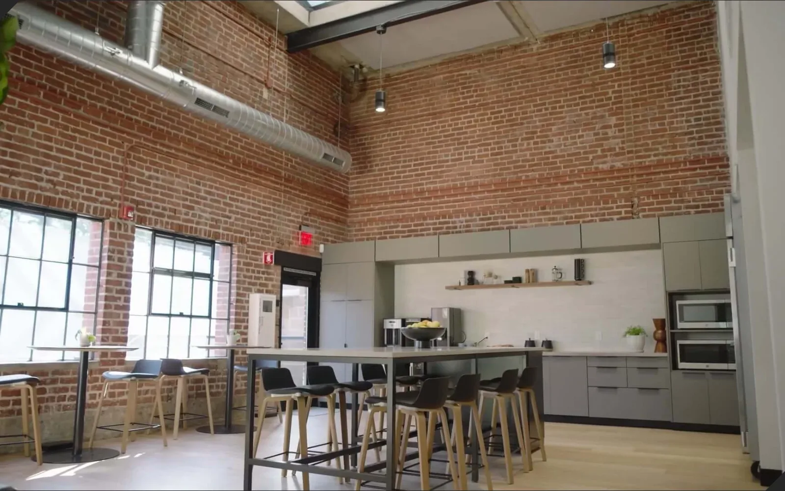
A full-bleed photograph of a brick-walled kitchen with tall windows and pale timber stools does the selling before any text appears. On mobile, a dark overlay keeps the large white headline readable, set in a clean geometric sans. The thin wordmark, small menu button and one underlined prompt leave plenty of room for the image.
Borrow this: Use one honest photograph of your own workspace or finished job as the full-width opening, then lay a dark tint and a single large sentence over it.
Watch out for: The page is heavier than average and the lab test came out middling, and real visitors see the layout shift as it loads, which is a common cost of big hero imagery and video.
Built by Studio Naam. Visit lpas.com.
51. arcoglobal
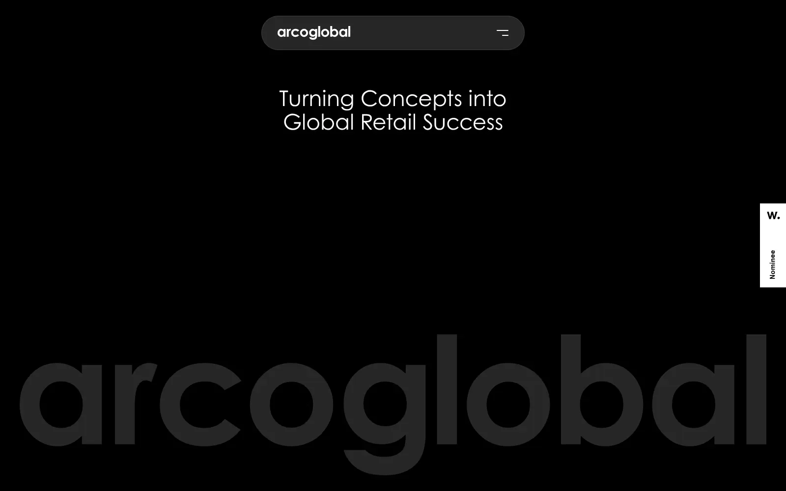
The desktop view commits to black and white, with a single dark grey for the oversized wordmark that spans almost the full width at the bottom. The headline uses a light, geometric sans with round letterforms, centred under a floating pill-shaped menu bar. Plenty of empty space makes the message read instantly, and the huge logo gives the brand presence without any photography.
Borrow this: Use your company name as an oversized, low-contrast wordmark at the foot of the opening screen, which needs nothing more than a text style and a dark background.
Watch out for: The page is heavier than average and scored middling in the lab test, and Google did not have enough real-visitor data to show how it performs for actual users.
Built by workattack. Visit arcoglobal.com.
52. Warren & Mahoney Architects
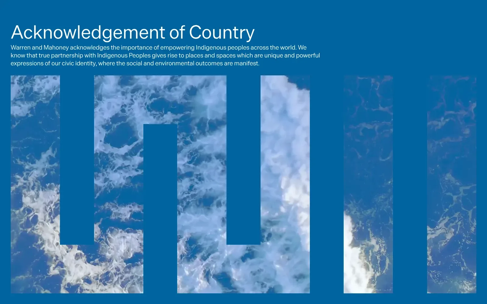
A flat blue ground carries everything, so the white heading in a light, open sans serif reads instantly. Below the short paragraph, tall vertical bars contain aerial photography of sea foam, and the gaps between them step up and down like a block letterform. The blue of the water matches the background, giving the page calm and a clear shape.
Borrow this: Crop a photograph into tall bars on a flat brand colour, so a plain page of text gets a distinct graphic shape without custom illustration.
Watch out for: The page is very heavy and scored only middling in the lab test, and Google did not have enough real-visitor data to show how it performs for actual visitors.
Built by Sons & Co. Visit wam.studio.
53. Lithuania Travel
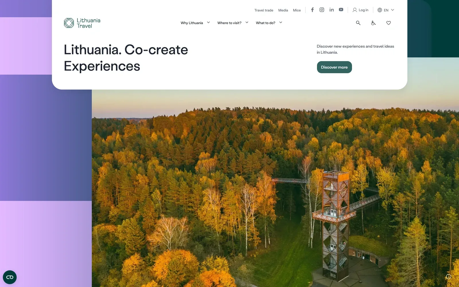
A white rounded panel carries the headline and one button, sitting over a full-bleed autumn forest photograph with a timber lookout tower. Soft lilac and purple blocks at the edge frame the image without fighting it. The warm oranges against deep green give the page a clear mood, and the type is a friendly geometric sans.
Borrow this: Place a single rounded white card over a large photograph and keep it to a headline, one line of support and one solid button.
Watch out for: The lab test found the page slow and heavier than average, and real visitors see slow loading of the main image (LCP), so a hero photograph this large needs tighter compression.
Visit lithuania.travel.
54. GetYourGuide Trend Tracker
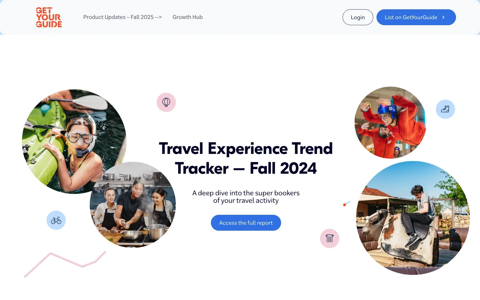
Circular photo crops of people snorkelling, cooking, indoor skydiving and riding a mechanical bull make the topic clear before any text is read. Small pastel pink and blue icon dots and a faint zigzag line hint at data without clutter. The heavy dark navy headline sits centred in generous white space, with one blue pill button as the only action.
Borrow this: Crop customer photos into circles and pair them with small tinted icon dots to give a plain white page a friendly, ordered feel.
Watch out for: The lab test found the page slow and heavier than average, and real visitors see problems with loading (LCP) and responsiveness (INP), so the image-rich animated hero costs speed.
Built by Vovi. Visit getyourguide.supply.
55. Colours of Istria
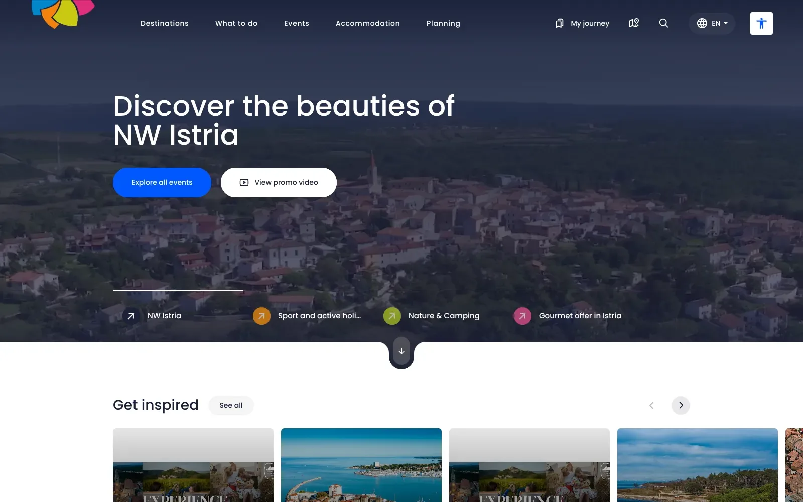
A dark, tinted aerial photo of a hilltop village sits behind a large white headline in a round, geometric sans, so the text reads cleanly. One saturated blue pill button stands out against the muted navy. Four small coloured arrow icons in orange, green and pink echo the multicoloured petal logo and give the hero a quiet colour code.
Borrow this: Tint a single photograph with a dark overlay, then place one bold headline and one bright pill button on top so the main action is obvious.
Watch out for: The page is heavier than average, which is the cost of image-led cards and a carousel, but it tested fast in the lab and real visitors get a good experience on all three Core Web Vitals.
Built by ALT_digital. Visit coloursofistria.com.
56. KAAN Architecten
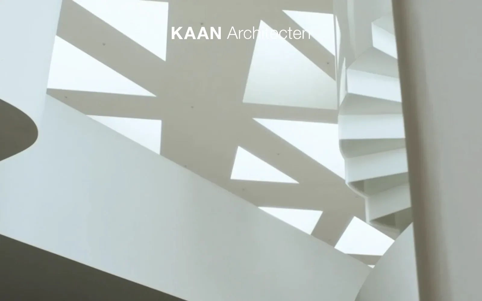
The whole screen is given to a full-bleed photograph of a white spiral staircase and a lattice ceiling, shot from below, so the building does the talking. The palette stays in pale greys and white, and the wordmark is the only other element. A bold uppercase sans paired with a light weight for the descriptor gives a quiet hierarchy.
Borrow this: Lead with a full-screen photograph of your best finished work and set the name over it in white, using a bold weight and a light weight to separate the two parts.
Watch out for: The page is fast in the lab test and real visitors get a good result on every Core Web Vitals measure, though it is heavier than average, which is the usual cost of an image-led opening screen.
Built by Humans & Machines. Visit kaanarchitecten.com.
Business and health
Business and health sites have to earn trust fast. Three of these eight pass all three Core Web Vitals, the most of any category, and this group also includes the heaviest page in the sample, ERA Residence at 104.4 MB. For clinics and practices, see healthcare website design.
| # | Site | Lighthouse (mobile) | LCP, real visitors | INP | CLS | Page weight | Built with |
|---|---|---|---|---|---|---|---|
| 57 | Twelve | 70 | no data | no data | no data | 5.4 MB | WordPress |
| 58 | Gielly Green | 73 | 1.9 s | 115 ms | 0.00 | 2.4 MB | Nuxt |
| 59 | DVO | 62 | 5.0 s | 170 ms | 0.01 | 24.5 MB | WordPress |
| 60 | Rejuvenation Health | 81 | 2.2 s | 96 ms | 0.00 | 0.7 MB | Not detected |
| 61 | Enerblock | 63 | no data | no data | no data | 24 MB | Not detected |
| 62 | Seasats | 49 | 3.3 s | 359 ms | 0.00 | 5 MB | Next.js |
| 63 | ERA Residence | 58 | 2.3 s | 339 ms | 0.54 | 104.4 MB | Webflow |
| 64 | Heron AI | 52 | 1.8 s | 172 ms | 0.01 | 1.7 MB | Webflow |
57. Twelve
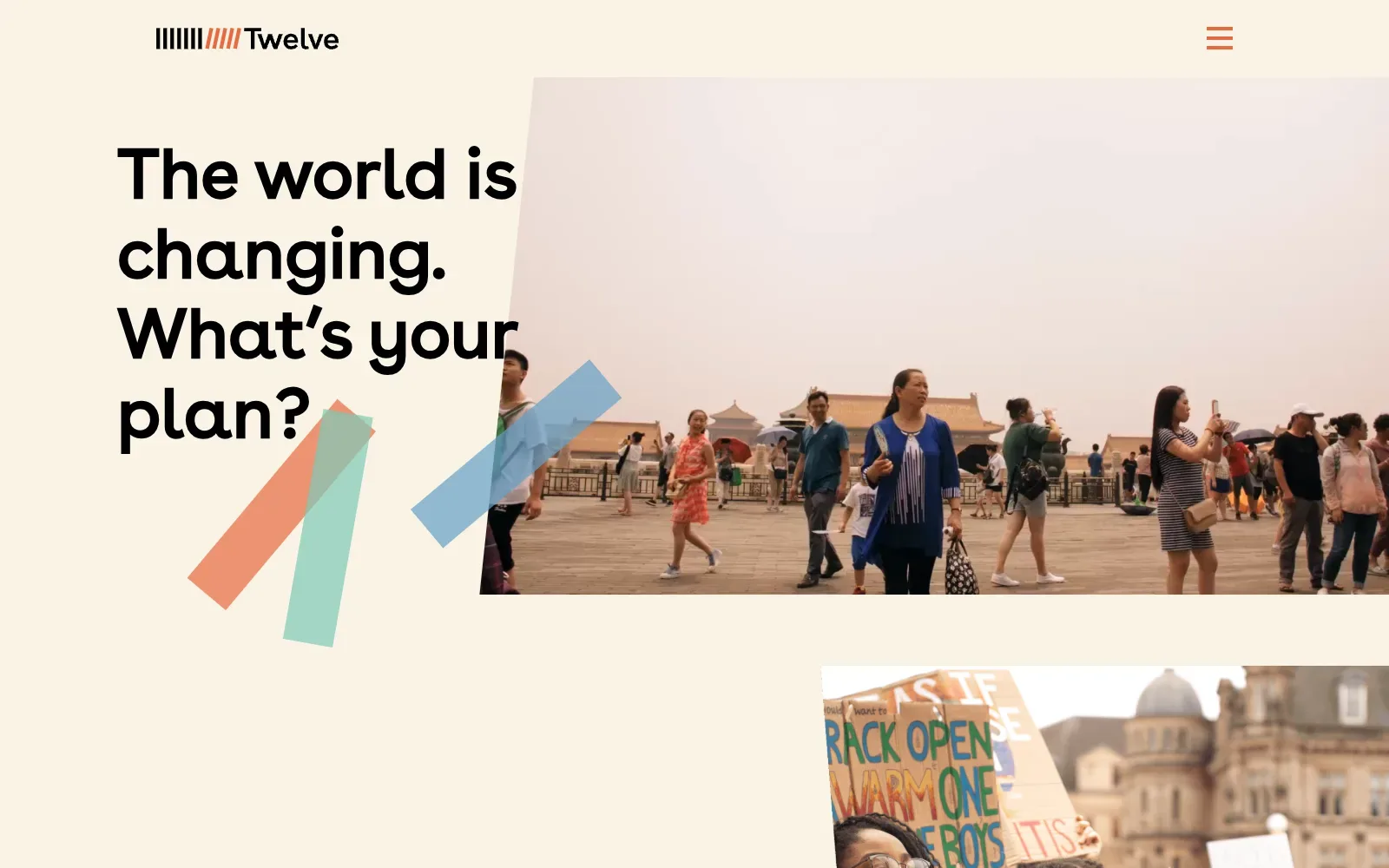
A warm cream background and one large rounded sans headline give the page a calm, confident start. The photograph is cut on a slight slant, and loose coloured bars in coral, mint and blue overlap the text edge to add movement. The logo's striped mark in black and coral is echoed by the coral menu icon.
Borrow this: Use one warm off-white background with a single accent colour repeated in the logo and menu icon, so a plain page still feels branded.
Watch out for: The lab test came out middling and the page is heavier than average, which fits a layout built on large photographs, and Google did not have enough real-visitor data to show how it feels in practice.
Built by Pixelfish. Visit twelvefutures.com.
58. Gielly Green
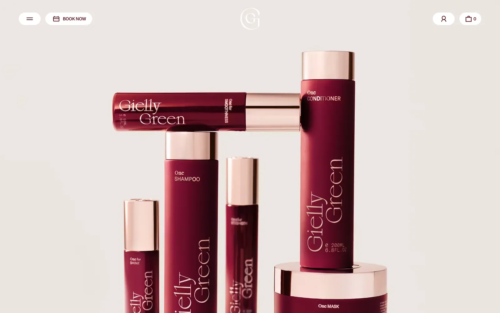
A single product photograph fills the screen, with deep burgundy bottles and rose-gold caps set against a warm, pale stone background. The colours are tightly limited, so the packaging does all the talking. The tall, light serif on the labels is echoed in the small monogram, and the pill-shaped navigation buttons sit quietly around the edges.
Borrow this: Pick one well-lit photograph of your own product, set it against a plain background in a single neutral tone, and keep the navigation to a few small rounded buttons.
Watch out for: The lab test came out middling, though the page is light and real visitors get a good experience on all three Core Web Vitals, so the speed that matters is holding up.
Built by Lovelace Studio. Visit giellygreen.co.uk.
59. DVO
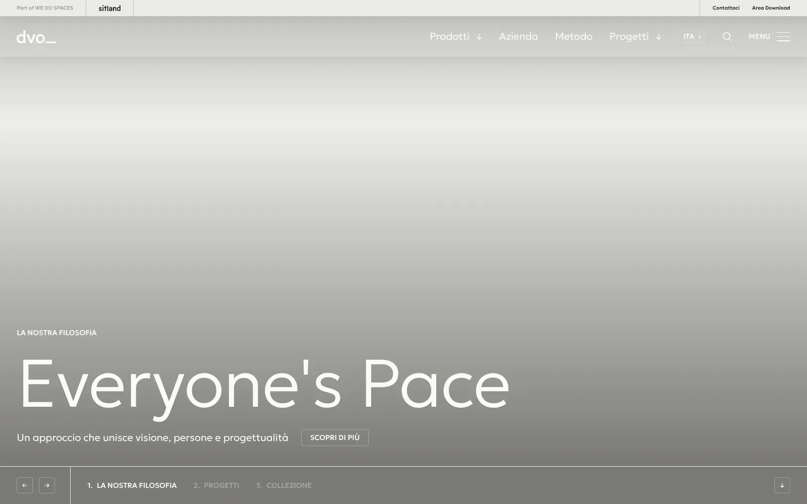
A very large, light-weight geometric sans headline sits low on the left over a soft grey gradient, with a small uppercase label above and a thin outlined button below. The restraint is the appeal: white type, generous empty space and a quiet palette give it a calm, architectural feel. A slim bar along the bottom with numbered slide titles and small arrow buttons keeps the controls tidy.
Borrow this: Set a short headline in a light, wide-set sans over a muted background and add a plain outlined button, so the message reads before anything else on the page.
Watch out for: The page is very heavy, the lab test came out middling and real visitors see problems with how quickly the main hero content loads, so the large hero is the part to keep light.
Built by Studio Idee Materia. Visit dvo.it.
60. Rejuvenation Health
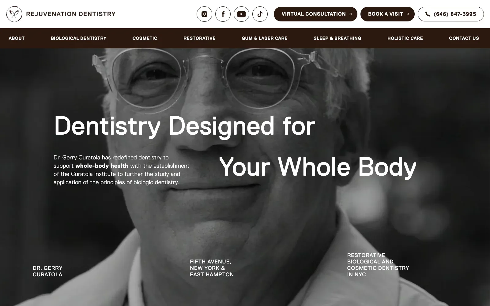
A large black and white portrait of the dentist fills the whole screen, so the first impression is a person rather than a stock smile. The headline uses a clean, wide sans serif in white and staggers across the face, giving the page movement without extra graphics. A dark chocolate brown main menu bar and matching buttons keep the palette calm and warm.
Borrow this: Use one honest, well-lit portrait of the owner behind a dark overlay with white text on top, so visitors see who they are dealing with straight away.
Watch out for: The lab test result is middling, but the page is light and real visitors get a good experience on every Core Web Vitals measure, so the large photograph is not costing them in practice.
Built by Studio 3 Marketing. Visit rejuv-health.com.
61. Enerblock
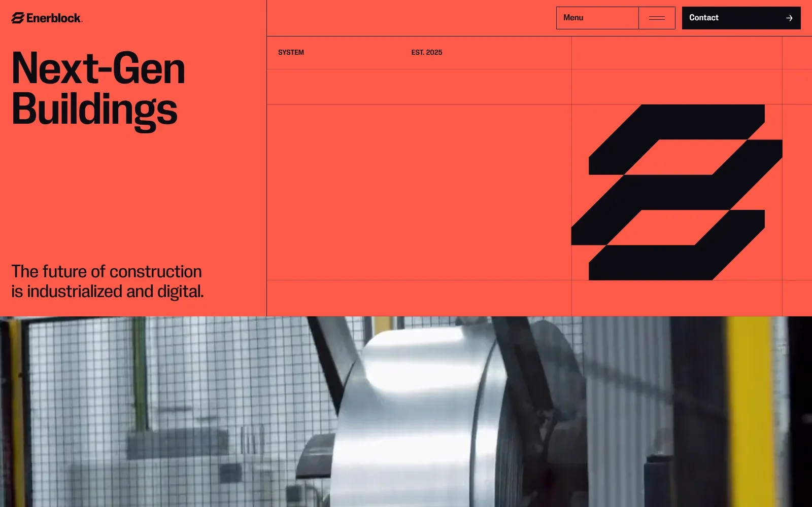
A flat, saturated coral-red field carries a tight, heavy grotesque headline in near-black, so the message reads at once. Thin ruled grid lines frame a large angular logo mark, giving an engineering-drawing feel. A photograph of a steel coil behind a wire cage sits below, grounding the graphic top half in real industry.
Borrow this: Pair a single bold background colour with one oversized headline and one strong graphic mark, then place a real photograph directly beneath to prove the work is physical.
Watch out for: The notes show a very heavy page and only middling lab results, so the full-width industrial imagery and likely moving footage cost visitors load time, and there is too little real-visitor data to say how it feels in practice.
Built by BANILA Studio. Visit enerblock.net.
62. Seasats
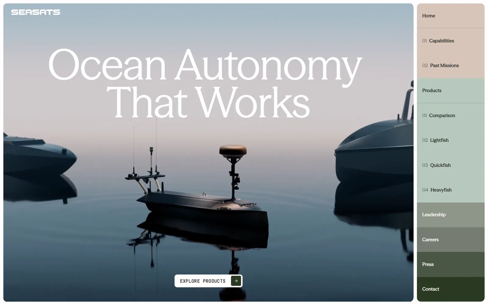
A calm, full-bleed photograph of small uncrewed boats sitting on still water fills the screen, with soft grey-blue sky fading into dark navy. The headline uses a light, wide-set serif in white and reads clearly against the pale sky. The right-hand column of stacked tabs shifts from sand to sage to deep green, giving the menu a clear order.
Borrow this: Use one large, quiet photograph with a single short headline and one clear button, and keep the sky or background empty enough for the white text to read.
Watch out for: The page is slow in the lab test and heavier than average, and real visitors run into problems with loading (LCP) and responsiveness (INP), which is a common cost of a large moving hero image and scripted scrolling.
Built by Raw Materials. Visit seasats.com.
63. ERA Residence
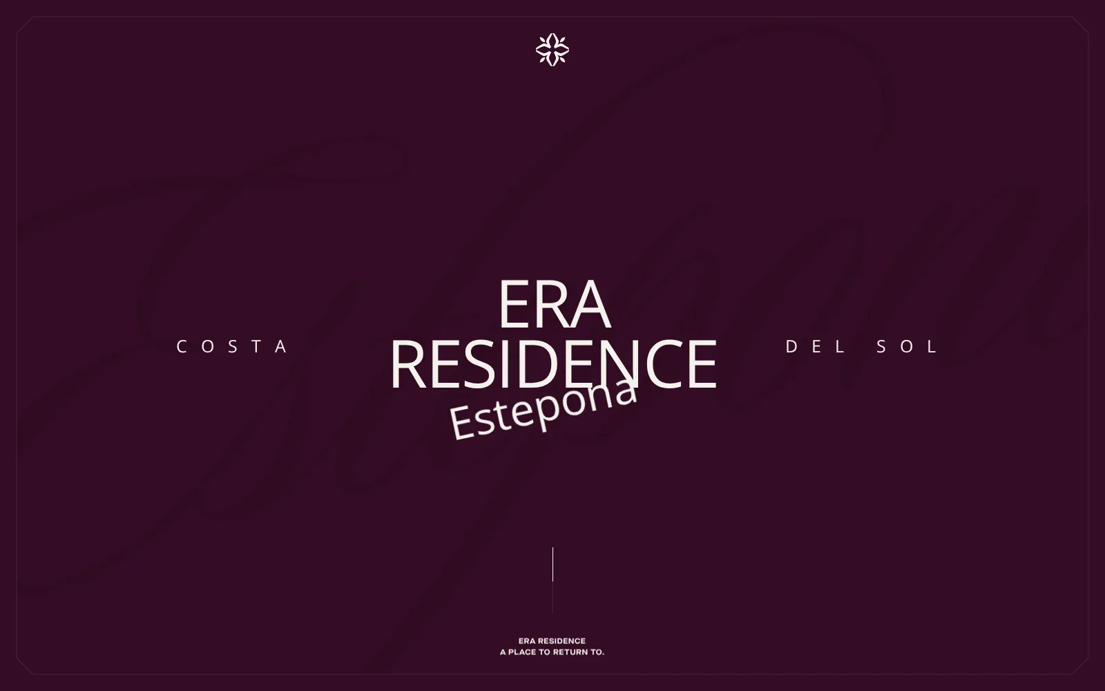
A deep aubergine field with warm off-white type gives the page a calm, expensive feel. The wide-spaced capitals for the region flank a large centred name, and the tilted script-like word for the town adds a hand-written touch. A faint giant signature sits behind it all, and a thin inset border frames the screen like a printed card.
Borrow this: Use one deep, single colour as the whole background and set a short name in large pale capitals, with one slightly tilted word as the only flourish.
Watch out for: The page is very heavy, and real visitors report problems with responsiveness and layout stability, which fits a build that leans on animation libraries and a lot of loaded assets.
Built by The First The Last. Visit era-residence.com.
64. Heron AI
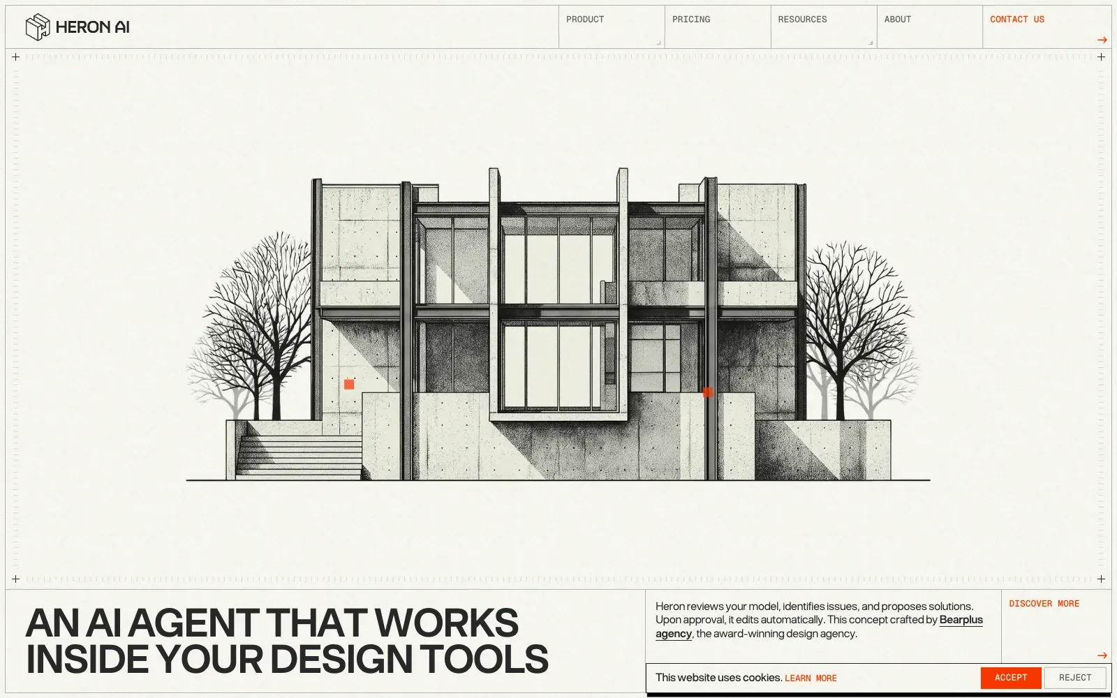
The page reads like an architect's drawing sheet. A stipple-shaded elevation of a concrete house sits on warm off-white paper, framed by hairline rules, tick marks and crosshair corners. The headline uses tight, heavy grotesque capitals, the navigation uses a small monospaced face, and a single orange accent appears sparingly on the contact link and buttons.
Borrow this: Pair a single illustration with hairline borders, a warm neutral background and a restrained accent colour to give a plain layout character without a photo shoot.
Watch out for: The lab test result is middling, but the page is light and real visitors get a good experience on every Core Web Vitals measure.
Built by Bearplus Agency. Visit heronaiapp.com.
Beautiful websites don't last
Design inspiration lists age badly. I opened every site linked from a popular 2026 list of the best website designs, 48 in all, in a browser on 31 Oct 2026.
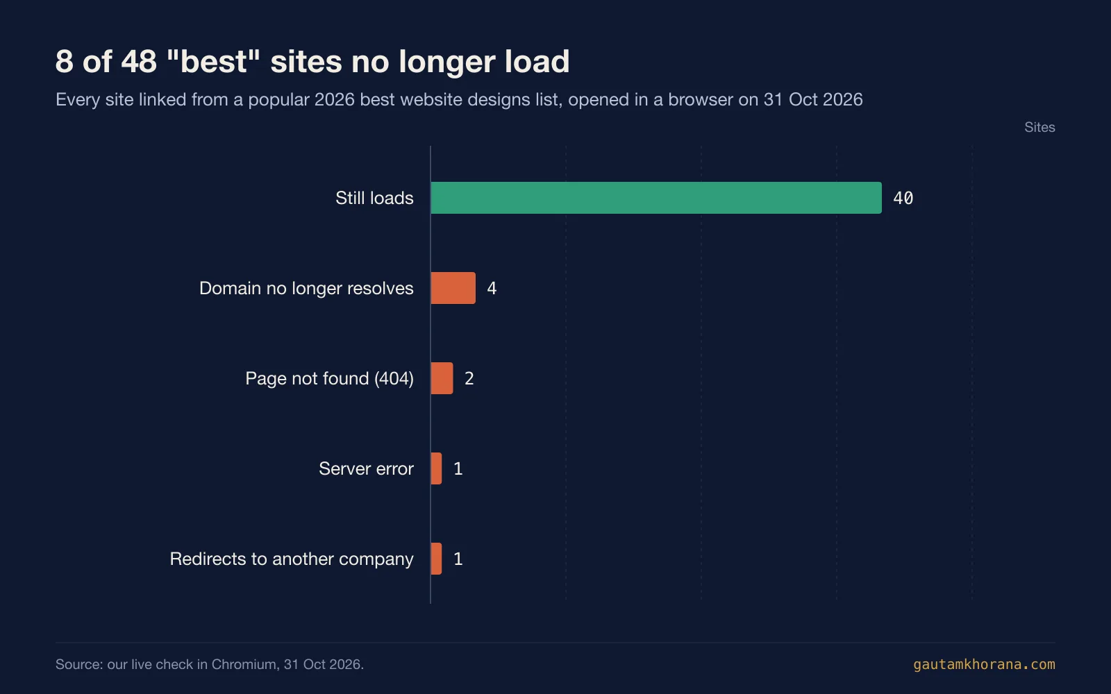
Eight of the 48 no longer load the featured site. Four domains no longer resolve, two pages return a 404, one returns a server error and one now redirects to a different company. Campaign microsites are the most fragile: they are built for a launch, they win attention, and then the maintenance budget ends. The sites that last are a company's main website, looked after year after year.
How to get a beautiful website that is also fast
The 11 sites that pass all three Core Web Vitals point to a few habits, and none requires giving up on looking good.
- Make the first screen light. The page can be heavy as long as the first thing people see arrives quickly. Fauna Robotics proves it at 68.6 MB.
- Treat every animation library as a cost. Smooth scrolling feels good, but the sites carrying one scored lower in the lab. Use motion where it explains something.
- One great image beats ten good ones. The fastest image-led sites here, such as KAAN Architecten, open with a single photograph and almost nothing else.
- Measure real visitors, not just the lab. A Lighthouse score is a starting point. Real-visitor data is what Google uses for page experience (Chrome UX Report).
- Plan for the long run. Put the effort into the site you will keep, not a microsite you will switch off.
If your current site looks dated, or looks good but loads slowly, that is exactly what a website redesign should fix: a design people remember, built to pass Core Web Vitals from the first day. If the design is fine and only speed is the problem, web performance optimisation is the smaller job.
Questions people ask
What makes a website beautiful?
Across these 64, the common thread is restraint: a short palette, one or two typefaces used with confidence, generous space and one strong image or headline per screen. The sites that look expensive usually have fewer elements on the first screen, not more.
Can a beautiful website also be fast?
Yes. KAAN Architecten scores 93 in the lab and passes all three Core Web Vitals for real visitors, and Rejuvenation Health passes all three on a 0.7 MB page. The slow sites in this sample are slow because of heavy media, animation libraries and large scripts, not because they look good.
What are good Core Web Vitals scores?
Google rates an LCP of 2.5 seconds or less, an INP of 200 milliseconds or less and a CLS of 0.1 or less as good, measured at the 75th percentile of page loads. A page passes when all three are good (web.dev).
Why do Lighthouse scores and real-visitor data disagree?
Lighthouse is a lab test run in a controlled environment, and it cannot measure INP. Real-visitor data from the Chrome UX Report reflects actual devices and networks over 28 days (web.dev). That is why Heron AI can score 52 in the lab and still pass all three Core Web Vitals.
Where can I find more website design inspiration?
These 64 are a sample. For browsing by layout, industry or component, the web design inspiration sites roundup lists the galleries worth bookmarking, and the neuroscience of UX design explains why some layouts simply feel better.