Here are 20 of the best restaurant and food websites online right now: restaurants, a hotel dining room, coffee roasters, wine producers and merchants, food makers, a food festival, a recipe site and a few hospitality brands. And none of them was picked by taste. I drew all 20 at random from 24 live, hand-reviewed food and hospitality sites, checked that each one loads, measured it on a phone and wrote down what a restaurant could copy. The sharper finding: the median mobile Lighthouse score is 61.5, and 5 of the 13 sites with enough real-visitor data pass all three of Google's Core Web Vitals. This is the food and drink spoke of 64 beautiful websites, checked live and speed-tested.
How these 20 were picked and tested
Most lists of the best restaurant websites are someone's favourites. That is fine for ideas, but it hides what a good-looking food site usually costs in loading time, because the slow ones quietly disappear from view. So I used a random draw instead.
- The pool: 24 live food, drink and hospitality websites from a curated design database I maintain. Every one was reviewed by hand, has desktop and mobile captures, and passed an availability check in the last 30 days.
- The draw: 20 sites in a fixed random order, with no more than two from any one studio. Nothing here is my client work, and no one paid to be included.
- Three swaps, each for a stated reason: two sites in the first 20 sit behind age-verification screens that hide the whole design, and I do not click through legal-age checks. A third now sells 3D product configurators rather than food or drink. Each was replaced by the next site in the draw.
- The live check: every site was opened in a browser (Chromium) on 31 Oct 2026 and loaded the same site it was listed for.
- The lab test: a mobile Lighthouse run per site between 12 and 20 Oct 2026, recording the performance score, Largest Contentful Paint and page weight.
- The real-visitor data: Chrome UX Report figures for phones, which Google collects from real Chrome users over a rolling 28-day window. Not every site gets enough visitors to appear (Chrome UX Report), so 5 of the 20 show "no data".
- Not a ranking: the order below is the draw order.
What 20 restaurant and food websites cost in speed
Google rates a page as good when its Largest Contentful Paint (LCP) is 2.5 seconds or less, its Interaction to Next Paint (INP) is 200 milliseconds or less and its Cumulative Layout Shift (CLS) is 0.1 or less, measured at the 75th percentile of page loads. A page passes Core Web Vitals only when it meets all three (web.dev).
| Finding | Result |
|---|---|
| Median mobile Lighthouse performance score | 61.5 |
| Score 90 or above | 0 of 20 |
| Score under 50 | 3 of 20 |
| Median page weight | 4.7 MB |
| Pages over 10 MB | 4 of 20 |
| Heaviest page | 53.4 MB (Slurp) |
| Sites with real-visitor (CrUX) data | 15 of 20 |
| Pass all three Core Web Vitals, of the 13 with enough data to judge | 5 |
| Real-visitor LCP within 2.5 seconds | 9 of 15 |
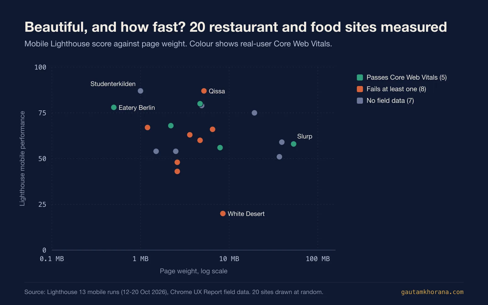
The heaviest page in the draw is also one of the five that pass. Slurp, a ramen bar in Copenhagen, weighs 53.4 MB, yet real visitors see its main content in 1.9 seconds. Whatever else the page carries, the first screen arrives in time. And that is exactly what the LCP measures.
The lab score and the real-visitor result often disagree. Qissa shares the top lab score of 87 with Studenterkilden, but its real visitors wait 2.7 seconds for the main content, just over Google's line, so it fails. Paul & Bohne scores 56 in the lab and passes all three for real visitors. Lighthouse is a single lab run on an emulated phone, while the Chrome UX Report is what Google Search uses for its page experience signal (Chrome UX Report).
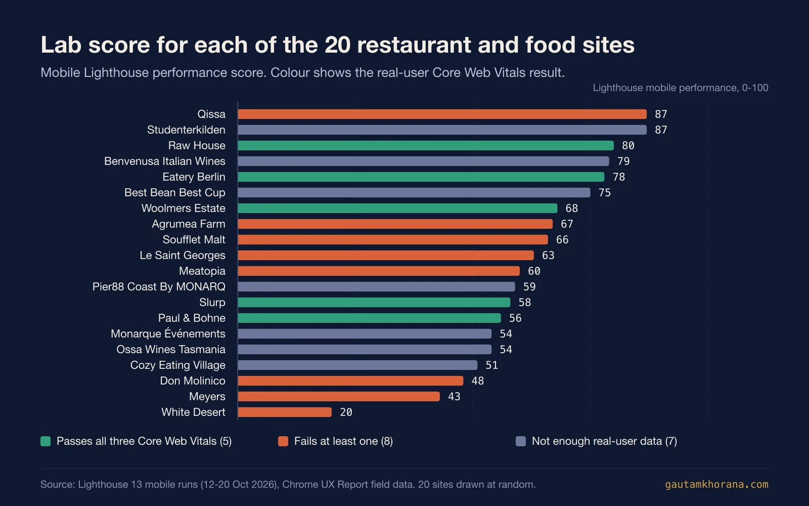
Loading speed is where most of these sites slip. Of the 8 sites that fail, 6 miss the 2.5 second LCP target, 4 have too much layout shift and only 1 is slow to respond to taps. That is the familiar food-site pattern: a large hero photograph or video, served at full size, becomes the thing everyone is waiting for.
There is a second finding worth knowing if you read the pillar. In the 64-site draw, none of the eight food, drink and hospitality sites passed Core Web Vitals. With 20 drawn from the same pool, five do: Raw House, Woolmers Estate, Slurp, Paul & Bohne and Eatery Berlin. So a small sample can make a whole category look worse, or better, than it is.
What these 20 are built with
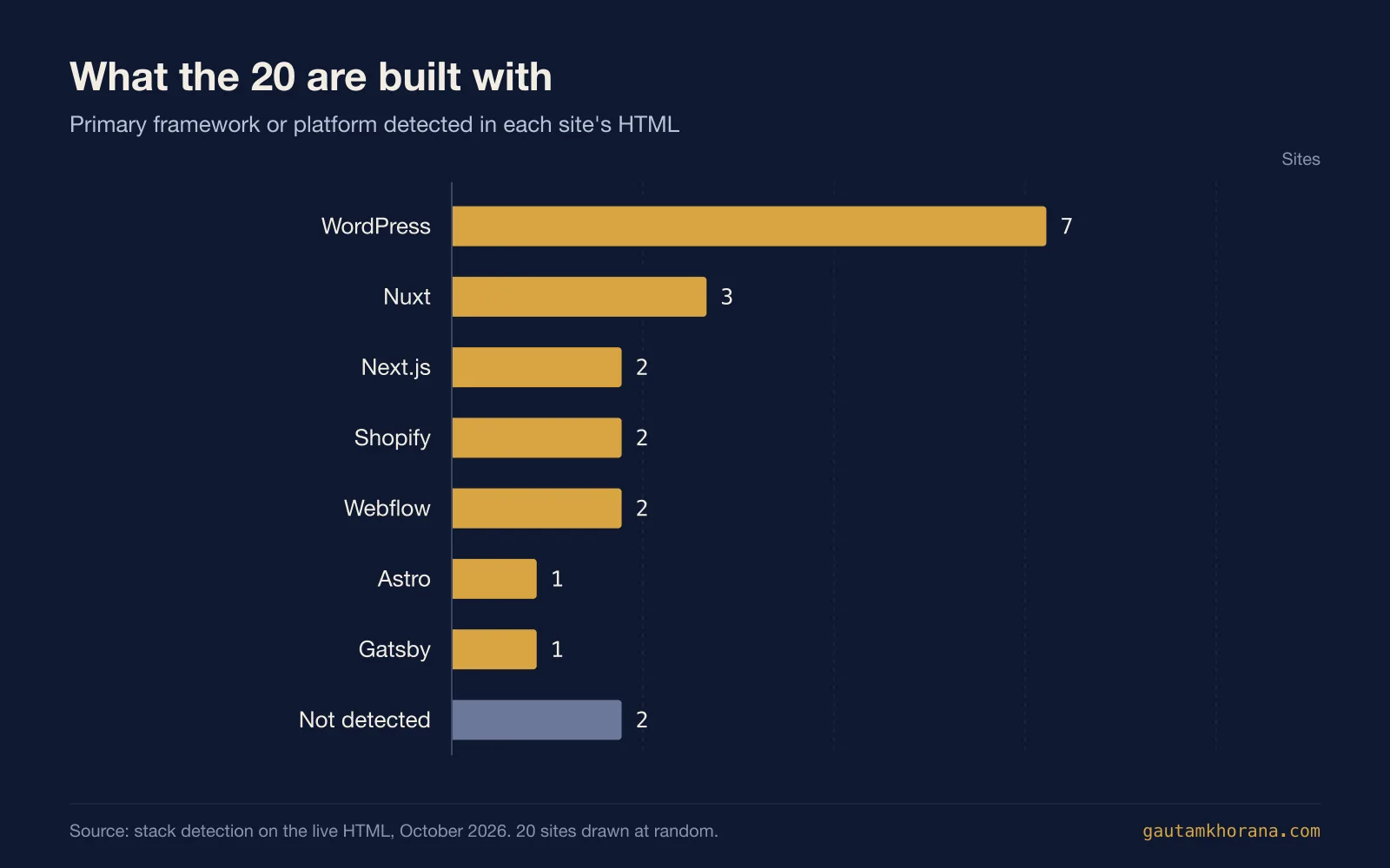
WordPress runs 7 of the 20, more than any other platform. Nuxt has 3, and Next.js, Shopify and Webflow have 2 each, with one site each on Astro and Gatsby and 2 where the stack could not be read from the HTML. The two Shopify sites, Paul & Bohne and Best Bean Best Cup, are the two that sell coffee online. Raw House, on Astro, has the fastest real-visitor LCP in the draw at 0.8 seconds, and Eatery Berlin, on Gatsby, has the lightest page at 0.5 MB. If you are choosing a framework, Astro vs Next.js covers the trade-off.
What the 20 have in common
Every site in the database is tagged by style when it is reviewed, and the stack is detected from the live HTML. So these are counts rather than impressions.
- Food photography leads. 9 of the 20 are tagged photographic, more than any other style. The best of them use one large, close, well-lit plate rather than a grid of small ones.
- Colour is a choice, not a default. 8 are tagged colourful, and the ones that work pick one or two strong colours from the food or the brand and use them everywhere.
- Type does the talking. 7 use big display type and 6 a serif, and the two often appear together: a serif headline set large over a photograph or a flat colour.
- Motion is common but not the problem. 7 load a smooth-scroll or animation library (GSAP and Lenis on 4 each). Their median lab score is 66, against 60 for the rest, so in this draw animation alone does not explain the slow scores.
The 20 restaurant and food websites
All 20 in draw order, measurements first, then a closer look at each one with a capture of its homepage, the pattern worth borrowing and the trade-off to know about. Real-visitor figures are from phones; "no data" means Google had too few visitors to report. For your own place, see restaurant website design.
| # | Site | Lighthouse (mobile) | LCP, real visitors | INP | CLS | Page weight | Built with |
|---|---|---|---|---|---|---|---|
| 1 | Studenterkilden | 87 | 1.6 s | no data | 0.00 | 1 MB | Webflow |
| 2 | Meatopia | 60 | 3.7 s | 499 ms | 0.06 | 4.7 MB | Next.js |
| 3 | Pier88 Coast By MONARQ | 59 | no data | no data | no data | 39.3 MB | WordPress |
| 4 | Le Saint Georges | 63 | 3.5 s | 112 ms | 0.96 | 3.6 MB | WordPress |
| 5 | Raw House | 80 | 0.8 s | 88 ms | 0.03 | 4.7 MB | Astro |
| 6 | Soufflet Malt | 66 | 5.9 s | 130 ms | 0.02 | 6.5 MB | WordPress |
| 7 | Meyers | 43 | 2.1 s | 161 ms | 0.12 | 2.6 MB | Nuxt |
| 8 | Woolmers Estate | 68 | 1.7 s | 158 ms | 0.00 | 2.2 MB | WordPress |
| 9 | White Desert | 20 | 2.3 s | 194 ms | 0.23 | 8.5 MB | Next.js |
| 10 | Agrumea Farm | 67 | 5.3 s | 194 ms | 0.00 | 1.2 MB | Nuxt |
| 11 | Slurp | 58 | 1.9 s | 79 ms | 0.00 | 53.4 MB | Webflow |
| 12 | Paul & Bohne | 56 | 2.4 s | 103 ms | 0.05 | 7.9 MB | Shopify |
| 13 | Ossa Wines Tasmania | 54 | no data | no data | no data | 1.5 MB | WordPress |
| 14 | Don Molinico | 48 | 3.8 s | 136 ms | 0.16 | 2.6 MB | Nuxt |
| 15 | Benvenusa Italian Wines | 79 | no data | no data | no data | 4.9 MB | Not detected |
| 16 | Monarque Événements | 54 | no data | no data | no data | 2.5 MB | WordPress |
| 17 | Best Bean Best Cup | 75 | 1.4 s | no data | 0.00 | 19.3 MB | Shopify |
| 18 | Eatery Berlin | 78 | 1.3 s | 74 ms | 0.00 | 0.5 MB | Gatsby |
| 19 | Cozy Eating Village | 51 | no data | no data | no data | 36.9 MB | Not detected |
| 20 | Qissa | 87 | 2.7 s | 137 ms | 0.00 | 5.2 MB | WordPress |
1. Studenterkilden
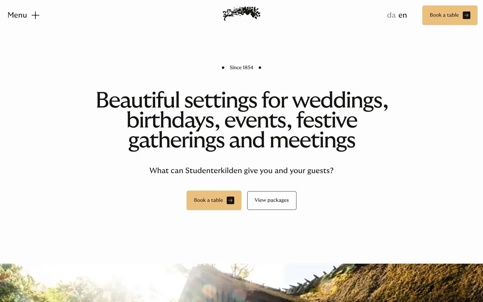
A tall, tightly set serif headline fills the centre of a clean off-white page, with generous empty space above and below it so the message has room to land. The warm sand-coloured button is the only warm colour, which makes the booking action easy to spot, and the outlined secondary button sits quietly beside it. A sunlit photograph of a turf-roofed timber building peeks in at the bottom, just enough to hint at the setting.
Borrow this: Pair a single warm-coloured booking button with a quiet outlined button for menus or packages, and repeat the pair in the header so the next step is never out of reach.
Watch out for: The lab test rated it middling, though the page itself is light, and the animation and smooth-scroll scripts on top of Webflow add some work for the browser. But there was not enough real-visitor data to say how it performs for actual guests.
Built by SOUR. Visit studenterkilden.dk.
2. Meatopia
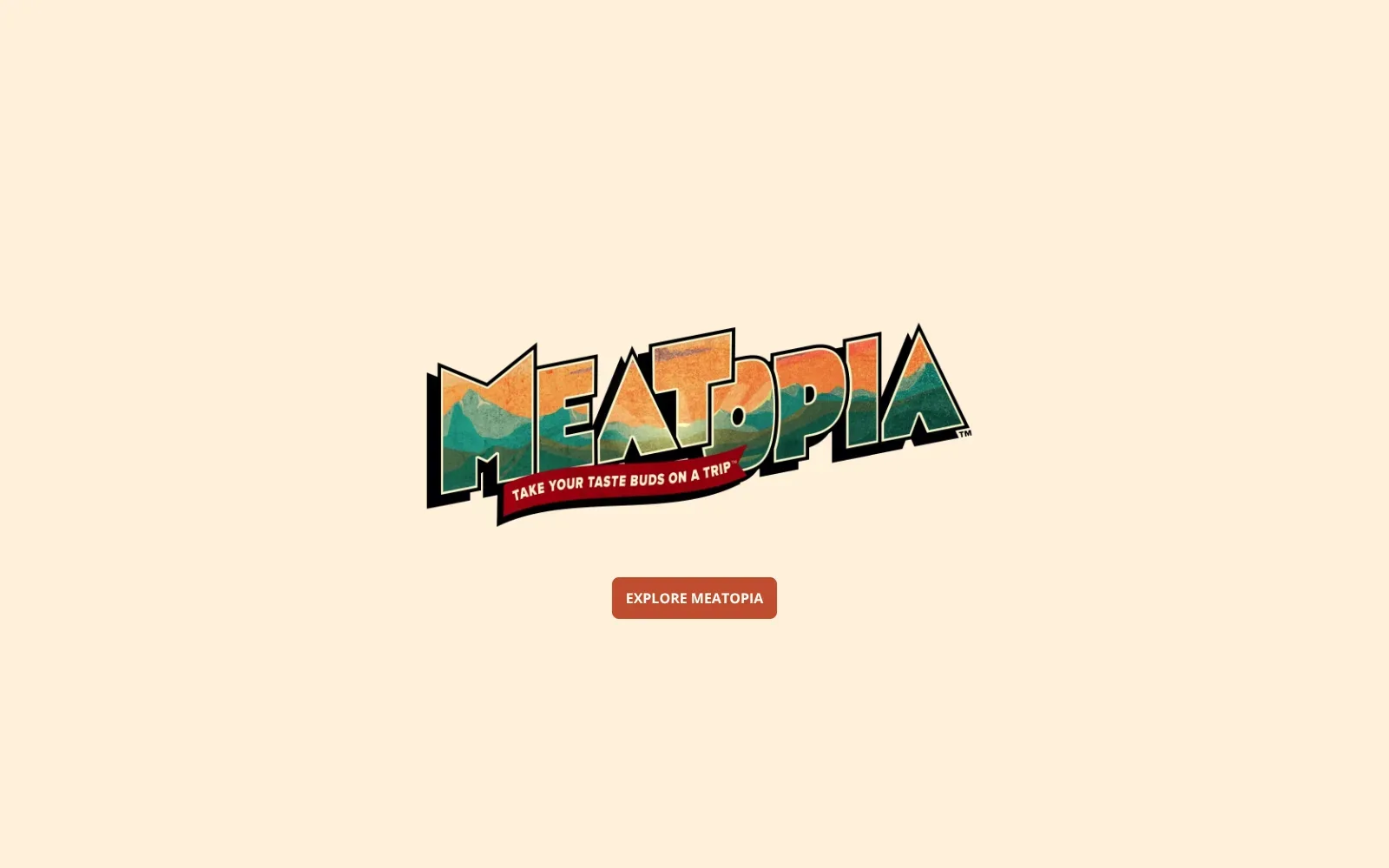
The wordmark does all the work. Chunky, slanted capital letters with a black drop shadow are filled with a mountain landscape in orange, teal and olive, and a red ribbon tagline cuts across the bottom like a vintage postcard. Set alone in the middle of a warm cream field with a single rust-red button beneath, it gives the page a clear focus and a confident, playful mood.
Borrow this: Copy the habit of filling a bold lettered logo with a texture or landscape photo, then leave plenty of plain colour around it and a single clear button.
Watch out for: The page is heavier than average and scored only middling in the lab, and real visitors see slow loading of the main content and sluggish response to taps and clicks. So the large logo artwork is worth compressing rather than treating as harmless decoration.
Built by Arro Labs. Visit visitmeatopia.com.
3. Pier88 Coast By MONARQ
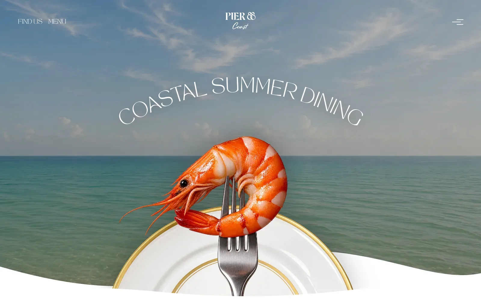
A single photograph does all the work: a glossy orange prawn on a fork, set against a calm teal sea and a soft blue sky. The warm orange against cool blues is instantly appetising. The headline curves in thin white capitals above the shrimp, echoing the plate rim, while the logo and menu sit quietly at the edges. And the wavy white edge at the bottom hints at the tide without labouring the point.
Borrow this: Pick one confident hero photograph of your signature dish, place it in a setting that suggests the venue, and keep the headline short and light over the sky or background.
Watch out for: The page is very heavy and the lab test came out middling, which fits a full-bleed photograph plus animation libraries such as GSAP, Lenis and Lottie. So slower connections will feel the visual choices first.
Visit pier88coast.com.
4. Le Saint Georges
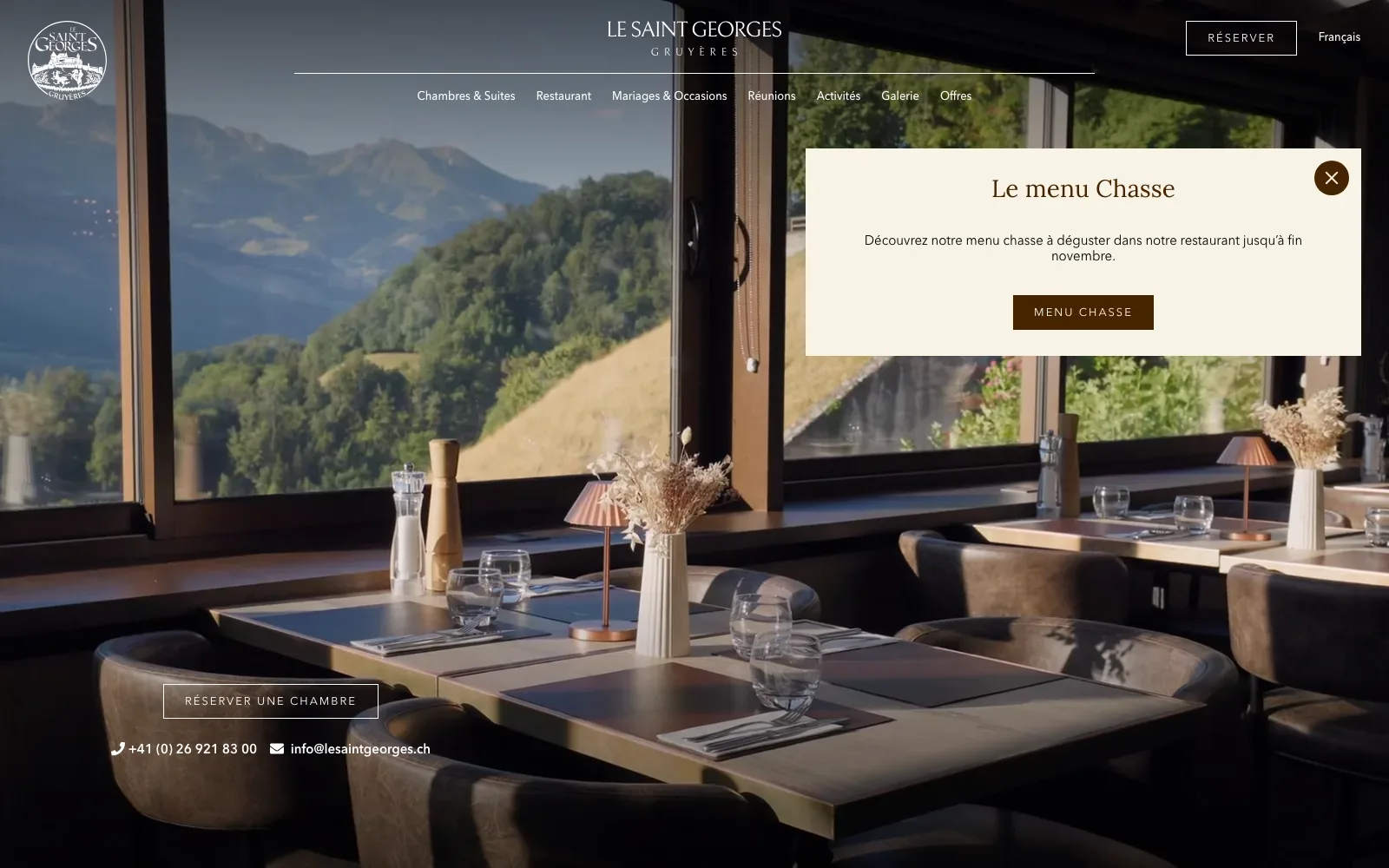
A full-bleed photograph of laid tables beside a mountain window does nearly all the work, and the pale logotype and thin-ruled navigation sit over it without a heavy bar. The cream announcement panel uses a warm serif heading and a dark brown button, which matches the wood and copper tones in the picture. On mobile the painted cow gives the page a local, slightly playful character.
Borrow this: Pair one honest photograph of your own dining room with a single cream panel and one dark button to announce a seasonal menu.
Watch out for: The page itself is light, but real visitors see slow loading of the main image area and layout shifting while it settles. So the big hero and pop-up are worth checking on ordinary phone connections, not just on a tidy desktop preview.
Built by Ludovic Dind. Visit lesaintgeorges.ch.
5. Raw House
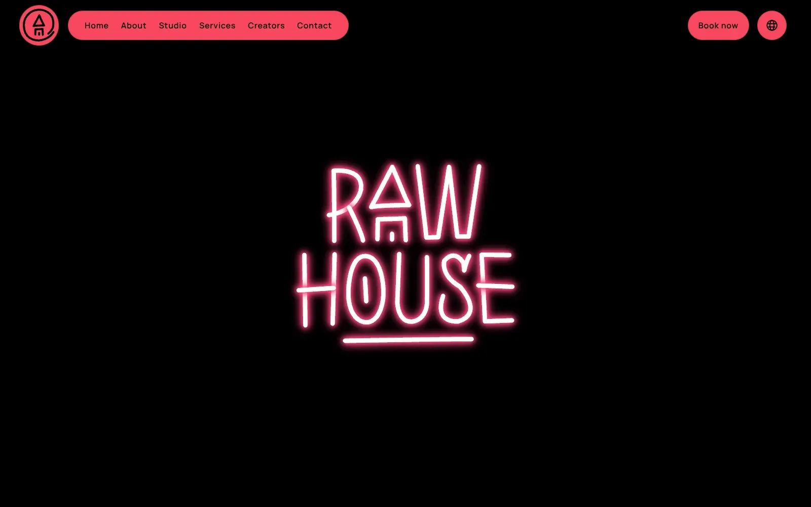
A single hand-bent neon sign in hot pink sits in the middle of a pure black screen, and nothing else competes with it. The glow gives the wordmark depth without any photography. The pink is repeated in the pill-shaped navigation, the Book now button and the round logo, so the whole page feels like one lit sign in a dark room.
Borrow this: Build the whole first screen around one confident logo or sign on a flat dark background, and repeat its single colour in the buttons so the booking link is impossible to miss.
Watch out for: The page is heavier than average and only middling in the lab test, though real visitors get a good experience on all three Core Web Vitals. The weight is there, but it is not hurting people in practice.
Built by webeleven. Visit rawhouseathens.gr.
6. Soufflet Malt
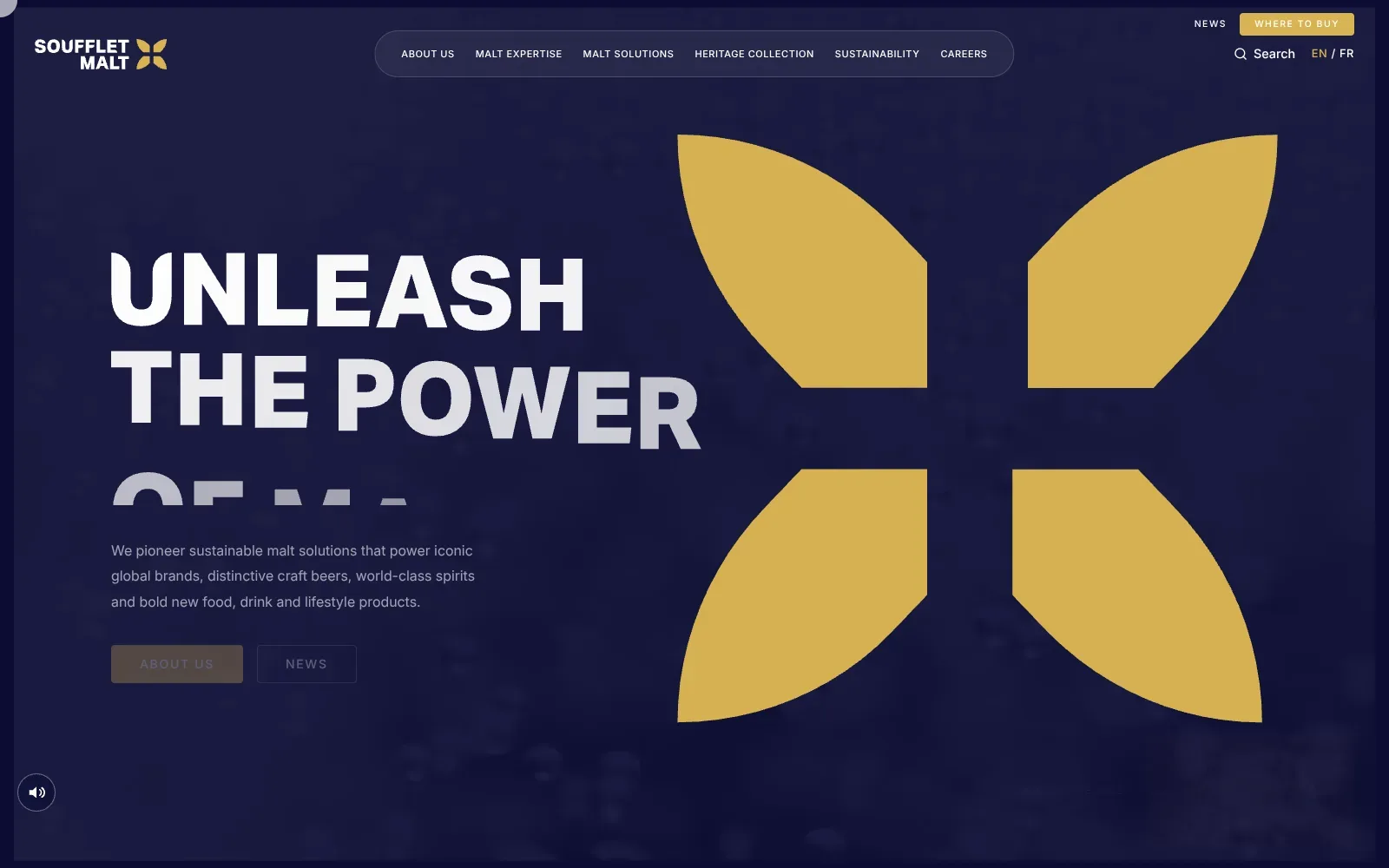
A deep navy ground and a huge gold petal-shaped mark give the page an immediate identity, and the limited palette keeps everything calm. The headline is set in heavy, wide capitals that fade from white to grey as they reveal, which suggests a scroll or load animation. The pill-shaped menu bar and the gold buy button stay tidy and easy to find.
Borrow this: Build the hero around a single oversized brand mark in a warm accent colour on a deep background, so a small food brand gets a memorable first screen from a flat shape rather than a photo shoot.
Watch out for: The page is heavier than average, scores only middling in the lab test and real visitors see slow loading of the main content. So the large animated hero is the first place to look, not a detail to leave until later.
Built by Allan LE GOUIL. Visit souffletmalt.com.
7. Meyers
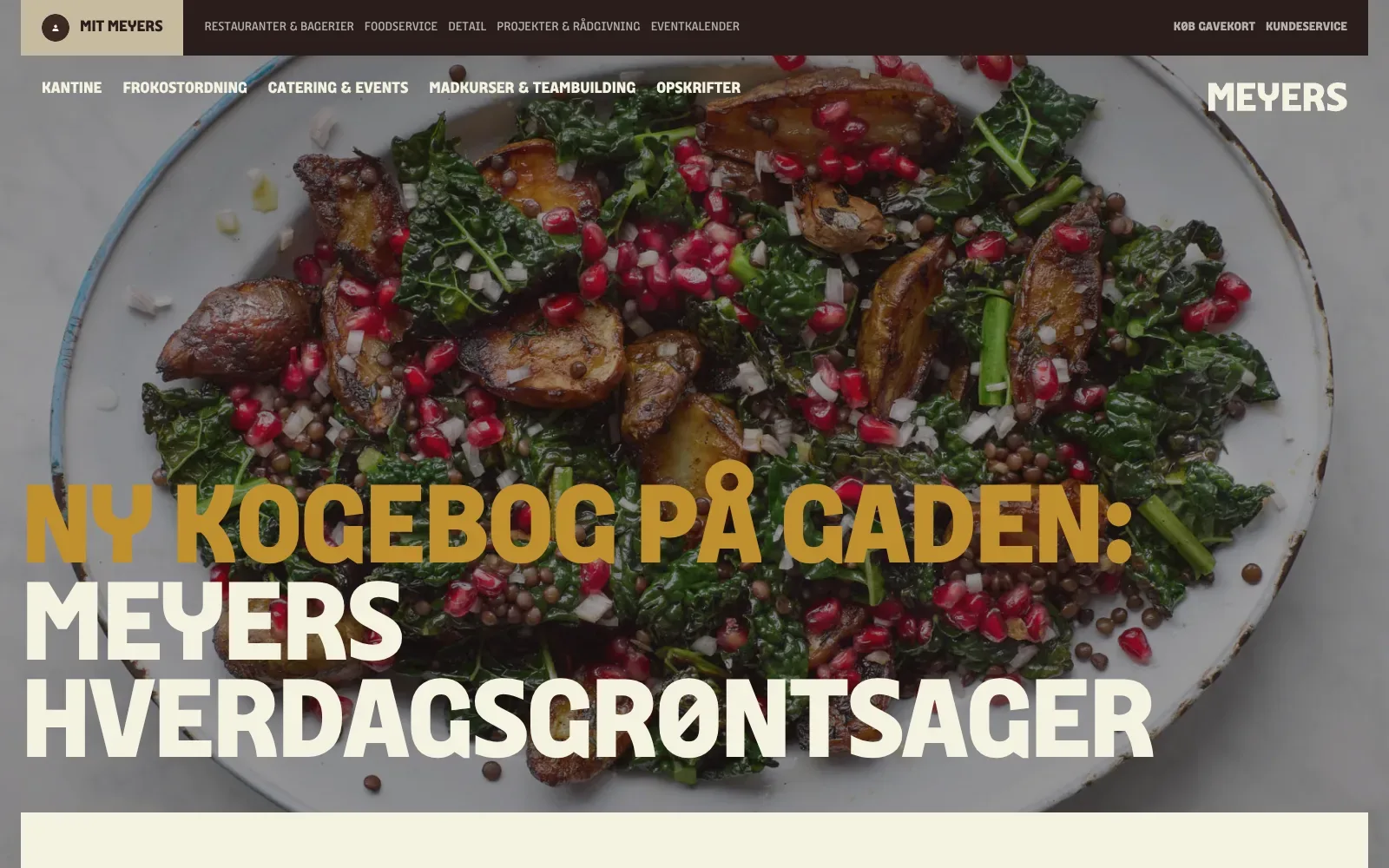
A single close photograph of a roasted potato, kale and pomegranate salad fills the screen, and its deep greens and red seeds do most of the work. The headline sits low in a heavy, chunky sans with quirky letterforms, mustard gold over cream, so it reads clearly against the darkened image. The dark brown top bar and tan tab keep the palette warm and tied to the food.
Borrow this: Lay a heavy headline in mustard and cream over a dark-tinted close photograph of your best dish, so a good photo carries the top of the page.
Watch out for: The page is light, but it was slow in the lab test and real visitors see layout shifts. But that points to the large image and headline moving as they load, not to raw page weight alone.
Built by Dwarf. Visit meyers.dk.
8. Woolmers Estate
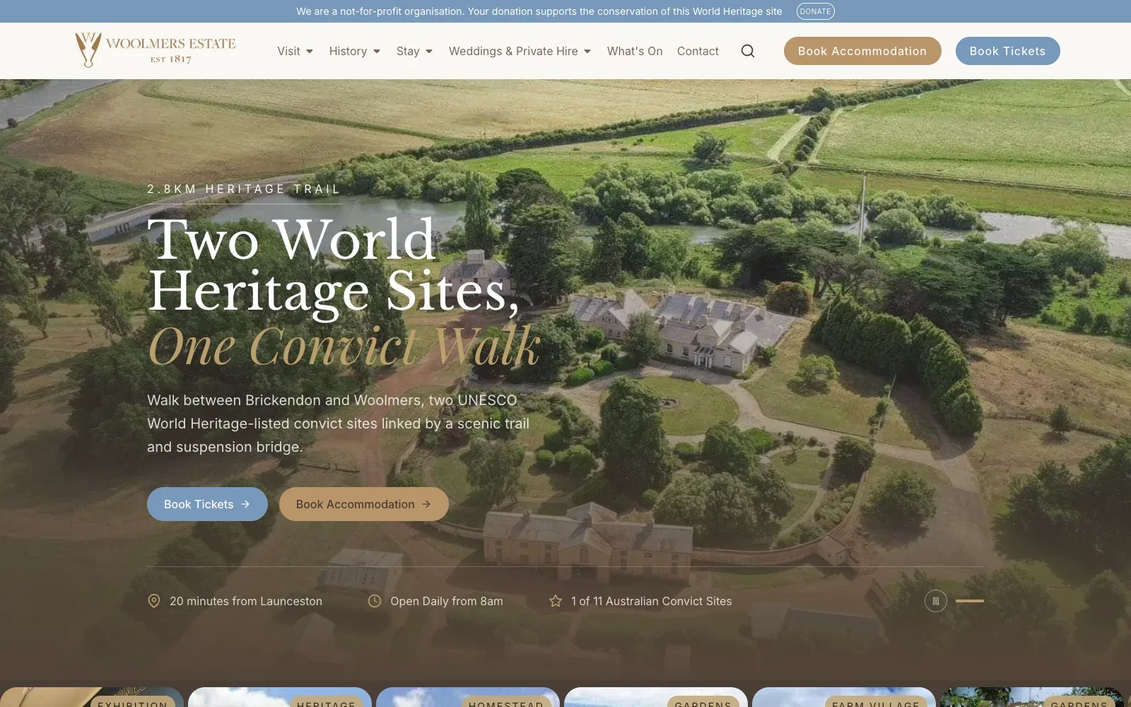
A full-bleed aerial photograph of the house and fields does the heavy lifting, with a dark wash over the lower half so the white text stays readable. The headline is set in a high-contrast serif, with the last line in italic gold that echoes the logo and the tan button. A small spaced-out caps label above it and a thin rule give the stack a calm, ordered feel, while the pale blue and tan buttons stay clearly distinct.
Borrow this: Pair a wide photograph of your own premises with a soft dark overlay, a serif headline ending in an italic accent line, and two differently coloured buttons for the main actions.
Watch out for: The lab result is middling, but the page is light and real visitors get a good experience on every Core Web Vitals measure. So the large hero image is earning its place rather than simply adding weight.
Built by YourMarketingExperts. Visit woolmers.com.au.
9. White Desert
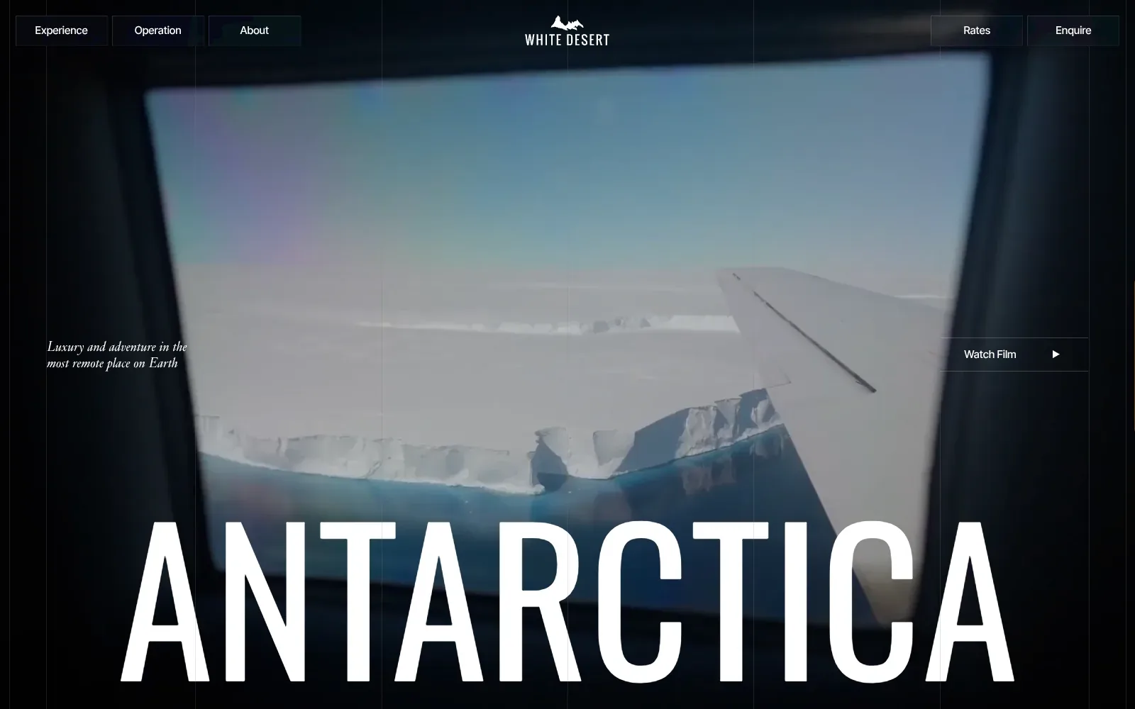
A full-bleed film plays through an aircraft window, so the dark frame becomes a natural vignette and the pale ice edge sits in the middle of the page. The huge tall condensed capital headline runs along the bottom, with a small italic serif line tucked to the left. Thin vertical rules, boxed navigation and a single warm orange button on mobile keep the restraint consistent.
Borrow this: Pair one short italic serif line with a single oversized condensed headline over a looping film of your own kitchen, so the mood is set before anyone reads a menu.
Watch out for: The page is slow in the lab test and heavier than average, and real visitors see layout shifting as the page loads. So the full-screen film and large type come with a stability cost.
Built by Malvah. Visit white-desert.com.
10. Agrumea Farm
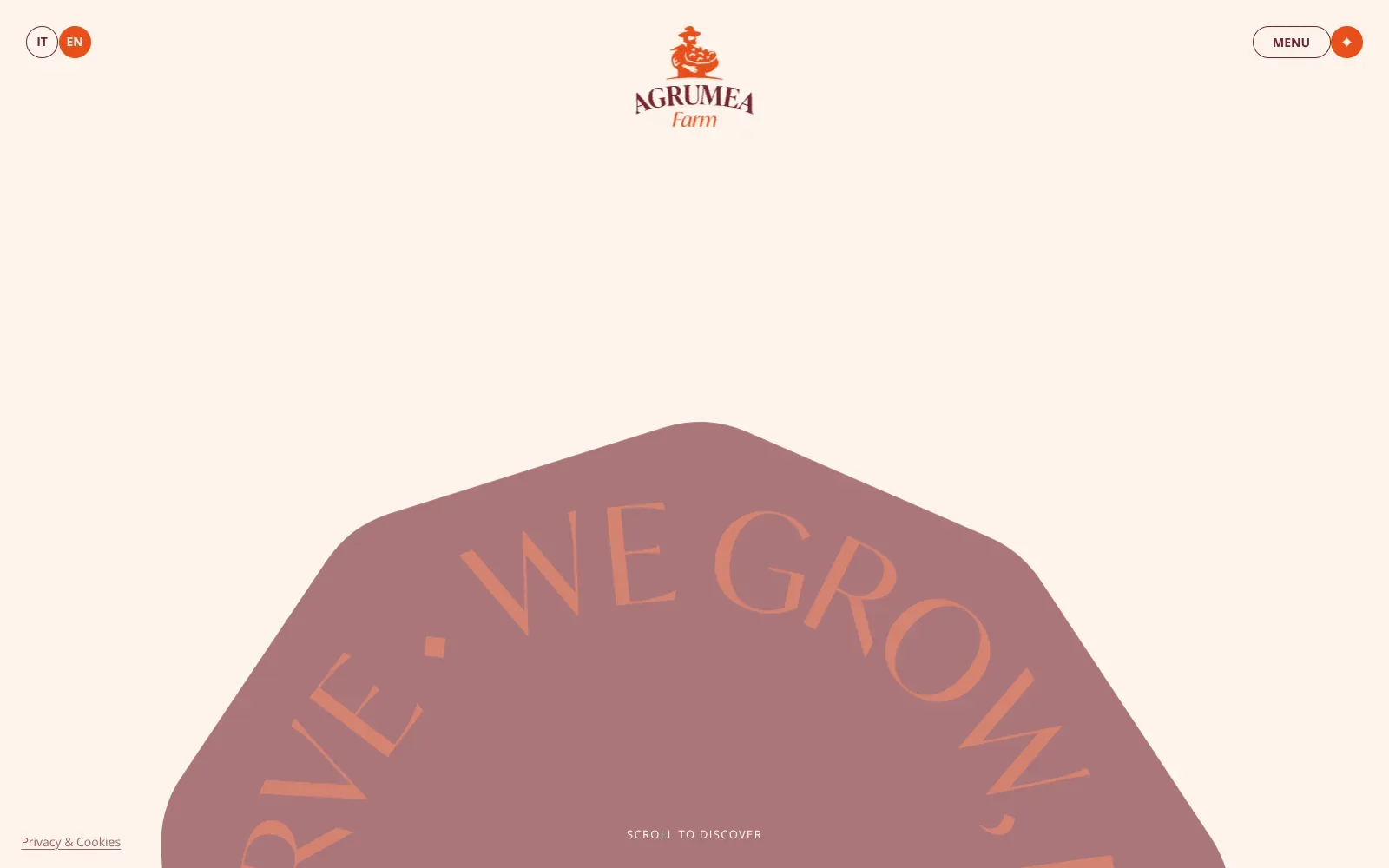
A warm cream ground carries everything, so the small burnt orange and plum accents read clearly. The desktop opening is sparse: a compact logo of a farmer holding a basket, rounded language toggles and a menu pill, then a large dusty mauve shape with tall flared capitals curving around its edge. On mobile, flat cut-paper vegetables in aubergine purple, tomato red, lemon yellow and green crowd into a ring, with large orange numerals peeking through the middle.
Borrow this: Draw produce as flat, chunky colour shapes on a plain cream background, which gives a small food brand a distinctive look from simple vector files.
Watch out for: The page is light, but the lab result is middling and real visitors see slow loading of the main content. That suggests the big artwork takes a moment to appear, even if the whole page is not especially weighty.
Built by Studio K95. Visit agrumeafarm.it.
11. Slurp
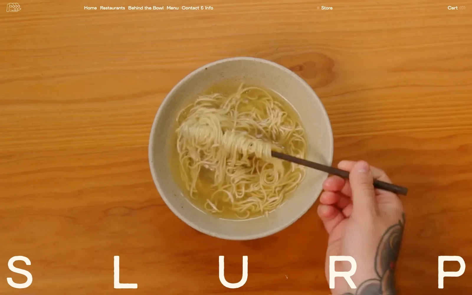
The page is almost entirely a single overhead film of noodles being lifted from a speckled stoneware bowl, set against warm orange wood grain. Nothing competes with it: the navigation is small cream text across the top and the name sits at the bottom in huge, widely spaced geometric capitals. The warm palette and the hand holding chopsticks make it feel human and appetising.
Borrow this: Film a single overhead shot of your most photogenic dish on a plain wooden table and let it fill the whole screen behind a small menu.
Watch out for: The page is very heavy and the lab score middling, though real visitors get a good result on every Core Web Vitals measure. That is a reminder to separate weight from the first thing people actually wait for.
Built by Studio Morfar. Visit slurpramen.dk.
12. Paul & Bohne
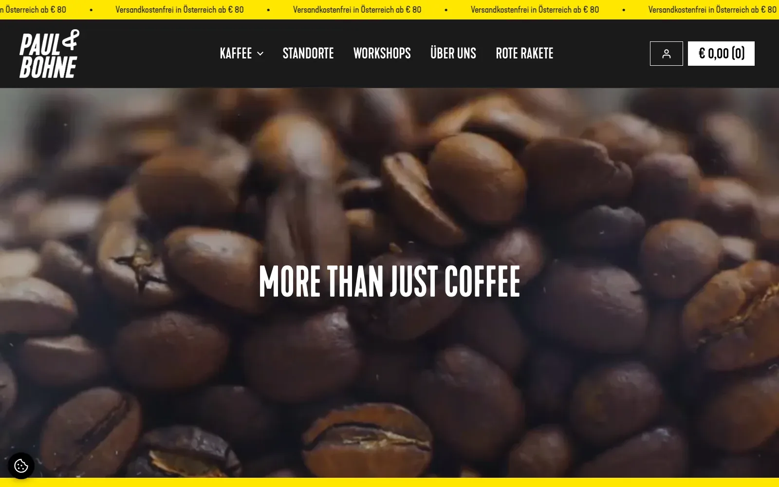
A close-cropped, softly blurred photo of roasted beans fills the screen, and a tall condensed white headline sits dead centre with plenty of contrast. Strong yellow bands top and bottom frame the dark navigation bar, so the palette stays to yellow, near-black and coffee brown. The type is loud but orderly, and the mobile view keeps the same headline and a big black heading on yellow below.
Borrow this: Pair one tightly cropped photo of your own beans, pastries or plates with a single bold condensed headline and one bright brand colour in the bands around it.
Watch out for: The page is heavier than average and only middling in the lab test, though real visitors get a good experience on all three Core Web Vitals. So the full-bleed imagery is not hurting people in practice.
Built by ONTU. Visit paulundbohne.at.
13. Ossa Wines Tasmania
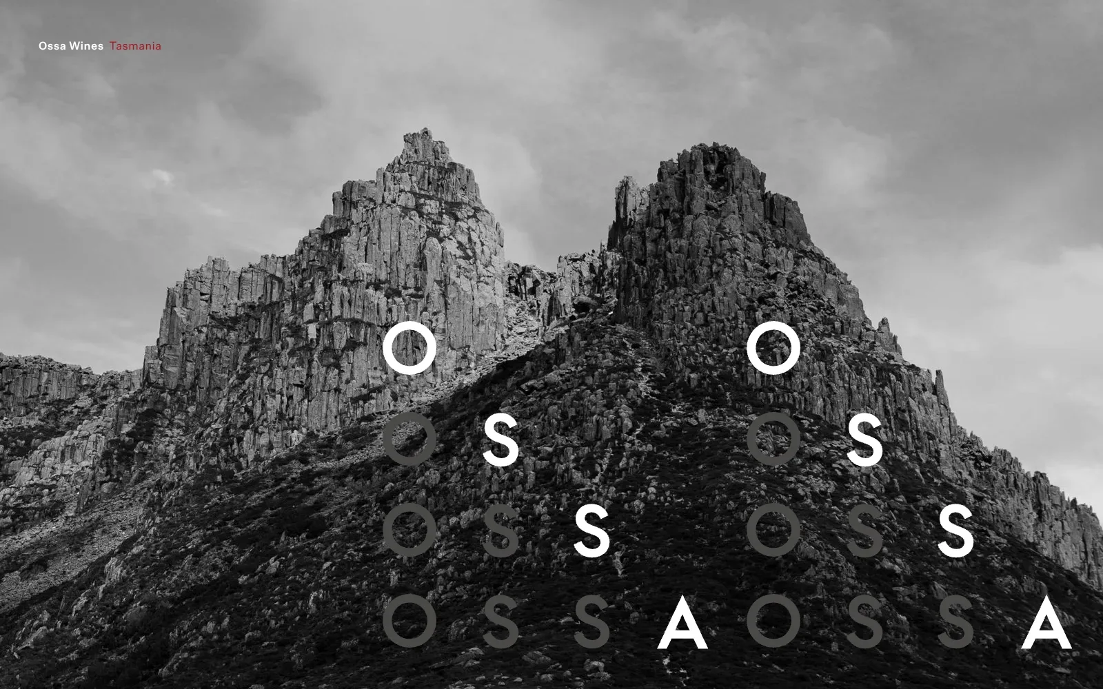
A full-bleed black and white photograph of jagged rock peaks fills the screen, with heavy cloud above and dark scree below. The name is spelled out in a grid of wide, geometric capitals, white letters stepping diagonally with grey repeats trailing behind, which hints at a staggered animation. The small red word Tasmania is the only colour, and nothing else competes for attention.
Borrow this: Use a full-bleed monochrome photograph of your own land, kitchen or dining room, lay a short wordmark over it in wide geometric capitals, and save a single spot of brand colour for a small label.
Watch out for: The page is light, which counts in its favour, but the lab test result is middling and there is not enough real-visitor data from Google to say how it performs for actual visitors.
Built by Inhouse Design. Visit ossa.wine.
14. Don Molinico
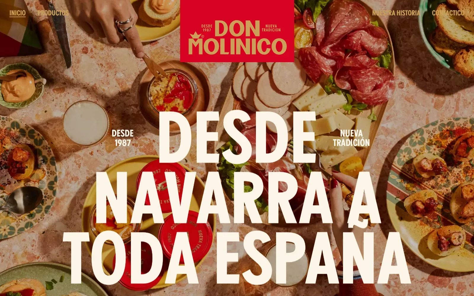
A full-bleed overhead photograph of a table laid with cured meats, cheese, jars and patterned plates fills the whole screen, so the food does the talking before any copy does. The headline is set in a tall condensed sans in cream, large enough to read as part of the picture, and the red logo block with gold lettering anchors the top centre. Warm terracotta tones tie the photo to the brand colours.
Borrow this: Start with an overhead photo of your own table as a full-screen background and lay a big cream headline across it, with a solid brand-colour block for the logo.
Watch out for: The lab test rated the page slow and real visitors see problems with loading of the main content and with layout shifting, even though the page itself is light. So image handling is where the effort belongs.
Built by AUGE EXPERIENCE. Visit donmolinico.es.
15. Benvenusa Italian Wines
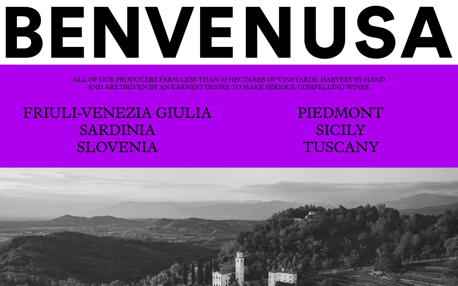
The wordmark runs edge to edge in a heavy, wide sans serif, so the name is the first and loudest thing on the page. Below it, a flat electric purple band holds small capitals in a classical serif, which reads like a printed label. The black and white hillside photograph keeps the colour restrained, and the villa and bell tower give the purple something calm to push against.
Borrow this: Pair one oversized wordmark with a single bold flat colour block and a monochrome photograph of your own place, so the whole look comes from three choices and no extra graphics.
Watch out for: The page is heavier than average with only middling lab results, so the large photography is likely where the weight sits. And there was not enough real-visitor data to say how it feels to actual visitors.
Built by Sons & Co. Visit benvenusa.com.
16. Monarque Événements
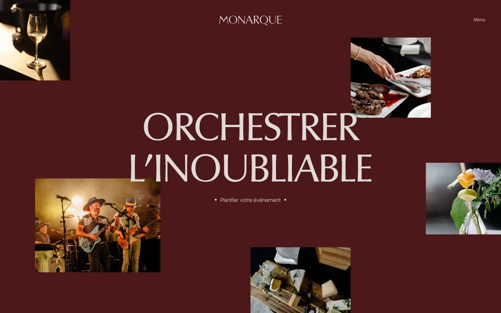
A deep burgundy field carries a huge headline set in a flared, high-contrast capital face, in warm off-white that reads easily. Five square photographs sit around it at uneven heights and sizes, each warmly lit: a wine glass, grilled meat, a live band, cheese on a board, a garnished drink. The generous empty space keeps the scattered pictures from feeling cluttered, and a single quiet link sits beneath the headline.
Borrow this: Pin a handful of warmly lit, square-cropped photos of your food and your room around one big headline on a single flat background colour, and skip the slider.
Watch out for: The page is light and the lab test came back middling, while the mobile view shows one photo still blurred and the rest of the screen empty. So the pictures may arrive late on slower connections, even when the page weight looks modest.
Built by Solstice. Visit monarque-evenements.com.
17. Best Bean Best Cup
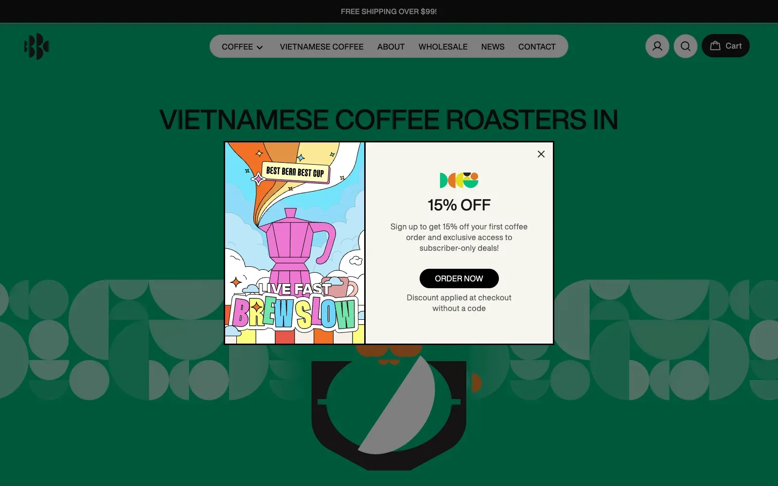
Deep forest green fills the whole page, with a tall black headline in a tight grotesque sans set in capitals across the top. Below it, flat geometric shapes in muted grey-green make a repeating pattern around a bold black cup graphic, echoing the half-circle and quarter-circle logo marks. The pill-shaped navigation bar in pale grey stands out cleanly, and the mobile view keeps the same bold headline stacked in tidy centred lines.
Borrow this: Pair a single deep background colour with a flat repeating pattern built from simple shapes, so a small café gets a distinctive look from basic vector artwork.
Watch out for: The page is very heavy and only middling in the lab test, which sits alongside the animation tooling detected on it. But there was not enough real-visitor data to say how it feels for actual customers.
Built by Nam Bui. Visit bestbeanbestcup.com.au.
18. Eatery Berlin
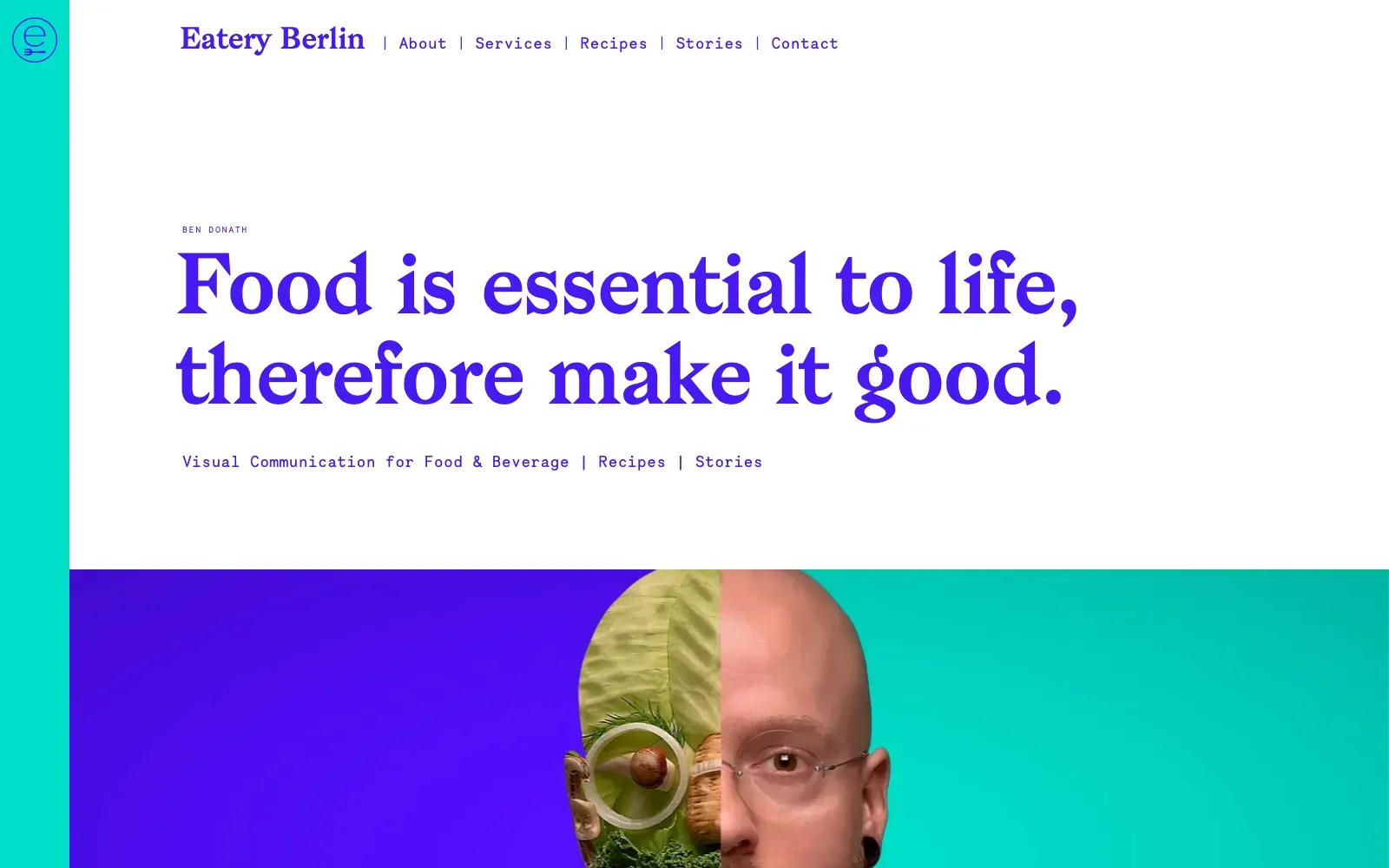
The page runs on a tight palette of electric violet, turquoise and white, so the headline, the thin teal side strip and the split portrait all feel like one system. A heavy, soft-edged serif headline sits against a light monospaced face for navigation and small labels, which gives clear contrast in tone and size. Generous white space around the headline lets it carry the page, and the half-vegetable, half-human portrait does the storytelling.
Borrow this: Pair one characterful serif headline with a plain monospaced face for menus and labels, and keep everything in two bold colours so the page looks designed without needing a large photo budget.
Watch out for: The lab test came back middling, yet the page is light and real visitors get a good result on all three Core Web Vitals. So the experience people actually have is sound.
Visit eateryberlin.com.
19. Cozy Eating Village
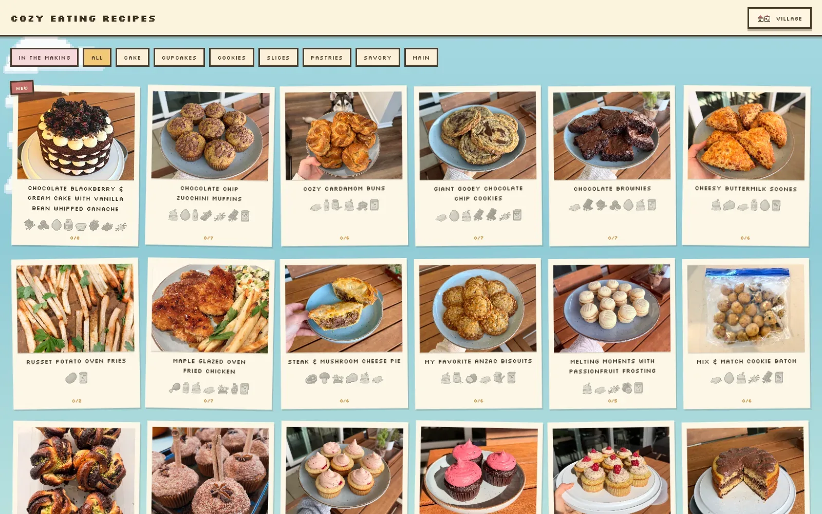
The pixel-art styling gives the page a clear personality: a chunky, blocky capital typeface, a pale sky-blue backdrop with little pixel clouds, and cream cards that look like tilted instant photos. Real photographs of home-baked food sit inside each card, so the warmth comes from the cooking rather than from decoration. Filter buttons with thick brown outlines and small greyed ingredient icons keep the grid tidy and readable.
Borrow this: Frame each dish photograph in a plain cream card with a short caption and a row of tiny ingredient icons, so a menu or recipe grid feels personal without custom photography.
Watch out for: The page is very heavy, largely because of the wall of full photographs, and the lab test result was middling. But there was not enough real-visitor data from Google to say how it feels in practice.
Built by Brooke Beswick. Visit cozyeating.app.
20. Qissa
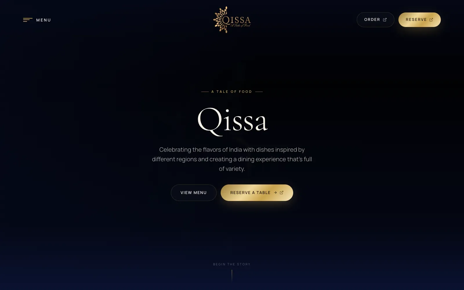
A deep midnight navy ground carries a single metallic gold accent, used on the logo, the reserve buttons and the small spaced capitals, so the eye lands on where to book. The restaurant name sits in a light, high-contrast serif above a pale sans paragraph, all centred with generous empty space. On mobile, faint cutlery arranged in a radiating burst sits behind the text and echoes the logo.
Borrow this: Copy the pairing of a dark background with a single warm metallic accent reserved for the booking button, so the main action is the brightest thing on the screen.
Watch out for: The page is heavier than average and real visitors wait slightly too long for the main content, so the large dark hero imagery is worth compressing. And the lab score is only middling.
Built by Red Dash Media. Visit qissa.co.uk.
What a restaurant website needs, beyond looking good
A beautiful first screen gets attention. But the visit only turns into a booking if the practical details are easy to find, for people and for Google.
- Put the menu on its own page. Google's guidance for food businesses asks for "the fully-qualified URL of the menu" in your structured data, so the menu needs an address of its own (Google Search Central).
- Publish hours, phone and address as text. Google's local business markup takes opening hours, an address and a phone number that includes the country code and area code (Google Search Central).
- Use the Restaurant type. Google advises the most specific business type available and names Restaurant as an example; servesCuisine says what you cook (Google Search Central). Schema.org's acceptsReservations can point straight at your booking page (schema.org).
- Keep your Google Business Profile in step. Its menu editor lists dishes with descriptions and prices, and changes can take 24 to 48 hours to show on Maps and Search (Google Business Profile Help).
- Make the booking button the most obvious thing on the page. Qissa puts "Reserve a table" next to "View menu" in the first screen, and Studenterkilden shows "Book a table" twice before you scroll.
- Size the hero photograph for a phone. It is the largest thing on most of these pages, and LCP was the metric that failed most often.
If your restaurant's site looks dated, or looks good but loads slowly, that is what a website redesign should fix. The restaurant website design page covers how I build menus, booking and location pages for restaurants, and web performance optimisation is the smaller job when only the speed needs work.
Questions people ask
What makes a restaurant website good?
It answers four questions in the first screen: what you serve, where you are, when you are open and how to book. Across these 20, the ones that look best lead with a single strong food photograph or a large serif headline and keep everything else out of the way. The ones that work best on a phone also load that photograph quickly.
What should a restaurant website include?
Your name, address, phone number, opening hours, a menu on its own web page and a clear way to book or order. Google's local business guidance asks food businesses for the menu's URL and a phone number with the country code and area code, and recommends the Restaurant type in your structured data (Google Search Central).
How fast should a restaurant website load?
Google treats an LCP of 2.5 seconds or less, an INP of 200 milliseconds or less and a CLS of 0.1 or less as good, at the 75th percentile of page loads (web.dev). Of the 13 sites here with enough real-visitor data, 5 meet all three.
What platform do restaurant websites use?
In this draw, WordPress runs 7 of the 20, and the two coffee roasters use Shopify for their online shops. Sites that pass and sites that fail both run on WordPress here, so the platform alone does not decide the speed.
Where can I see more beautiful websites?
The 64 beautiful websites pillar covers eight categories, from studios to museums, with the same tests. For designers and studios, see the 20 best portfolio websites, and for galleries to browse, the web design inspiration sites roundup.